Where Recessions Live
Welcome back to Marginal Matters, the free series where we take one piece of research, sit with it, and walk it through our own data until it makes sense.
The Q4 offer. Through Sunday, October 11 at midnight ET, one price: $375 for the year, everything included, and the rate you join at stays yours for as long as you stay.
Everything, $375 for the year. The Beacon, The Beam, The Horizon and The Chartbook, every Crosscurrents issue with a note on each entry and exit, and Pharos, the terminal where the book and every board behind the research update each morning.
Four days left on the Q4 window.
This week we're going inside the factory, and then, as it turns out, a good ways outside of it.
The Economy That Makes Things
Ask most people to describe the US economy and they'll describe a services economy, and going by who works where, they're not wrong. In the 1950s more than a third of private-sector workers drew a manufacturing paycheck. Today it's 9.3%. The factory has turned into shorthand for the past: the Rust Belt, the closed plant, the politician standing in front of a shuttered mill promising to bring it all back. So when people go looking for the next recession, they tend to look where the people are, at restaurants and hospitals and airfares and whatever the consumer did last month.
Ryan Decker, an economist at the Federal Reserve Board, published a short note on October 2 called "Beyond the factory gate" that pushes back on most of that picture. His argument, boiled down, is that physical goods are still about a quarter of the economy, that we undercount them because we keep measuring them at the factory door, and that, in an accounting sense, recessions are goods recessions.
We took each of those claims to our own data. They hold up, and the way they hold up is the interesting part.
The Factory Line Went Flat
Start with the number most people reach for when they want to know how much the country makes: industrial production. The Fed publishes it every month, and it measures output roughly as it leaves the factory gate. Manufacturing is about three-quarters of it, with mining and utilities a bit more than a tenth each. For decades it rose more or less in step with GDP. Then, somewhere in the mid-2000s, it just... stopped.
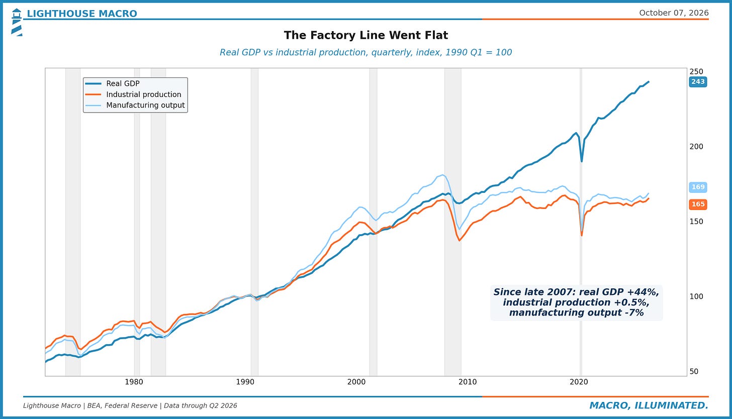
Since the end of 2007, real GDP is up 44%. Industrial production is up half a percent, and manufacturing output is down 7%. If that were the whole story, the obvious conclusion would be that the US more or less quit making things around the financial crisis, and plenty of people have drawn exactly that conclusion.
Decker's point is that the flat line hides a lot, and that it's looking at only one link in a much longer chain.
What Happens After the Factory Gate
There are two ways to measure what a factory does. Gross output is the sticker price of everything that leaves the building. Value added is that sticker price minus everything the factory bought to make it: the steel, the parts, the electricity, the outside services. Value added is the piece GDP counts, because counting gross output would count the steel twice, once at the mill and again inside the car.
Since the mid-2000s those two have split apart. Real manufacturing gross output has gone sideways, same as industrial production. Real manufacturing value added climbed back to its pre-crisis level by the late 2010s and kept going. Across the goods industries (farming, mining and manufacturing), value added went from just above 35% of gross output to just above 40%. In plain English, factories are getting more value out of every dollar of stuff they buy, or at least the data says they are.
That "or at least" is doing real work, and Decker is upfront about it. Some of it looks like genuine efficiency. Some of it is mix: more than two-thirds of the rise in manufacturing's value-added share traces back to a single industry, chemicals, with pharmaceuticals and basic chemicals doing most of the lifting. And some of it may be measurement. The BEA never measures the price of value added directly. It backs it out from what goods sell for and what their inputs cost, and research going back to 2011 suggests the price indexes for factory inputs rose faster than what factories actually paid once they switched to cheaper foreign suppliers, which would flatter value added. Computers and electronics, where prices are notoriously hard to pin down, is the industry where value added most outran gross output. The honest answer is some mix of all three, and Decker leaves the exact split to future research.
Then comes the part we found the most fun. Follow a car out of a plant in Michigan. The factory adds value building it. A truck hauls it to a dealer lot, and the trucking company adds value. The dealer sells it, and the dealer adds value. Before any of that, a design firm and probably a law firm billed the automaker for something. Whoever drives it home pays for all of it, and GDP counts all of it as a good. The trucking company and the dealership are services businesses with services employees, though, so everything they add shows up in goods GDP without ever showing up in factory output or factory jobs.
Goods GDP and the factories' own value added grew at about the same pace until the mid-2000s. Since then goods GDP has grown much faster, which says more and more of what a physical product is worth gets added outside the factory walls. Add in the "factoryless" producers, companies that design a product here, have it built overseas, then import it and sell it, and you get a goods economy that has kept pace with total GDP for more than a decade while the factory line went flat. One study Decker cites found 15.1 million Americans who say they work in manufacturing, against 12.9 million counted on manufacturing payrolls. A lot of people apparently think they work in the goods economy even when their employer gets filed somewhere else.
Counting factory jobs to size the goods economy is a bit like judging a restaurant by how many people are working in the kitchen. You'd miss the servers, the delivery drivers and whoever designed the menu, and you'd conclude the place was shrinking while the dining room stayed full.
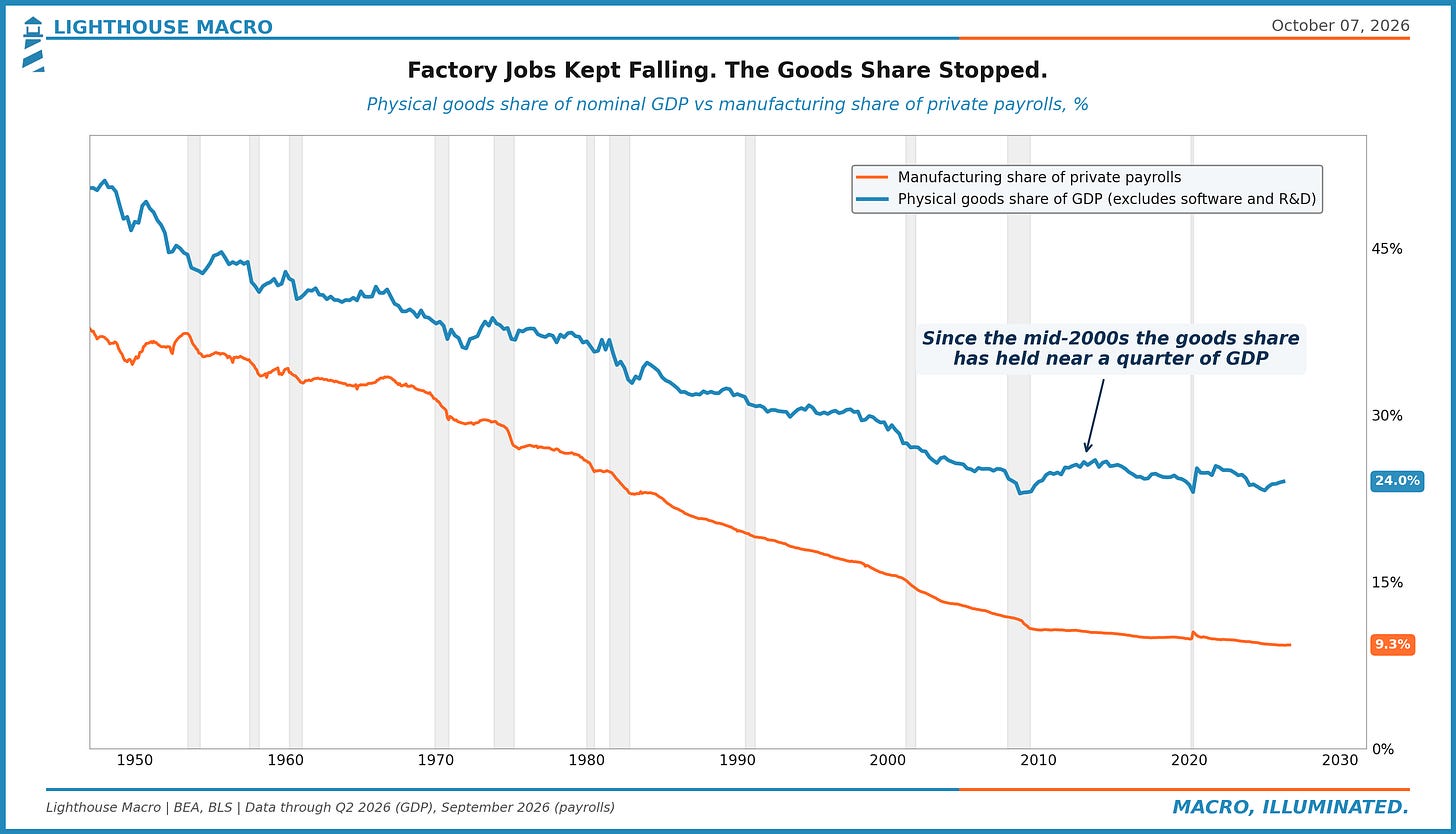
Strip software and R&D out of the BEA's goods category (it files them there, which is a story for another day) and physical goods were 24% of GDP in the second quarter, right where Decker has it. That share slid for half a century, then leveled off in the mid-2000s, right around when the factory line went flat. Factory jobs never leveled off.
Where Recessions Live
Now for the claim that gives this piece its name. Split GDP growth by what's being produced (goods, services, and structures, which is buildings, houses included) and ask which one does the falling when the economy shrinks.
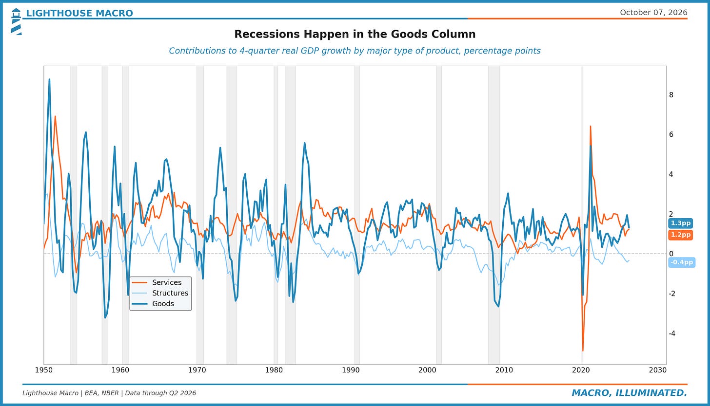
It's goods, nearly every time. Services growth slows in a downturn, and it slows reliably, but it almost never goes negative. Over any full year since 1950, services output has shrunk three times: in 1954, by a hundredth of a percent in late 2011, and in 2020. Goods output falls in every recession on the chart, and usually hard. Here they are peak to trough.
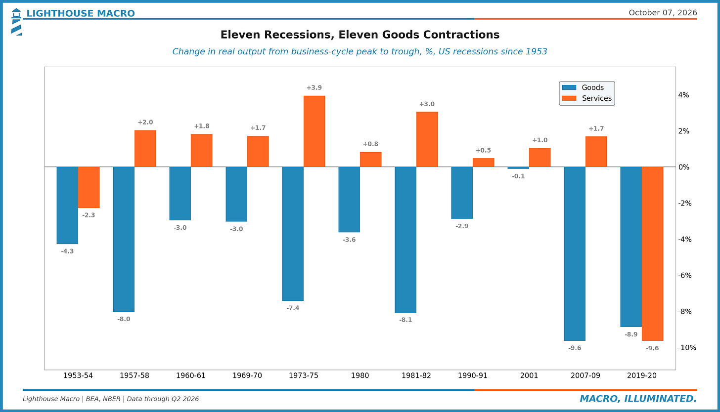
Goods fell in all eleven. Services fell in two, and one of those was the pandemic, the only recession in seventy years that arrived by closing the restaurants and the gyms on purpose. Inside goods, durables do the damage. Decker finds durable goods output contracted meaningfully in every one of the eleven, while nondurables (food, fuel, clothes) held flat or grew in seven of them.
The mechanism is about as old as economics gets, and once you see it you can't unsee it. Rent comes due. The kid still needs the pediatrician. The car, the dishwasher, the new delivery van and the factory expansion can all wait a year, and when households and companies get nervous, the things that can wait, wait. Then inventories pile on. A store selling fewer washers orders even fewer than it sells for a while, to work its stockpile down, so the factory feels a bigger hit than the store did.
Two footnotes in the note are worth the price of admission, which, conveniently, is zero.
The first: if you've spent any time around macro people, you've heard Ed Leamer's line that "housing IS the business cycle." Decker takes it on directly. Housing tends to peak first, which is what makes it such a good early warning, and Leamer's own work has goods peaking soon after. But when you add up what actually shrinks during recessions, goods account for more of it than structures do. Housing rings the bell. Goods do the damage.
The second: part of why services look so steady may come down to how they used to be measured. Until the Quarterly Services Survey arrived in the 2000s, the BEA had little hard quarterly data on most services spending and leaned heavily on models to fill it in, and a modeled series is going to look smoother than a measured one. Decker raises it as a possibility, nothing more. We raise it because it's the kind of thing you'd never know unless you read the footnotes.
Two Factory Floors
Back to that flat industrial production line, because it's hiding one more thing. The Fed also sorts factory output by who it's for. Consumer goods are about 30% of it, equipment (for businesses, plus defense and space) a bit over 10%, and the rest is supplies and materials, the stuff that goes into other stuff. Since the financial crisis those groups have gone in very different directions. Output of energy materials has grown markedly. Consumer goods never recovered.
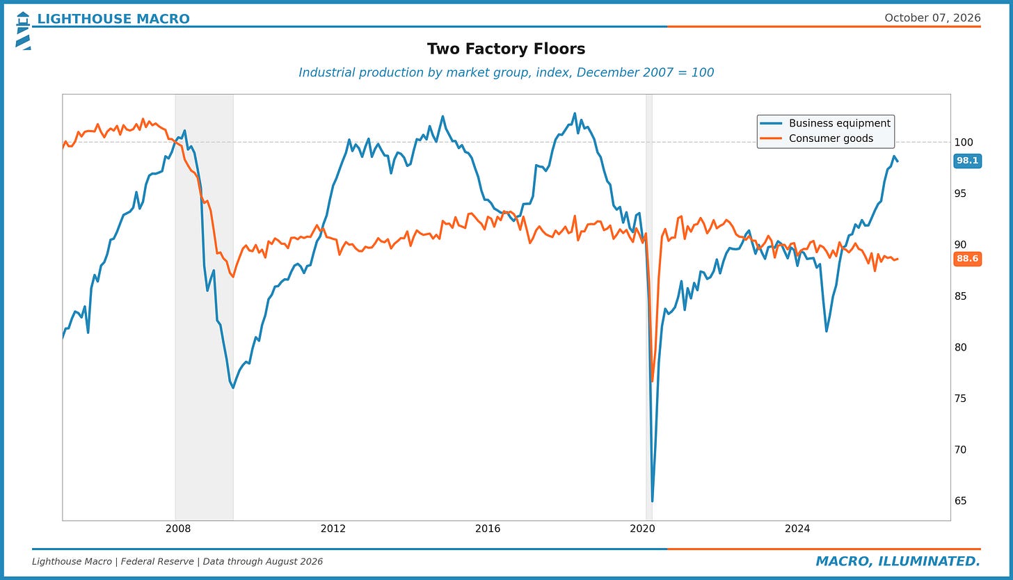
Consumer goods production is still 11% below where it stood in December 2007 and has gone more or less nowhere for fifteen years. Business equipment is back within 2% of its 2007 level. If you've read us on the two economies, you've seen this shape before. One factory floor is building for companies spending on data centers, power and equipment. The other builds for households.
How to Read It
So which of these numbers do you actually watch? Decker is careful to say none of them is the right one and each does a different job, and we'd put it like this. Industrial production is the fast read: monthly, out within three weeks of the month ending, and detailed down to narrow industries and end uses, but it only sees the factory gate. GDP by type of product is the full read, every link from the plant to the buyer, but it comes quarterly and late. Factory employment tells you about jobs and paychecks, which matters a great deal to the people holding them, and surprisingly little about how much is being made.
When the question is whether a recession is coming, goods are where we look first, and durable goods in particular, because that's where every recession since 1950 has done its damage.
What It's Saying Now
Briefly, since this is the part that changes every quarter. Over the four quarters through June, real GDP grew 2.2%, and physical goods contributed 0.86 percentage points of that. That's 39% of the growth coming from 24% of the economy.
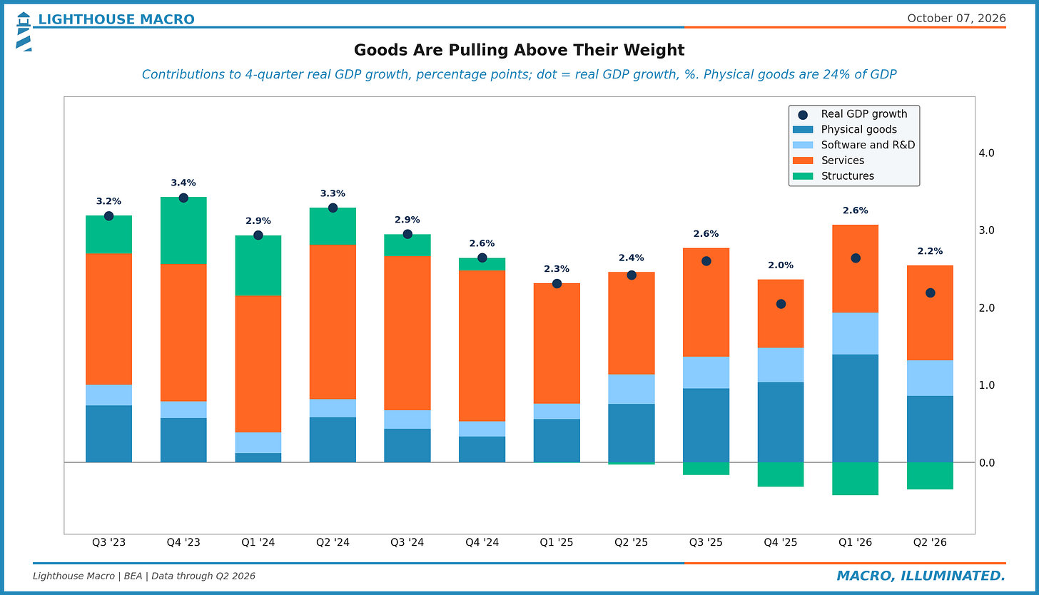
So the column where recessions start is currently doing more than its share of the work, led by the business side of the factory, while consumer goods output keeps sliding (down 1.1% on the year in August, against a 7.1% gain for business equipment) and construction has been a drag for six straight quarters. None of that rules out a downturn. It does mean the usual first domino is still standing.
If you run a business, the split is the thing to take away. Selling physical things to other businesses has been the strong side of the data. Selling physical things to households has meant a flat-to-shrinking market for a long time, and the growth has been happening somewhere else.
Since 2005, physical goods have gone from 25% of GDP to 24%. Factory jobs went from 12.7% of private payrolls to 9.3%.