Richer, Not Relatively
On October 6, Ben Carlson over at A Wealth of Common Sense published a piece called "The Rich Are Getting Richer. So Is Everyone Else," and it does what his best work always does, which is line up a dozen charts that are each entirely real and that all point the same way. He starts with the top 0.1% of households, about 137,000 of them, who now hold 15% of the country's wealth and have added nearly $15 trillion this decade alone. Then comes the turn. Five million households are worth $5 million or more, the young are wealthier than earlier generations were at the same age, households earning $150,000 or more have gone from one in twenty to more than one in four, the poorest fifth's income has doubled since 1979, stock ownership keeps broadening out, and Americans own so much stuff that, per The New Yorker, we hold about 90% of the world's self-storage capacity just to keep it all somewhere. His conclusion is the title.
We agree with nearly every number in it, which is exactly why it gets a full reply and not just a quote tweet. 'So what's the problem then, Bob…??' Bear with us. The problem is what the title implies, which is that everybody is keeping up. The bottom half of the country certainly has more money than it did, and on an "I have more money" basis Ben is simply right. But richer is a word people use relative to somebody, and relative to the households they would need to catch, the bottom half is further behind today than it was when the decade started, and so is the middle. Over the decade they got richer without getting any closer, and once you take out inflation the bottom half is still below where it stood in the middle of 2022, which is what the rest of this piece sets out to show using the Fed's own data.
You only really notice how both of those can be true if you read his piece a second time while keeping an eye on the unit of measurement. The top is counted in dollars, $15 trillion of them. Everyone else gets counted in something else, and it's a different something each time: a percentage change, an average, a share of households, an inflation-adjusted threshold, an income figure after government transfers. Each of those is a perfectly legitimate unit, and each one also happens to be the unit in which that particular group looks its best. Ben does say, in a single line, that the gains at the bottom aren't the same as the gains at the top, but the piece never actually puts a number on the difference.
So we did. We used the same sources he cites (the Federal Reserve, the Congressional Budget Office and the Census Bureau) and simply measured the top and the bottom the same way each time, starting with the decade itself.
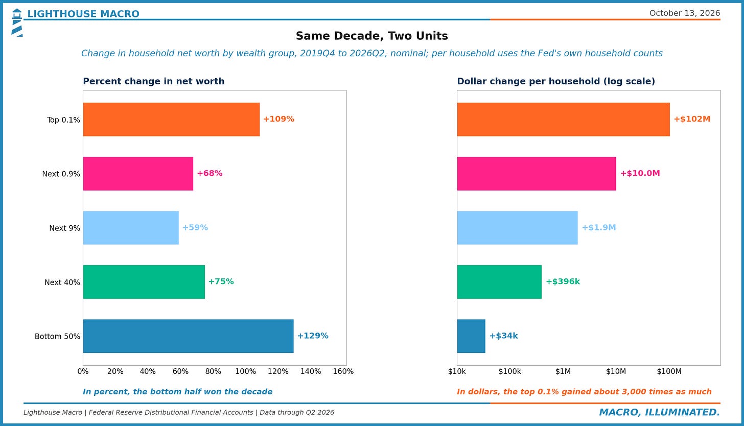
Since the end of 2019, the net worth of the bottom half of American households is up 129% while the top 0.1% is up 109%, and so by growth rate the bottom half won the decade and it wasn't particularly close. In dollars, the average bottom-half household went from $28,933 to $63,269, a gain of about $34,000, while the average household in the top 0.1% went from $101.9 million to $203.7 million, a gain of about $102 million, or roughly 3,000 times as much. Both panels are the same Fed data over the same 26 quarters. Everyone got richer, and every group below the top fell further behind it.
Where Ben Is Right
We want to start with what holds up, because a lot of it does, and a reply that pretended otherwise would just be the same mistake pointed in the opposite direction.
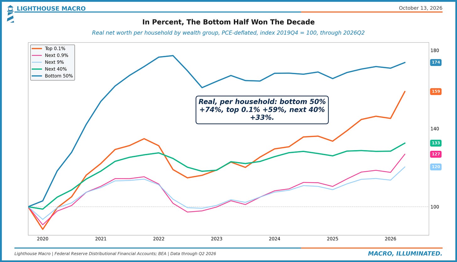
Household Net Worth in the Fed's Distributional Financial Accounts went from $107.6 trillion at the end of 2019 to $185.7 trillion in the second quarter of 2026, and every slice of the distribution took part in it. Even after adjusting for the 26% rise in consumer prices over that stretch and counting it per household, the bottom half is still up 74% in real terms, the top 0.1% is up 59%, and the household sitting between the 50th and 90th percentile is up 33%. The bottom half's share of all household wealth actually rose, from 1.7% to 2.3%. Meanwhile the top 10%'s share slipped from 69.9% to 68.9%, largely because the real story inside the top this decade was the 0.1% pulling away from the merely rich, gaining 2.6 points of share while the 90th to 99th percentile gave up 3.1.
He is also right that the wealthy are a far bigger group than the billionaire list would suggest, and we would go even further than the book he cites. Our own shorthand for the part of the country that lives on its balance sheet is the top 10%, about 13.5 million households, and it holds 69% of the net worth and 88% of the stock. That split is the subject of Two Economies, which we published in April. And he is certainly right that real incomes are higher than they were, that a family at the median lives better in most measurable ways than the same family did in 1979, and that a household under 35 has more net worth at the median than its 1989 counterpart did. None of that is in dispute here.
The Decade Has Two Halves
What is in dispute is the tense. Ben's window is "this decade," and this decade turns out to be two very different stretches stapled together.
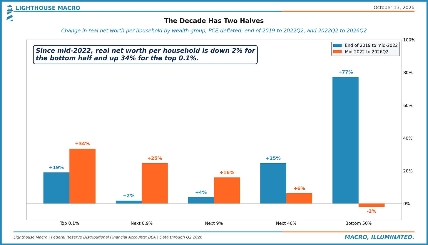
From the end of 2019 to the middle of 2022, which is to say the stimulus checks and a housing boom landing more or less at once, the bottom half of the country had an extraordinary ten quarters. Its real net worth per household rose 77%, its share of the country's wealth rose in every one of those quarters, from 1.7% to 2.7%, and it truly did close ground on everybody above it. That is the stretch Ben's charts are picking up, and he is right about it.
Then it stopped. The middle of 2022 turned out to be the high-water mark for the bottom half's real net worth per household, and four years later it is still 2% below it, while over the same stretch the household between the 50th and 90th percentile is up 6%, the next 9% is up 16%, the next 0.9% is up 25% and the top 0.1% is up 34%. It is a staircase, with every step up the distribution doing better than the one below it, and it does not depend on where you start the clock: begin two quarters later, at the end of 2022, and the bottom half is up 8% against 37% for the top 0.1%. The bottom half's share of the country's wealth has fallen in 12 of the 16 quarters since, from 2.7% back to 2.3%, and the top 1%'s share, at 32.5%, is the highest in a series that starts in 1989.
So when we say richer, not relatively, we mean it two ways. The first is the distance between the bottom half and the households it would need to catch, which is measured in dollars and which widened across the whole decade, the good half and the bad. Against the top 1% it was about $32 million a household at the end of 2019, in today's dollars, and it is about $44.6 million now. The second is the plain relative measure, share and multiple, where the bottom half has given back more than 40% of its pandemic gain over the last four years and sits well below where it started the series, having held 3.5% of the country's wealth in 1989 against 2.3% today (it has been lower still, 0.4% in 2010 after the housing bust), while the average top 1% household went from 325 times the average bottom-half household to 706 times.
The Unit Changes Mid-Sentence
The $15 trillion checks out. In the Fed's data the top 0.1% went from $13.4 trillion to $27.9 trillion since the end of 2019, a gain of $14.5 trillion, while over the same stretch the bottom half went from $1.9 trillion to $4.3 trillion, a gain of $2.4 trillion that gets spread across 67.6 million households. Put those two next to each other and the first thing you notice is that the top 0.1% gained more in six and a half years than the entire bottom half of the country owns, and by a factor of better than three.
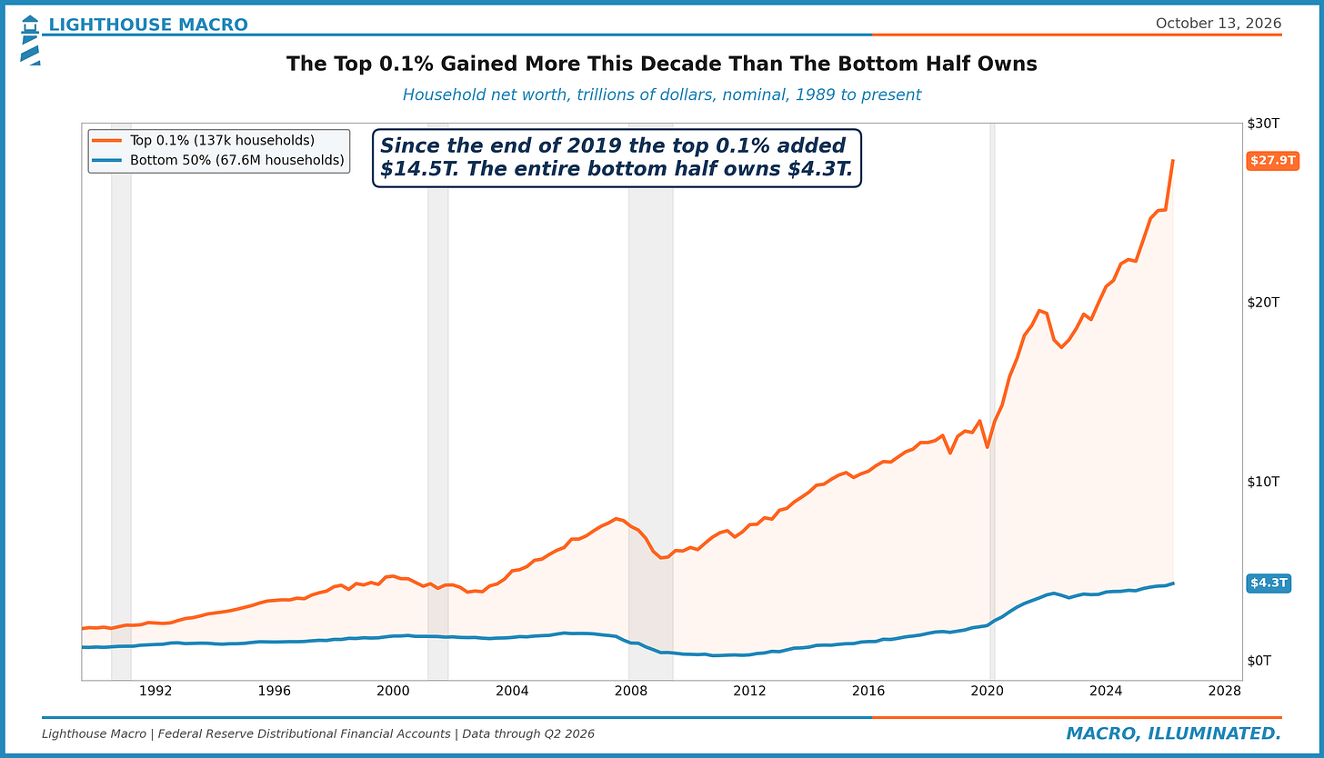
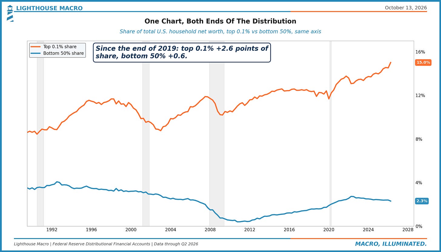
The chart Ben leads with is the top 0.1%'s share of household wealth, which the Wall Street Journal drew from the same Fed series, and it is a good chart, but it is also a chart of only one end. Put the bottom half on the same axis and you get the picture below, which is 15.0% against 2.3%, with the top line up 2.6 points this decade and the bottom line up 0.6. Proportionally, the bottom line had the better decade. You just have to squint to see it.
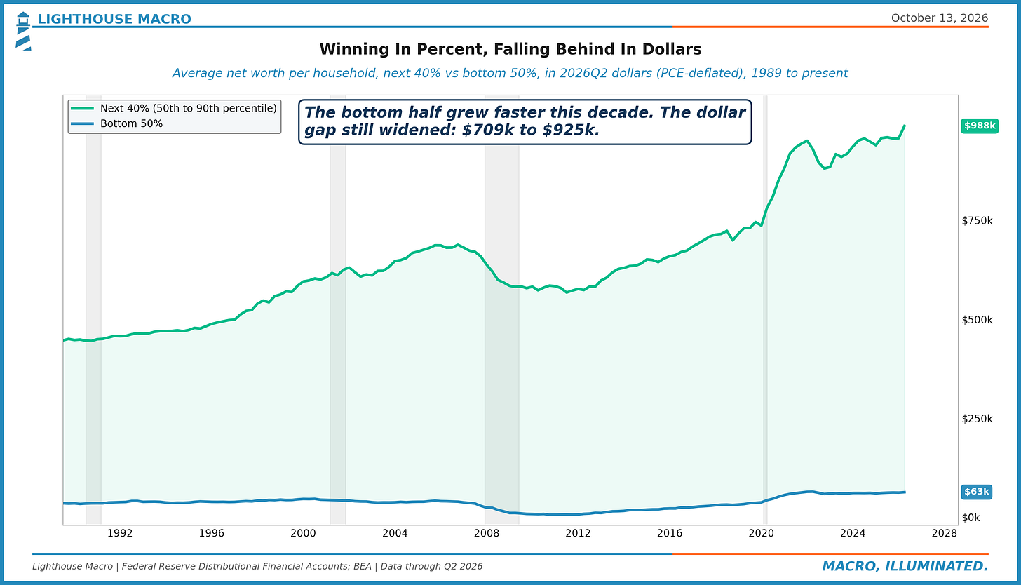
Ultimately, all of this is simply the arithmetic of a low base, and it's worth saying plainly because it really is the whole piece. A household that starts with $29,000 and more than doubles it has had an extraordinary decade by its own history, and it has still added less, in dollars, than a household in the next group up added by growing two-thirds. It's a bit like telling a kid he grew faster than his older brother this year, which he did, and then wondering why he still can't reach the top shelf. The average household between the 50th and 90th percentile went from $592,000 to $988,000. To keep the dollar distance between itself and that household from widening, the bottom-half household would have needed to add $396,000. It added $34,000. And if both households simply kept growing at this decade's pace, which flatters the bottom half, that dollar gap would go on widening for another 56 years before it narrowed at all, and against the top 1% it would take about 185. That is simple arithmetic and not a forecast, but it is what winning in percent from a low base actually buys you.
We ran that comparison against the middle on purpose, because comparing anyone to the top 0.1% is really just comparing them to a rounding error of households with an entirely different kind of balance sheet. The gap between the bottom half and the group sitting right above it, in today's dollars, went from $709,000 at the end of 2019 to $925,000 now, and against the next 9% (the households between the 90th and 99th percentile) it went from $4.6 million to $5.5 million. So the bottom half grew faster than both of those groups and fell further behind both of them, and both of those statements come out of the very same table. In fact every group in that table fell further behind the one directly above it.
Why should the dollar version be the one that counts? Because nothing a household actually does with its wealth is denominated in percent. A down payment is dollars, six months of expenses is dollars, and so is the collateral for a small-business loan, a year of tuition, or the cushion that lets somebody walk away from a bad job. Twenty percent down on the median new home, which sold for $410,700 in the second quarter, comes to about $82,000. The average bottom-half household's entire net worth is $63,000 and, as the next section shows, most of that is already a house and a car.
What The $34,000 Is Made Of
Ben's storage-unit section is easily the most fun part of his piece and, we think, the part that ends up arguing against him. He offers the sheer volume of American stuff as evidence of American wealth, which for the top of the distribution it may well be. For the bottom half, though, the stuff isn't so much evidence of the wealth as it is the wealth itself.
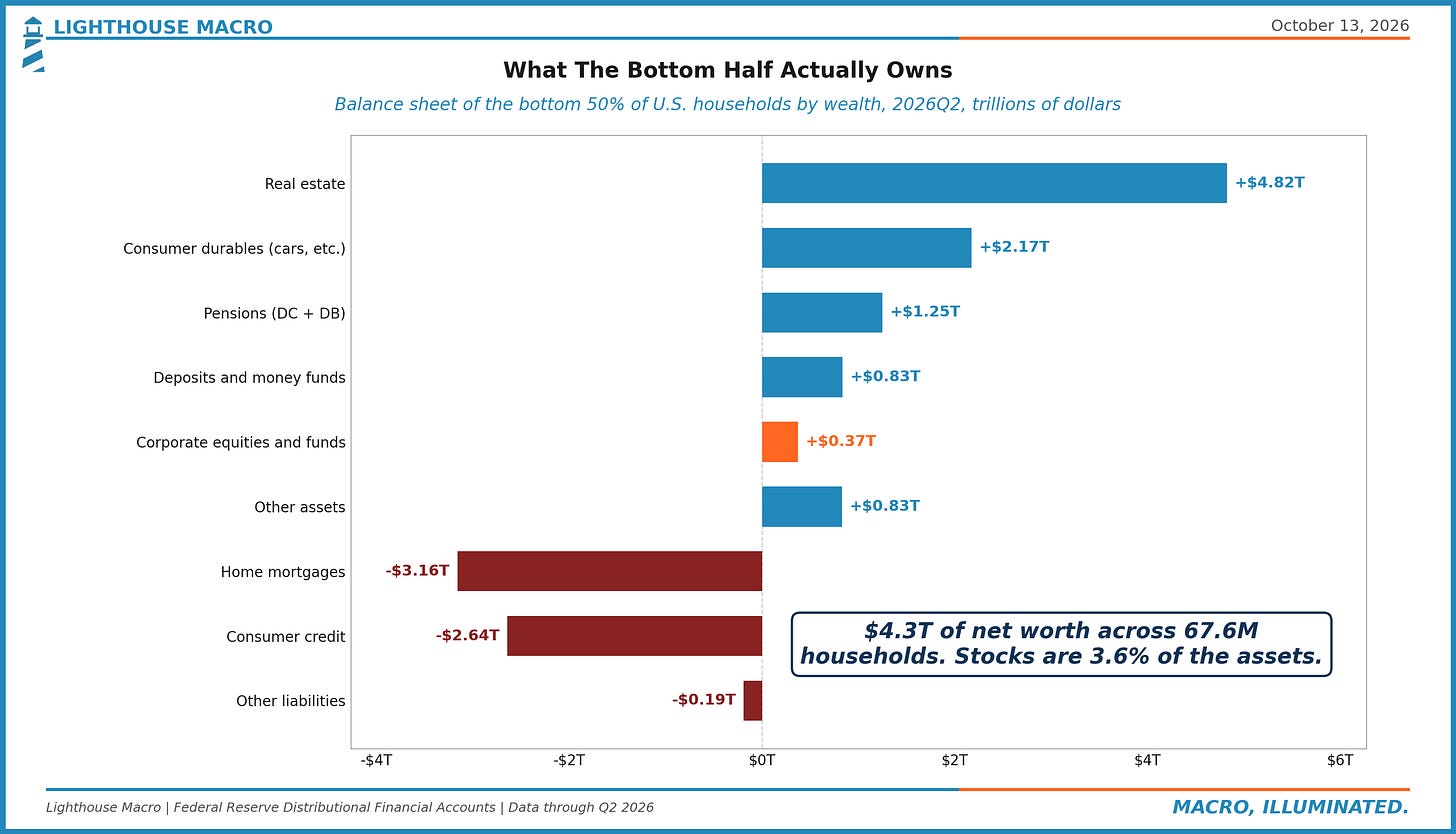
The bottom half holds $10.3 trillion of assets against $6.0 trillion of debt. Of those assets, $4.8 trillion is real estate and $2.2 trillion is consumer durables, which is the Fed's category for cars, appliances and furniture, and together those two make up 68% of everything they own. Corporate equities and mutual funds come to $0.37 trillion, or 3.6%. On the other side of the ledger, consumer credit alone, at $2.6 trillion, is more than three times what the bottom half has sitting in bank deposits and money funds.
Now look at where the decade's gain actually came from. Since the end of 2019 the bottom half's assets rose $3.4 trillion, and two-thirds of that, $2.3 trillion, was simply real estate and durables going up in value, because home prices rose and so did the price of a used car, and both got marked up on the balance sheet. That is real in the sense that the Fed counts it, and so we count it too. It is also about the least spendable kind of gain there is, since getting at it means either selling the house or borrowing against it, and the bottom half's liabilities did in fact rise $1.0 trillion over the same stretch.
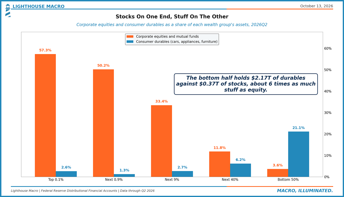
Run the same cut across the whole distribution and the two ends come out close to mirror images of each other. Stocks are 57% of the top 0.1%'s assets and another 17% is equity in private, noncorporate businesses (the dealerships and dental practices Ben's book is about), while durables are just 2.6%. For the bottom half, durables are 21% and stocks are 3.6%. So when the garage is too full to park in, which more than a third of them apparently are, that is really a description of the bottom half's portfolio, one that holds about six dollars of stuff for every dollar of stock. And stuff depreciates.
More Shareholders, Same Owners
On stock ownership, Ben is right about the headcount. The Bloomberg chart he uses is headlined "Almost Everyone's in the Market Now," says more than 60% of Americans own stock, and plots almost $48 trillion sitting in retirement plans. He adds in the very same sentence that a lot of the wealth is concentrated at the top, and so the only real question between us is how much. The Fed's Survey of Consumer Finances counts families instead of people and comes in a little lower, with 32% of families holding any stock in 1989 (directly, or through a fund or a retirement account) and 56% doing so in the 2025 survey, a touch below the 58% of 2022. Either way, more than half the country now has some stake in the market, and a generation ago it was under a third.
The dollars, however, went the other way. In 1989 the top 10% of households by wealth held 82% of household equities and mutual fund shares, and they hold 88% now. The top 0.1% alone went from 15% to 25%, while the bottom half went from 1.1% to 0.6%. We know the objection here, which is that most people's stock sits in a 401(k) and the Fed files that under pensions. So we added every dollar of defined-contribution pension assets to the equity line and treated all of it as stock, which is generous. Even then the bottom half's share comes to 1.4%, down from 2.3% in 1989 and the lowest reading in the series, while the top 10% holds 82%, up from 76%.
The $48 trillion on Bloomberg's chart is a total, and a total can't tell you whose it is. In the Fed's accounts, pension entitlements of both kinds (defined-contribution and defined-benefit) come to $32.8 trillion, and the households between the 50th and 90th percentile hold 47% of that, which is the fairest thing you can say for the chart: retirement plans are where the middle truly is in the market. The top 10% holds about half. The bottom half holds 3.8%, which works out to roughly $18,500 a household.
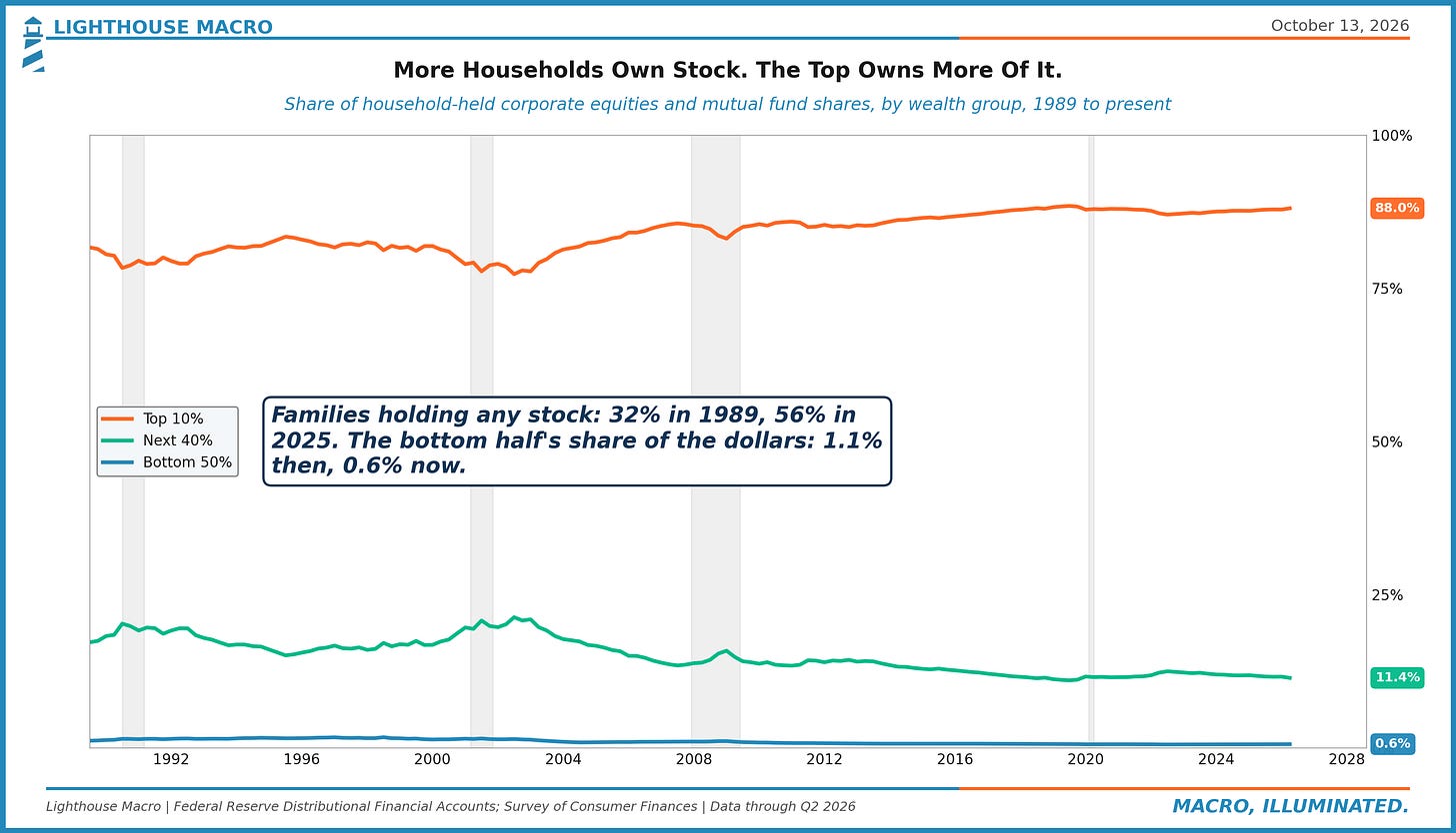
Put more simply, participation is a count of people and a rally pays out by dollars held. Among the families that own any stock at all, the median holding in 2025 was $78,000, which is a real asset, and those families are certainly better off for having it. But when the S&P 500 rises 10%, a household at that median makes $7,800, while the average top 0.1% household, with something over $100 million in equities, makes more than $10 million. Broader ownership gave more families a seat at the table, and the top's share of what's on the table grew anyway.
The same thing is going on with the book Ben leans on, The Everywhere Millionaire. Its finding, as he relays it, is that about five million households have $5 million or more, most of them owners of unglamorous private businesses. We believe it, and it fits the Fed data rather well. Five million households is also the top 4%, though, and a book about one household in twenty-five is evidence about that household. The "everywhere" in the title is about geography.
The chart Ben reproduces from the book actually makes the point better than we could. It has two bars, the Forbes 400 at $4.0 trillion and the Main Street Millionaires (about three million households) at $54.8 trillion. That is a real and interesting finding about the rich, which is that the dealers and the dentists hold far more between them than the billionaires do. It is also three million households holding more than twelve times what the Fed counts today for the bottom 67.6 million.
Same Age, Two Averages
The generational claim is the one we expected to hold up best, and it turned out to be the one where the unit matters most. Ben uses four charts from BCG and one from Jeremy Horpedahl, and it pays to read the footnotes on them. The income charts are medians, and on those the claim holds, because at the same age the median millennial earns more in real wages than the median Gen Xer or boomer did (by roughly a fifth against the boomers on BCG's chart). The wealth charts, on the other hand, are averages. BCG's headline chart plots average real net worth per household, its three-panel chart puts median income and net worth per capita side by side in the very same figure, and Horpedahl's is average wealth per person and says so right in its title. Even the chart showing millennials with 19% of their assets in stocks at age 34, against 11% for Gen X and 7% for the boomers, is the generation's total stock over its total assets, which weights it by dollars; across the whole country that same ratio runs from 57% at the top to 3.6% in the bottom half.
An average is a total divided by a headcount, and a small number of very large balance sheets can move it a long way. Ben allows that there is inequality among younger households, but an average simply can't show you how much.
The Fed's 2025 Survey of Consumer Finances lets us run the same comparison with the median, which is the household in the exact middle of each age group, with everything in 2025 dollars.
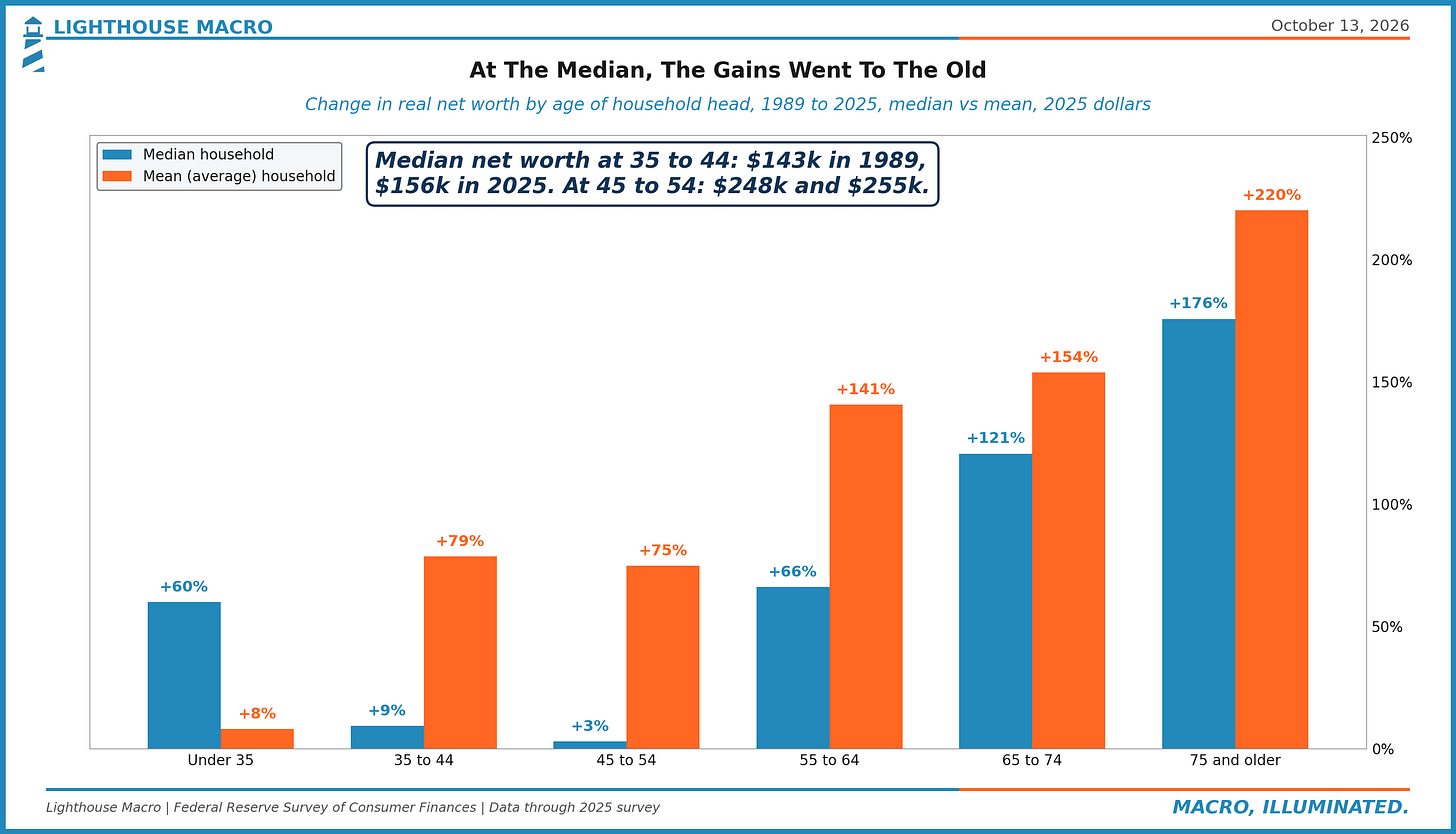
For households headed by someone under 35, median net worth was $20,500 in 1989 and $32,800 in 2025. That is 60% higher, so the claim is true, and it comes to about $12,000; it is also down from $42,700 in the 2022 survey. For households headed by a 35 to 44 year old, the median went from $142,700 to $156,000, which is 9% in 36 years, or $13,000. For 45 to 54 it went from $247,500 to $254,700, which is 3%. Then the line turns. The 55 to 64 group is up 66%, 65 to 74 is up 121%, and 75 and older is up 176%, from $183,100 to $504,600.
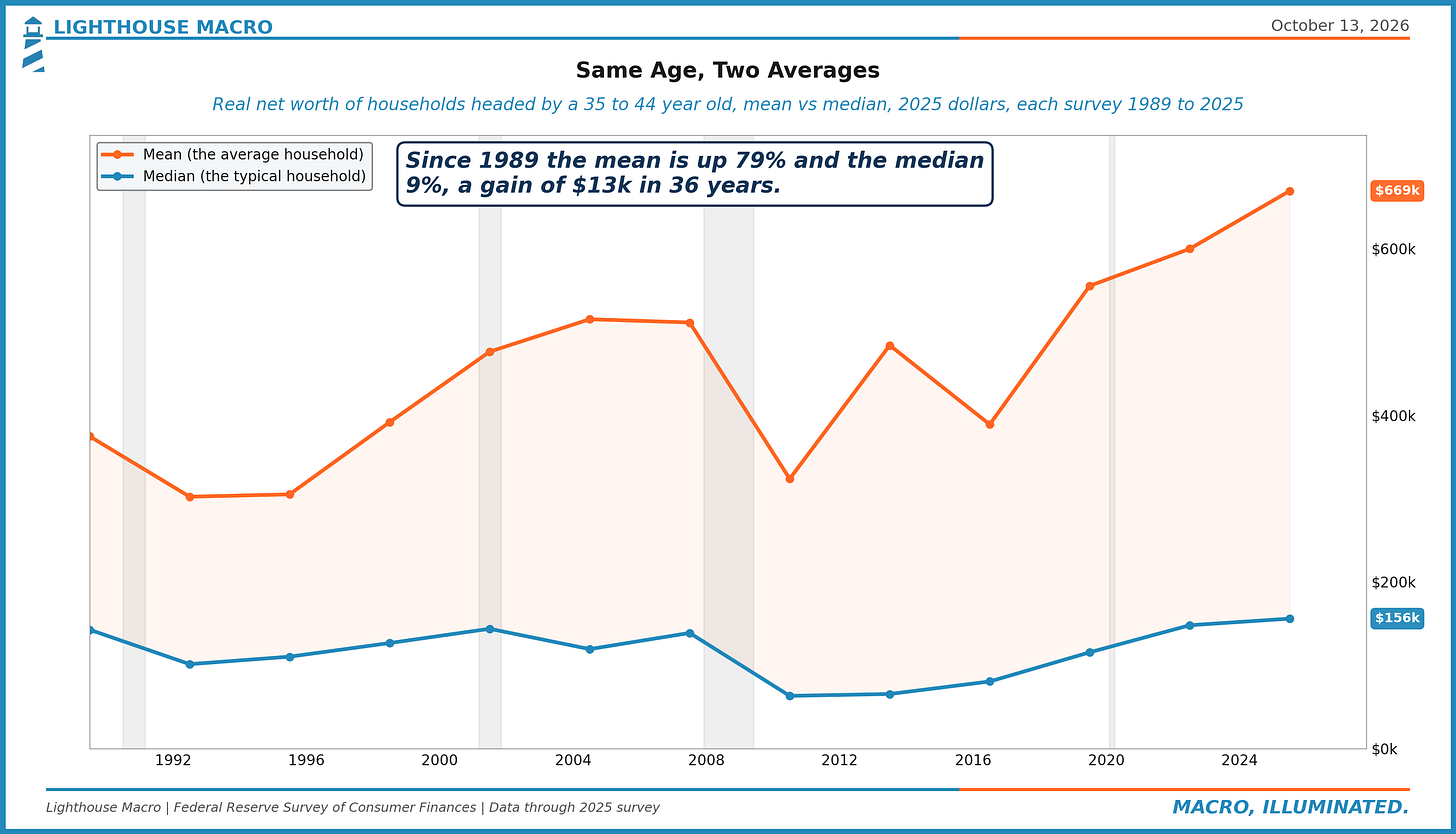
Now compare that to the averages. Mean net worth for the 35 to 44 household went from $375,000 to $669,000, up 79%, and where the mean for that age group was 2.6 times the median back in 1989, it is 4.3 times now. So "the young are wealthier than prior generations" is true at the mean by 79% and true at the median by $13,000, and the distance between those two is the concentration inside the generation, which is the same thing we just looked at for the whole country showing up again one level down. Horpedahl's chart has average wealth for 40 to 54 year olds up just under 60% since 1989, while the Fed's median for the 45 to 54 household is up 3%.
On income, the medians agree on direction and differ on size. BCG counts individual wages and has each generation ahead of the last. The Fed's survey counts the whole family's income before tax, and it has the 35 to 44 household at $92,100 in 1989 and $97,600 in 2025, a 6% raise over 36 years. And one more from BCG's own three-panel chart: millennials match Gen X on homeownership at 42, with both sitting about five points below where the boomers were at that age.
Ben says in passing that old people control most of the wealth. At the median they also got most of the last 36 years of gains, while the age groups in the middle of their working lives are about where they were.
What $150,000 Buys
The Cato chart Ben reproduces says the share of households with money income of $150,000 or more, in 2025 dollars, rose from 5% in 1967 to 28% in 2025. We take it at face value, as that is a big and very real change in how many American households can afford to buy a lot. It is also true, on the same chart, that 19% of households are still under $35,000, down from 30%. That is one in five.
Where we part ways is on what an inflation adjustment can actually tell you. The price index behind those thresholds is a consumption basket of groceries, rent, cars and haircuts. It was never meant to track the price of becoming an owner, whether of a house or of a claim on corporate profits, and over this period those prices ran well ahead of the basket. You can see it by pricing the two assets in hours of work at the average production and nonsupervisory wage, which covers roughly four in five private-sector workers.
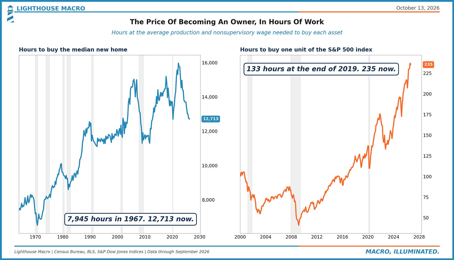
In the first quarter of 1967, the first year on Cato's chart, the median new home cost $22,300 and that wage was $2.81 an hour, so the house cost 7,945 hours, or a little under four years of full-time work. In the second quarter of 2026 the house was $410,700 and the wage was $32.31, which comes to 12,713 hours, closer to six and a half years. The caveats here are real ones. Today's new home is larger and better built, mortgage rates move the monthly payment more than the price does, and this measure peaked near 16,000 hours in 2022 and has come down since. Even so, it is still 60% more work to buy the house than it was when the chart begins.
The stock market is the cleaner case, because nobody can argue the index got bigger bathrooms. At the end of 2019 one unit of the S&P 500 cost 133 hours of work at that wage, and in September it cost 235, as the wage rose 37% while the index rose 141%. For a household whose wealth is going to have to come from a paycheck, the thing it needs to buy got 77% more expensive in six and three-quarter years. For a household that already owned it, that very same move was the $15 trillion.
The 108%
The last chart, also from Cato and built on CBO data, is the one the tweet version called wage gains. It shows the lowest fifth of households with income up 108% since 1979 and the median household up 70%, and both of those figures are after transfers and taxes. CBO publishes the before figure too, and it sits in the left-hand panel of the same chart, where the lowest fifth's income before transfers and taxes is up 50% and the median household's is up 44%. (CBO's "before" figure already includes Social Security and Medicare; what gets added afterward is means-tested aid like Medicaid and food stamps, less federal taxes.)
Forty-four percent over 44 years is 0.8% a year. Over those same 44 years, real output per person in the United States rose 109%.
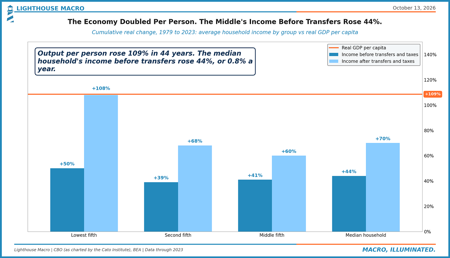
Two honest caveats on that comparison. CBO deflates with the PCE price index while the output figure uses the GDP deflator, and one is per household while the other is per person, so the gap is approximate. It is also much too large to be an artifact. The economy roughly doubled per person, and the household in the middle got less than half of that before means-tested transfers and taxes and about two-thirds of it after them. The lowest fifth kept pace with the economy only on the after-transfer line, and a large piece of what gets counted there is Medicaid, valued at what it costs the government to provide.
To be clear, we aren't arguing the transfers don't count. If Medicaid pays for the surgery then the family is better off, full stop. Our point is simply that "the poor and the middle class are getting richer" and "the poor and the middle class are receiving more support" are two different findings with different implications, and the second one depends on a Treasury that is currently refinancing itself with the ten-year above 5%. We'd also note what the chart leaves off, as it plots the lowest fifth, the second fifth, the middle fifth and the median, with no line for the highest fifth and none for the top 1%. A chart about whether everyone is getting richer that leaves the rich off of it can tell you whether the bottom moved. It can't tell you whether the bottom moved any closer.
Why We Care
All of this would be an argument about fairness, and somebody else's argument to have, if it stopped there. We care because it changes how you read the economy.
Ben closes by granting that plenty of people hate this economy, with a link to his own piece on why sentiment is so low, and then argues that all this wealth is one of the big reasons the country keeps avoiding recession. He flags, fairly, that a wealth effect cuts both ways. We think he is right on both counts and that he has described, without quite saying so, what we mean by Two Economies. The United States runs two household economies on one set of statistics. One of them, about 13.5 million households, holds 88% of the stock, and its spending responds to asset prices. The other, about 122 million households, holds a house, a car, a retirement account and a credit line, and its spending responds to wages, transfers and whatever the card company is willing to extend.
Here's why that matters: the statistics we all trade on are weighted by dollars. Consumer Spending, retail sales, GDP... a dollar is a dollar, and the first group has most of the dollars. Sentiment surveys, on the other hand, are weighted by people, one household one vote, and the second group has most of the people. That is why spending can hold up for years while sentiment sits near record lows, and why nobody has to be lying for both of those to be true. Moreover, it is most of our answer to why sentiment is so low. It is also why "everyone is getting richer" is a risky way to read a strong aggregate, because an economy whose marginal dollar of spending comes from the group that owns the market is an economy whose consumption is leveraged to the market, while the households underneath it have a balance sheet that is two-thirds house and car with $2.6 trillion of consumer credit on the other side.
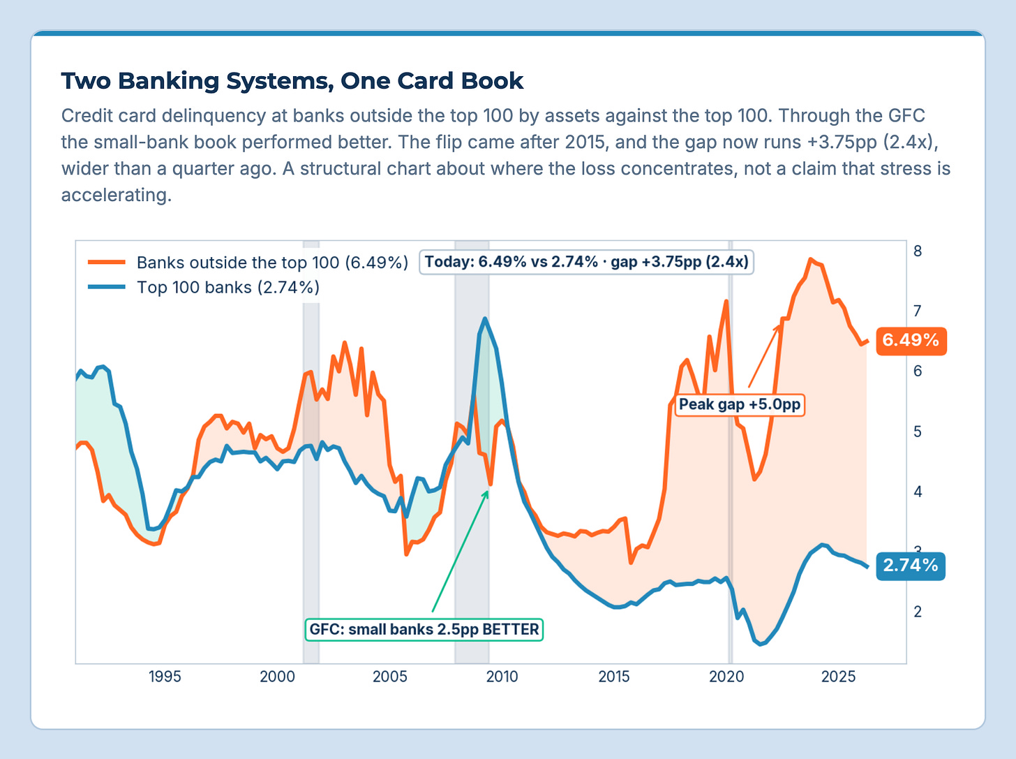
You can see the same split inside the banking system. At the 100 largest banks, 2.74% of credit card balances were delinquent in the second quarter, while at every other bank the rate was 6.49%, more than twice as high. In the spring of 2009, at the worst of the financial crisis, it ran the other way, with 6.87% at the big banks and 4.60% at the small ones. It's the same product, split only by the size of the lender. Most of that gap opened in a single year, 2017, and it has not closed since. It is one of the charts we track in Pharos, our terminal, on the Financial board.
If you run a business, the practical version of all this is to know which of the two you sell to, because they are on different cycles. If you allocate capital, it's that the consumer who matters for earnings is a much smaller and much more market-sensitive group than the phrase "the consumer" suggests. And if you set policy off the average, you should know whose dollars are in it. We made the case for reading the data that way in Why Most Americans Don't Care About Your Market Call, back in January.
What Would Change Our Mind
We could certainly be wrong about where this goes, and the data that would tell us so is specific.
The first is the dollar gap closing outside of a recession. The gap between the bottom half and the next 40% narrows whenever asset prices fall, simply because the people above have more to lose, and that is no kind of progress. If it narrows in real dollars for four straight quarters while markets are flat or rising, then something structural has likely changed.
The second is the medians. If the next Survey of Consumer Finances, the 2028 one, shows median net worth for the 35 to 44 household breaking clearly above the $101,000 to $156,000 range it has held in every survey outside the 2010 to 2016 trough, then the generational claim holds at the median and we will say so.
The third is ownership in dollars. With every retirement dollar counted, the bottom half's share of equities is 1.4%, and if broader participation really is a transfer of ownership then that number should go up, whereas right now it sits at the low of a series that starts in 1989.
The fourth is income before transfers. A decade in which the median household's income before transfers grows in line with output per person would settle the argument about the 108% in Ben's favor.
Any one of those would move us, and all four would mean Ben's title is simply correct.
The So-What
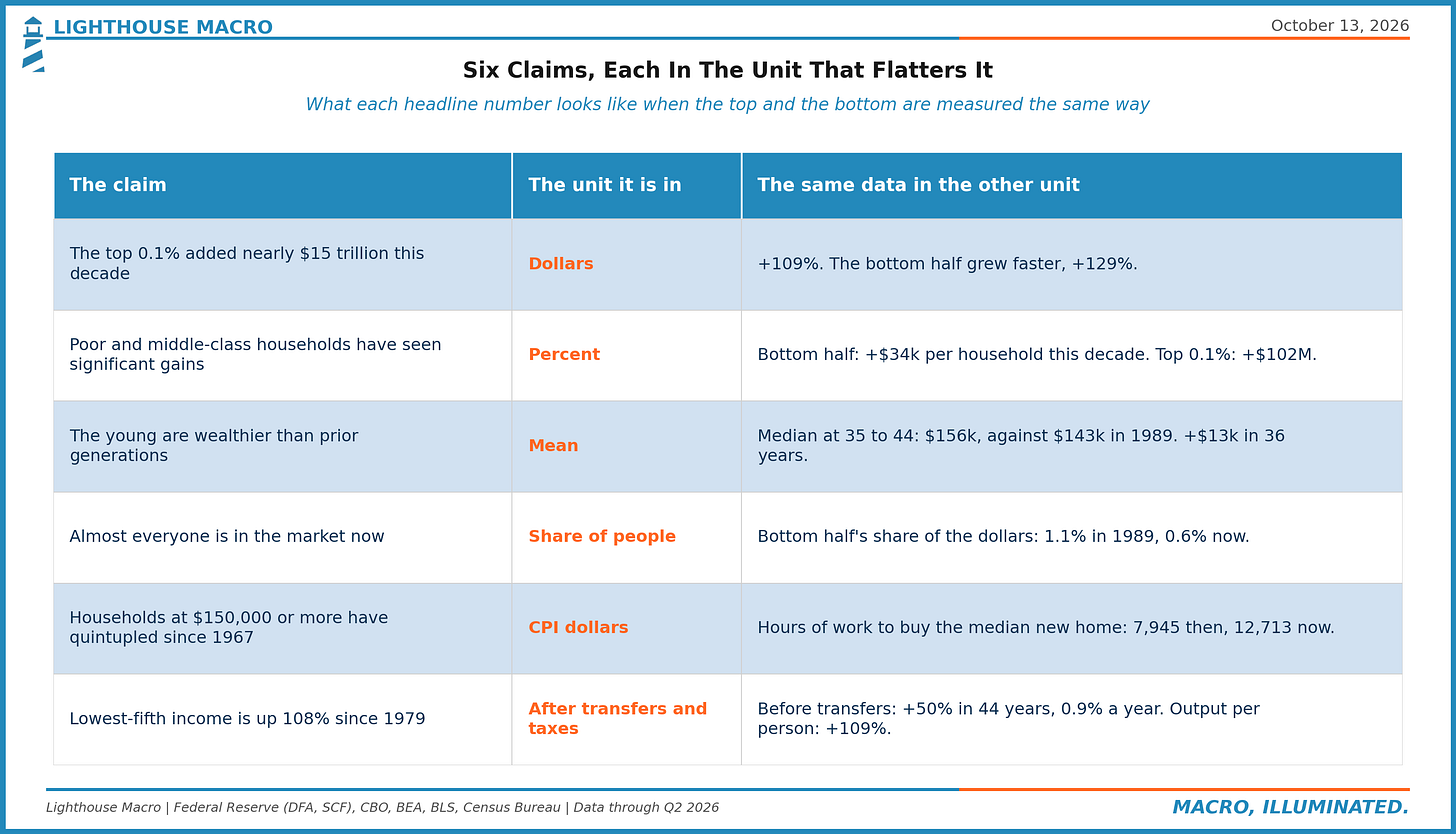
Ben's facts are right and we wouldn't change a single one of them. What the facts don't support is the sentence that joins them, because "richer" is being measured in dollars for the top and in percent for everyone else. Six claims, six units, and each claim is in the unit that flatters it. Put the top and the bottom in the same unit and the last six years look like this: the bottom half more than doubled its wealth, outgrew every group above it in percent, and still ended the period $216,000 further behind the household one rung up and about $75 million further behind the household at the top, both in today's dollars. And nearly all of that gain came before the middle of 2022, since when the bottom half's real wealth per household has slipped 2% while the top 1%'s has risen 28.5%.
So the next time somebody tells you a group is doing better, ask in what unit, and ask compared to whom. Mean or median, share of the people or share of the dollars, before the transfers or after, priced in groceries or priced in the things that make you an owner. The honest answer to "is everyone getting richer?" is yes, they have more money, and no, not relative to the people they needed to close the gap on. Twenty percent down on the median new home is about $82,000, and the average household in the bottom half of the country is worth $63,000.