Priced to Calm
Today's piece is free, and it includes two things: Crosscurrents and The Chartbook. Crosscurrents first, Issue 2, which is what the book has done since it went on the record at the October 1 open, name by name. Then The Chartbook, 60 of the charts our desk built this week across the twelve pillars, each with its numbers and what we take from it. It is going out on a Friday afternoon instead of Sunday because the week it covers is still on the screen, and the read is better taken while it is.
The read is in the title. The long end of the curve has repriced, and most of the rest of the market has not. The 10-year closed Wednesday at 5.28% and the 30-year at 5.67%, a series high; the 30-year gilt at 5.98% is above its 2022 crisis peak. Against that, high-yield spreads sit at 309 basis points, the 12th percentile since 2003, while the bond-volatility index that usually moves with them is at its 73rd. The VIX is 15. This year has had twelve sessions with the 10-year above 5% and the VIX at 17 or under; the last time that combination appeared was 2007. Credit and equity volatility are priced to calm. Rates are not.
Underneath, the economy that the rates are reacting to looks like this: growth at 3.7% on the Atlanta Fed's tracker while the Fed hikes, a core price level six points above the path the Fed set for itself in 2012 with the gap still widening, a labor market that has stopped firing and stopped hiring at the same time, and a Treasury that rolls a third of its debt inside a year into a bill curve above 4%. That is a lot of pressure on a market priced for none. The book is positioned for the version of this where orders keep landing and prices keep rising, which is what the data says so far, and it carries a stop on every name for the version where that stops being true.
The Q4 offer. Through Sunday, October 11 at midnight ET, the annual plan is half off and one price covers everything: The Beacon, The Beam, The Horizon, The Chartbook, every Crosscurrents issue, and Pharos, the terminal where the book and every board behind the research update each morning. The rate you join at stays yours for as long as you stay.
Two days left on the Q4 window.
Don't navigate in the dark. Join the Watch.
The Book: Crosscurrents, Issue 2
Figure 1. The record since the October 1 open against the S&P 500, with Friday stamped intraday.
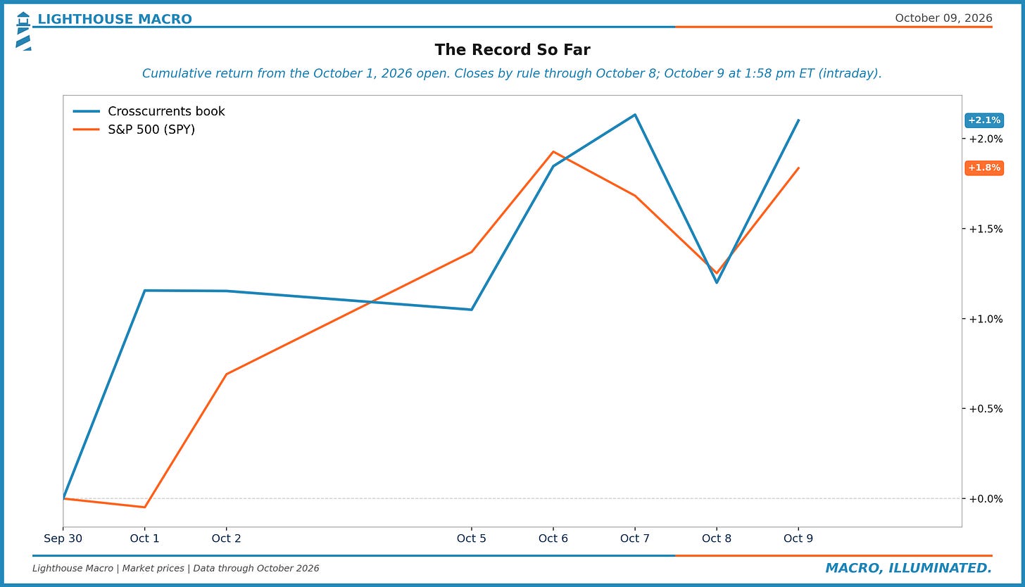
A week and a half in, the book is up 2.1% against 1.8% for the S&P 500, measured from the October 1 open to 1:58 pm ET today. Through Thursday's close the two were 1.2% and 1.2%, which is to say even. Friday's move opened a little daylight: the book is +0.9% on the day with the index +0.6%. We would not read anything into seven sessions in either direction, and we are showing them anyway, because the point of putting the book on the record was that you see every week, not the good ones.
The record runs close to close by rule. Today's number is a snapshot taken while the market is open and will be replaced by the close in the next issue; that is the one line in this section that moves after we send it.
Figure 2. The Crosscurrents book: seven names, what each one is, its weight at the October 8 close, and its return since the October 1 open.
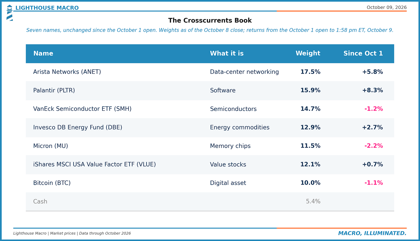
Nothing changed. No name left and none entered, because the rules did not ask for a trade. The weights drifted the way weights do when prices move and you leave them alone: Arista is the largest position now at 17.5%, Palantir 15.9%, the semiconductor ETF 14.7%, the energy fund 12.9%, the value fund 12.1%, Micron 11.5%, bitcoin 10.0%, and cash 5.4%. Two-fifths of the book is still the buildout: chips, memory and the networking that ties a data center together.
Figure 3. Each holding's return relative to the S&P 500 since the October 1 open.
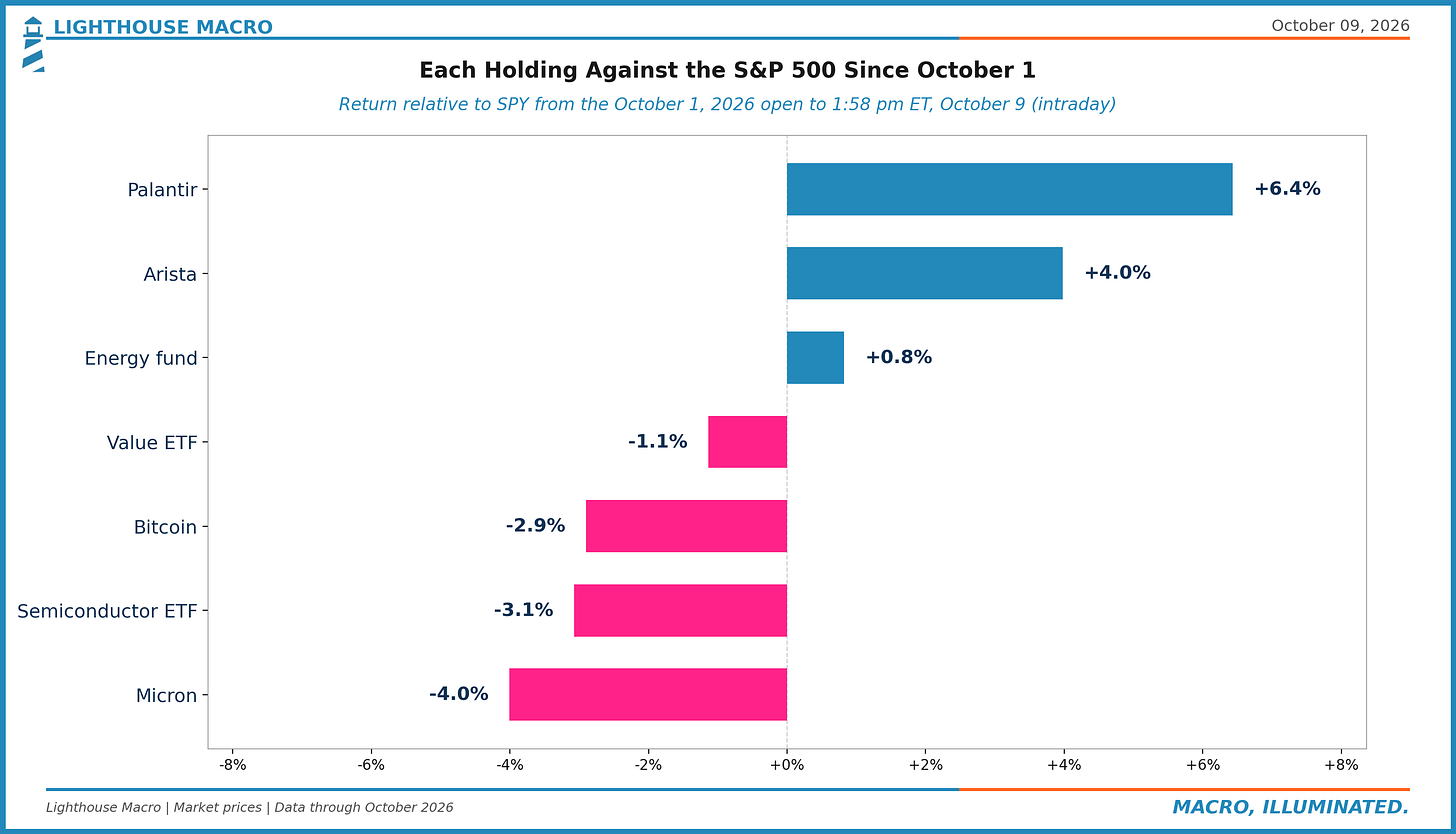
Inside the flat total, the names have split. Palantir (+6.4% against the index) and Arista (+4.0%) did the lifting; the energy fund (+0.8%) kept pace. The other side is the semiconductor ETF (-3.1%), Micron (-4.0%) and bitcoin (-2.9%), with the value fund (-1.1%) a touch behind. That is not a judgment on any of them. Every one of the seven had outrun the index over the three months before entry, and nine sessions is not long enough to say the trend has turned in any of them. The semiconductor read in the Chartbook below, the KOSPI giving back 25% from a June high while Samsung guided to a record quarter, is the thing we are watching on the chip side.
Figure 4. The Regime Ribbon. Eight states: the growth-and-inflation quadrant, split by financial conditions.
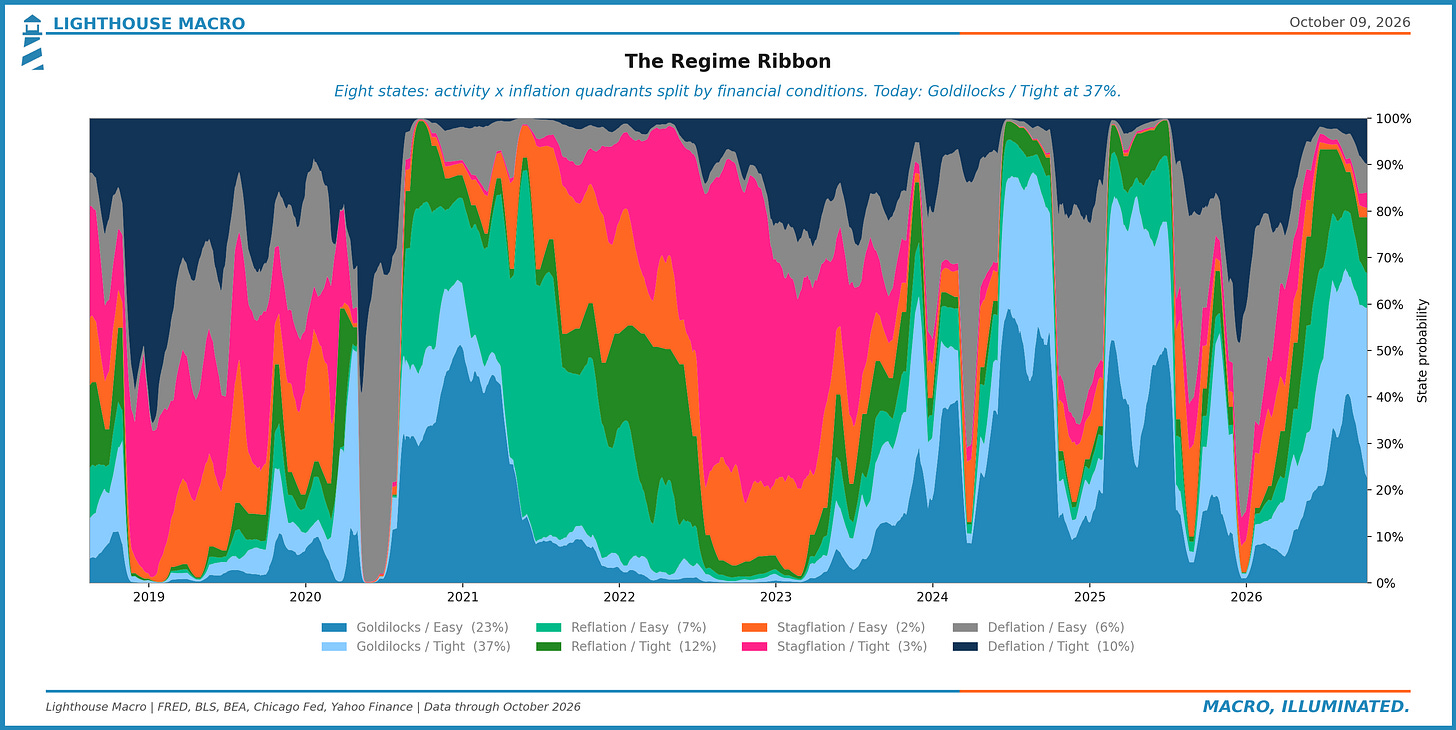
The Ribbon still reads Goldilocks with tight conditions, and we still think the inflation half of that label is generous. The core PCE price level is six points above its 2% path and the gap widened a point over the past year. The book's tilt follows from that: own what is being ordered and what is getting more expensive, and do not pay up for anything that needs cheap financing to work. This week's charts in the Prices section are the case.
Price decides when a name leaves. Every position carries a stop that is checked on the close, and a close through it means the name is sold at the next open, whatever we think of the story. Nothing was close this week; the nearest exit sits about 7% under Thursday's close.
Crosscurrents runs on rules, and we keep working on the rules; when the research finds a better one, the book takes it, and the version on the record since October 1 will be improved again. We are heavily quantitative but not purely systematic. The data informs the view, and the rules are there mostly to keep us from hurting ourselves.
This issue is free, as promised. From Issue 3 the full issue goes to paying readers and everyone else gets the summary. The book updates every morning on Pharos: https://pharos.lighthousemacro.com/d/crosscurrents
The Chartbook
Sixty charts our desk built this week, Monday through Thursday, by pillar. Each caption carries the numbers as of the day the chart was drawn.
Labor
Three charts, one message: the layoff side of the labor market is the quietest it has ever been, and that is not the same as healthy. Claims per covered worker are below every month since 1971, yet unemployment is 4.2%, and only a quarter of the unemployed are collecting benefits. The margin that is missing is hiring, and claims do not see it.
Figure 5. Initial claims ran 1.30 per 1,000 covered workers a week in Sep 2026, under every month of 1971-2019 (low: 1.45 in Sep 2018, 3.7% unemployment) and under Sep 2022 (1.39, 3.5%). Unemployment is 4.2%: +0.7pt since 2022 with fewer layoffs. Claims count firing; the missing margin is hiring.
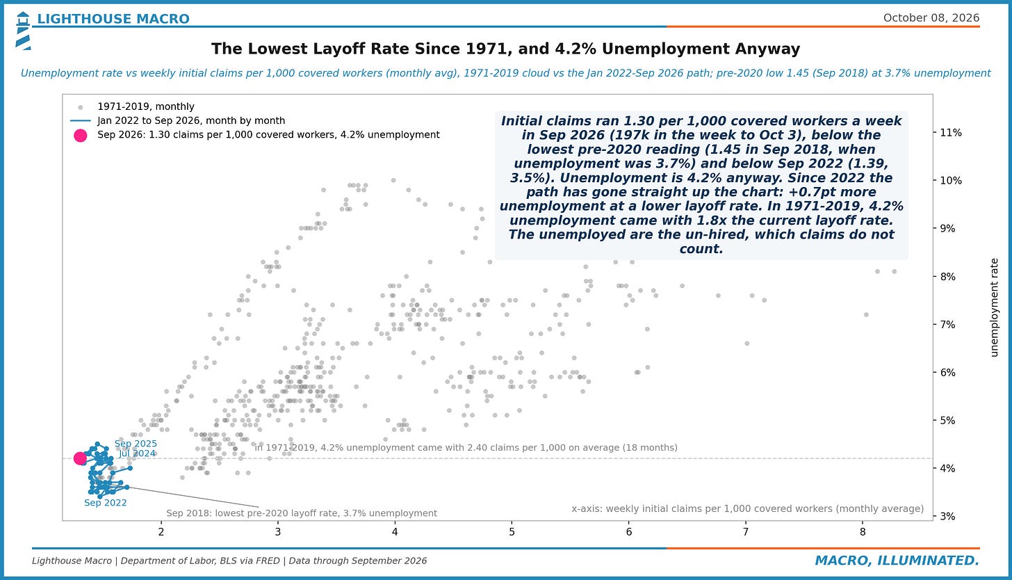
Figure 6. Sep 2026: 24% of the 7.1m unemployed were collecting regular state UI (1.71m continuing claims), the 1st percentile since 1967; it was 28% in 2019. Low claims read as a quiet layoff side, but the ratio also says most of the jobless are entrants and re-entrants the claims data does not see.
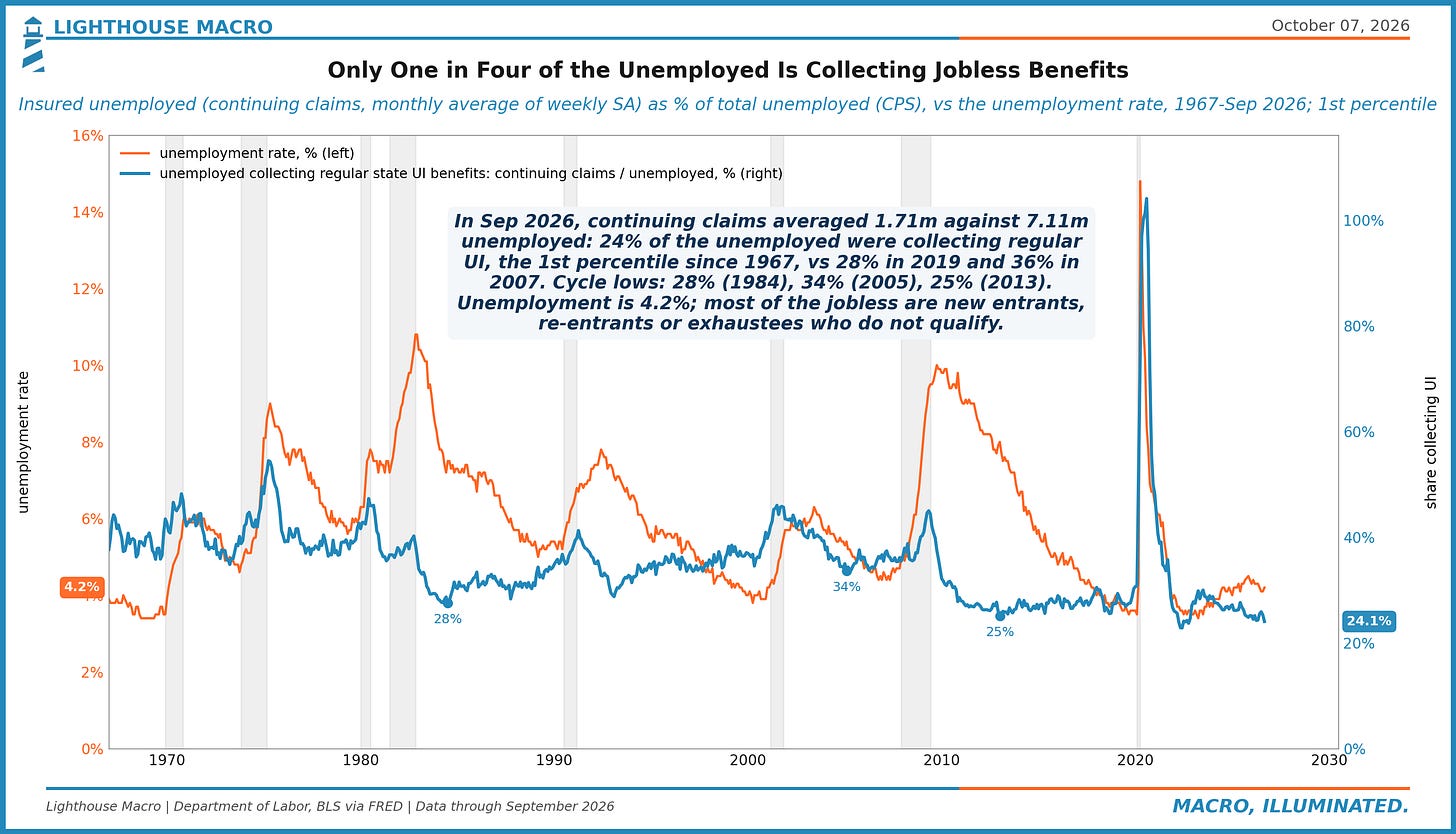
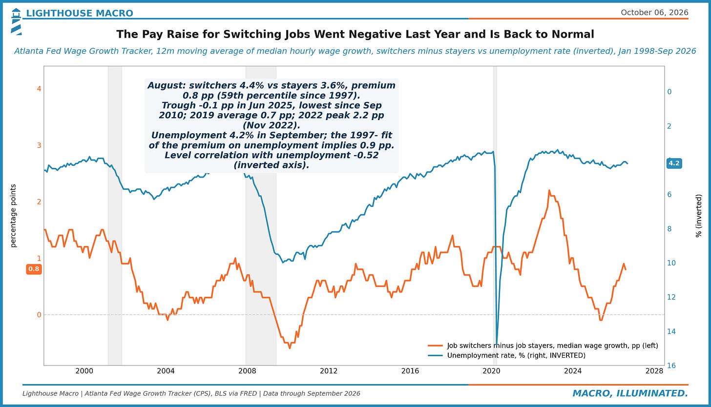
Figure 7. Atlanta Fed wage tracker, August: job switchers 4.4% vs stayers 3.6%, a 0.8pp premium, up from -0.1pp in Jun 2025 and above 2019's 0.7pp; unemployment at 4.2% would imply 0.9pp. Hires and quits are low, but the price of moving has rebuilt; a loosening market usually pays less to switch.
Prices
The last mile is wide, not just sticky. Half of the CPI basket is rising faster than 3%, core PCE sits six points above the path the Fed adopted in 2012 and the gap grew over the past year, and the market's five-year breakeven is pricing nearly two points less inflation than the last five years delivered. CPI lands Wednesday.
Figure 8. 1990-2019: core PCE barely moved with unemployment (r = -0.02); the 40 months near 4.1% unemployment averaged 1.6% and topped at 2.0%. Aug 2026: 3.0% at 4.1%, +1.0pt above the old fit (84th pctile). The curve shifted up: the Fed is hiking at a jobless rate that used to come with 2% inflation.
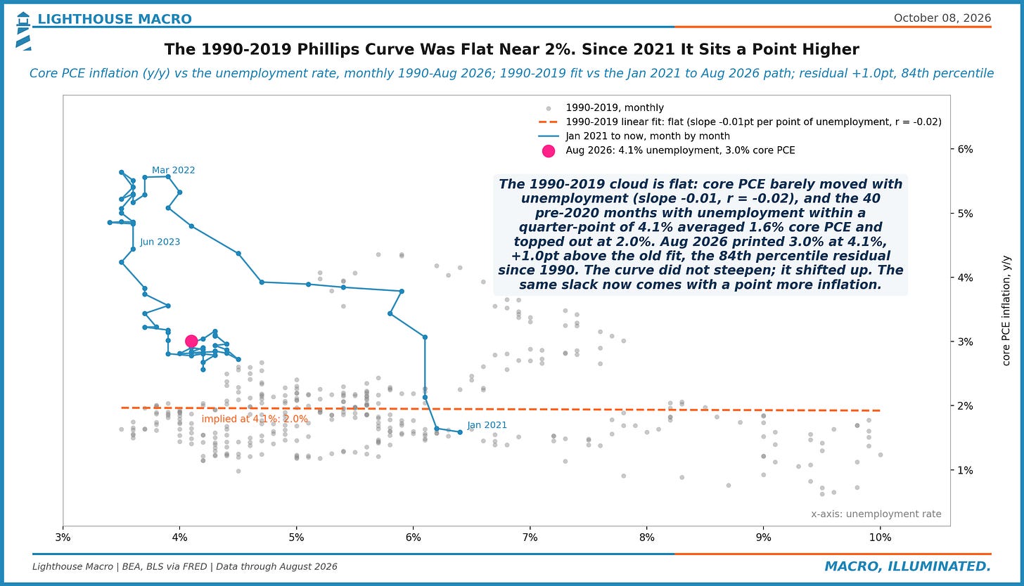
Figure 9. Core PCE prices are +6.0% above a 2% path from Jan 2012, when the Fed adopted the target, after running -4.0% below it in Jun 2020. From Jan 2020 the overshoot is +9.6%. The gap widened +1.0pt in the past year with core at 3.0% y/y. A 2% rate from here leaves the level gap where it is.
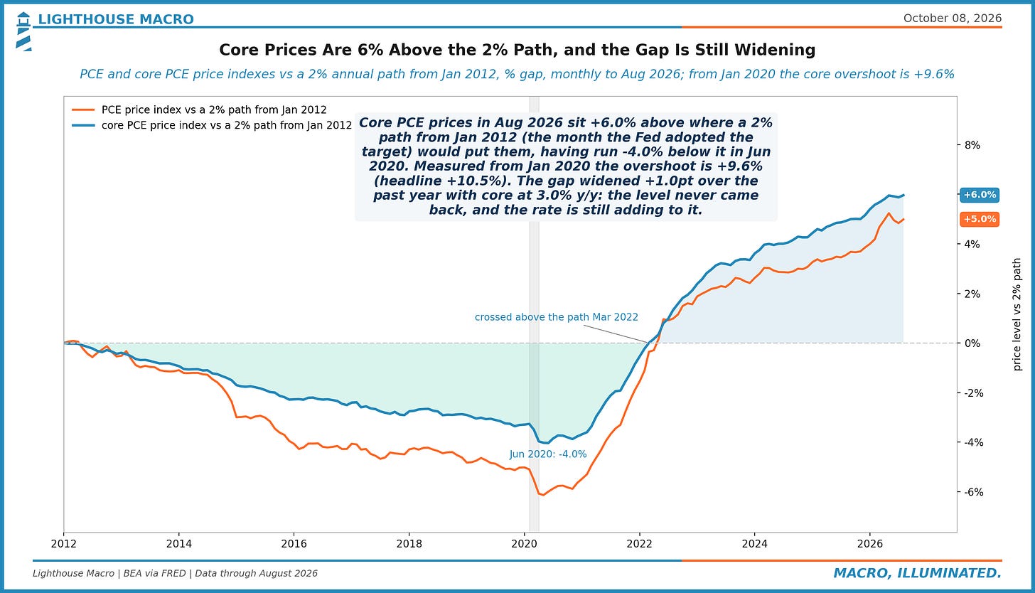
Figure 10. 5-year breakeven 2.37% Tuesday vs 4.15% a year of CPI actually delivered over the past five years: the market expects 1.78pt less than it just lived through (13th pctile since 2003). Since 2003 realized 5y inflation beat the starting breakeven 57% of the time. Anchored, or complacent.
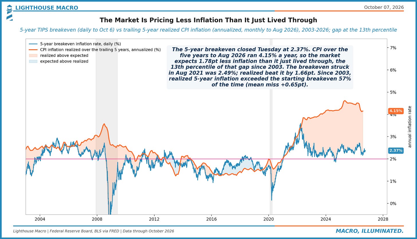
Figure 11. Aug 2026 CPI: 11 of 21 major components (52%) are rising faster than 3% y/y and 4 (19%) faster than 5%; the 3% share averaged 22% in 2017-19 and peaked at 95% in Aug 2022. Headline 3.4%. Breadth like this is what makes the last mile sticky. CPI lands Oct 14.
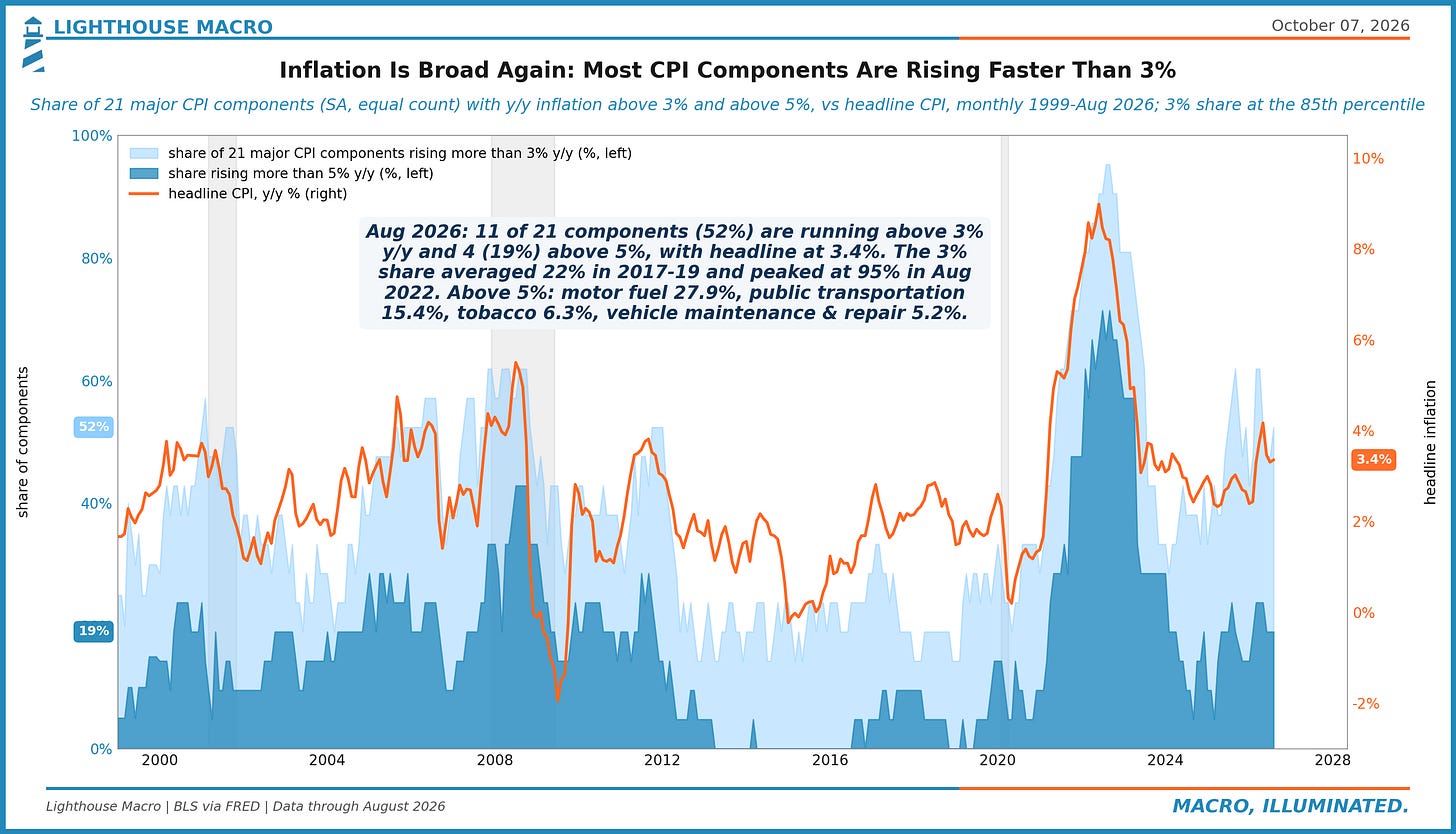
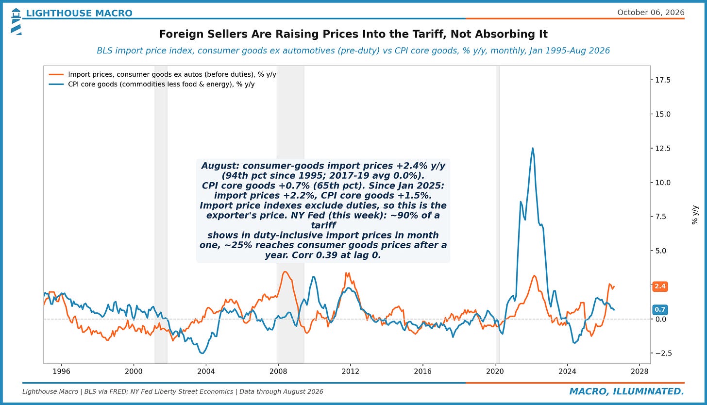
Figure 12. Pre-duty import prices for consumer goods ex autos rose 2.4% y/y in August, the 94th percentile since 1995 vs 0.0% in 2017-19; CPI core goods ran +0.7%. Exporters are adding to the tariff, not eating it. The NY Fed finds ~25% reaches consumers after a year; the shelf is still catching up.
Growth
Growth is running well above anything the Fed would call trend while it hikes. The Atlanta tracker has the third quarter at 3.7% after the annual revision cut it by more than a point in one update, private final demand is outgrowing GDP, and real goods spending is 28% above 2019 while the freight that moves it is flat. The gap between what is bought and what is shipped is a chart we keep coming back to.
Figure 13. Q2 2026: real final sales to private domestic purchasers +2.8% y/y vs GDP +2.2%; quarter on quarter 4.6% vs 2.2% annualized, inventories, trade and government the drag. GDPNow (Oct 6) has Q3 private demand at 4.5%. The Fed is hiking into a private sector growing near 4% annualized.
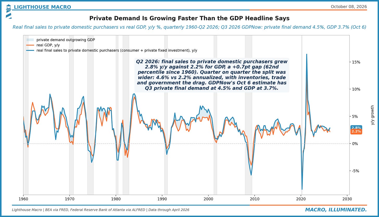
Figure 14. GDPNow has Q3 at 3.7% (Oct 6), from a 6.2% peak on Aug 3; the Sep 30 annual revision cut 1.3pt in one update. The Q2 path ended at 1.5% into a 1.5% advance print, since revised to 2.2%. Growth is running well above the Fed's idea of trend while it hikes. Next update Thursday.
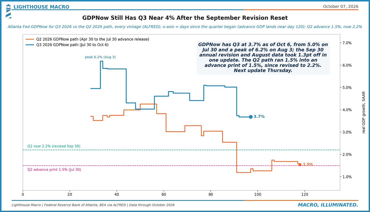
Figure 15. Real services spending is +16.5% above Feb 2020; private service-providing payrolls +5.2%. Spending per service job has grown 1.6% a year since, after 0.0% a year in 2012-19; latest y/y +2.5% spending vs +0.5% jobs. Service firms are meeting demand with prices and productivity, not headcount.
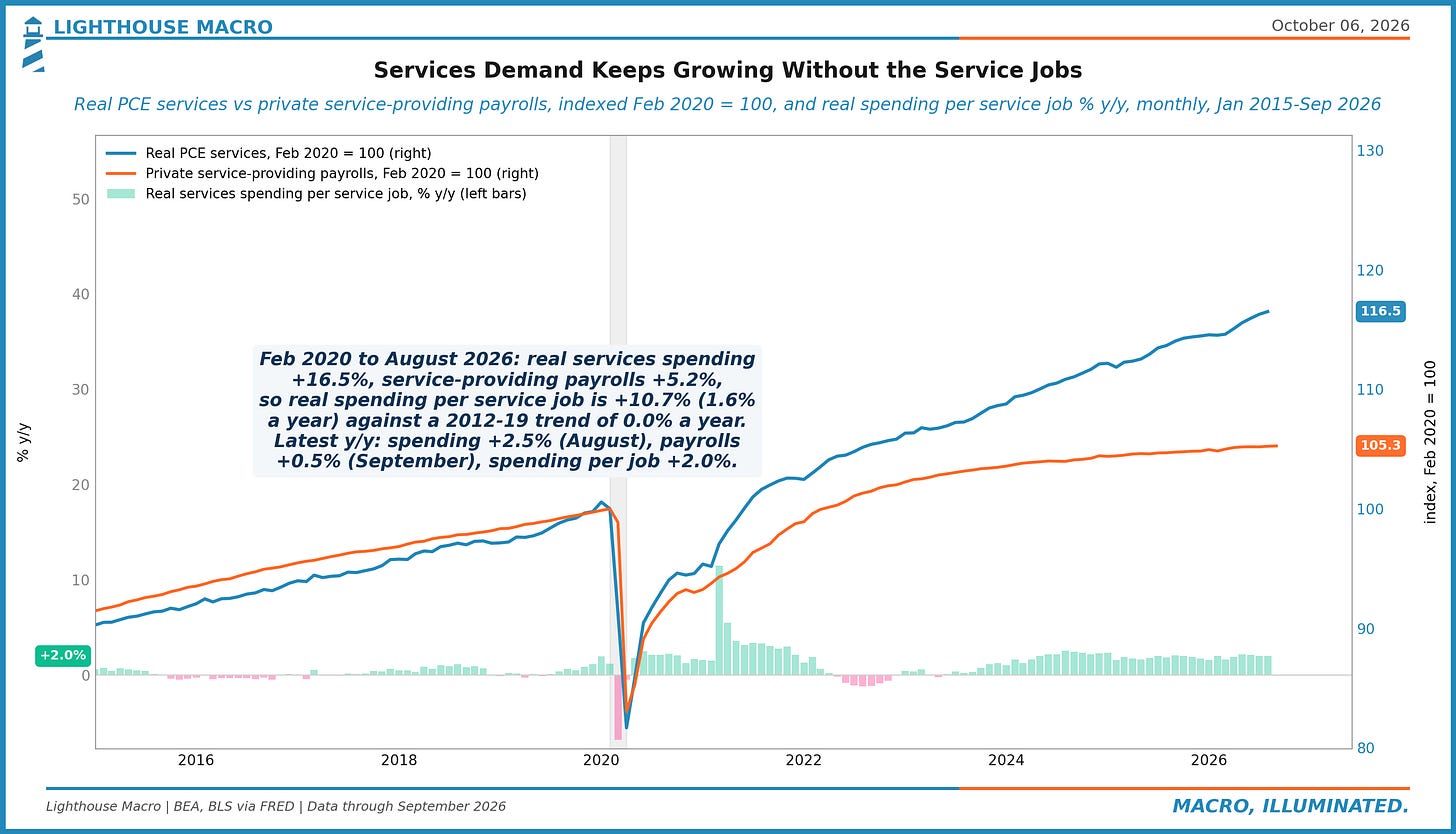
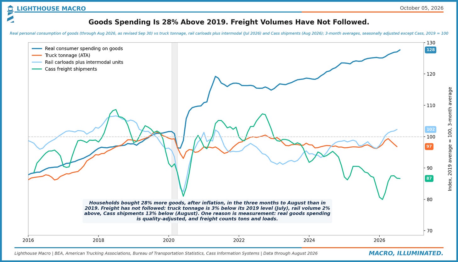
Figure 16. Real spending on goods is 28% above 2019. Truck tonnage is 3% below 2019, rail volume 2% above and Cass shipments 13% below (3 months to July/August). Part of the gap is quality adjustment in the spending data. Freight is the weaker read on the goods economy.
Consumer
Households are still spending real money at a 4% clip, and the paycheck behind it is not growing that fast. The charts here follow how the gap is being covered, and mostly it is not borrowed: private lenders added less consumer credit in the past year than they did in 2019, energy takes a tenth-percentile share of the budget, and groceries cost fewer hours of pay than at any point since 1964. The strain is in the paycheck arithmetic, not the shelf price and not the card.
Figure 17. In production-worker hours, groceries cost 5.4% less in Aug 2026 than in Jan 2019, a 1964-2026 low (Jan 2023 peak +2.0%); restaurant meals +0.9%. Grocery prices +2.1% y/y vs pay +3.3%; in 1980 the basket took 24% more work-time. The 2021-23 step is what households remember.
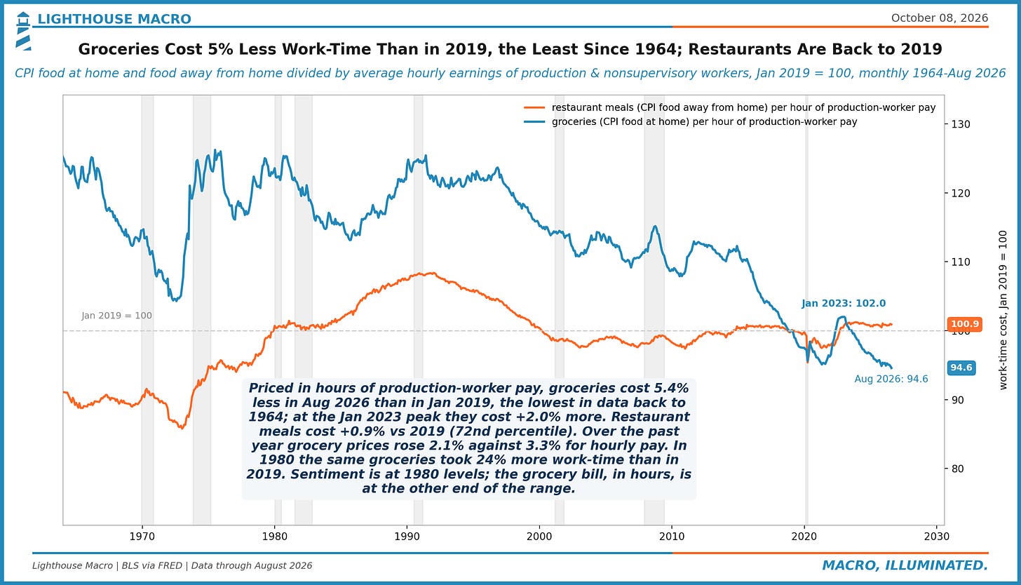
Figure 18. Energy took 3.9% of consumer spending in Aug 2026 (+0.4pt y/y), the 10th percentile since 1990, vs 6.8% in Jul 2008 and 5.1% in Jun 2022. Real services ex energy and housing grew 3.1% y/y. Past squeezes bit at 6%-plus shares; at 4% the oil shock is a price story before it is a wallet story.
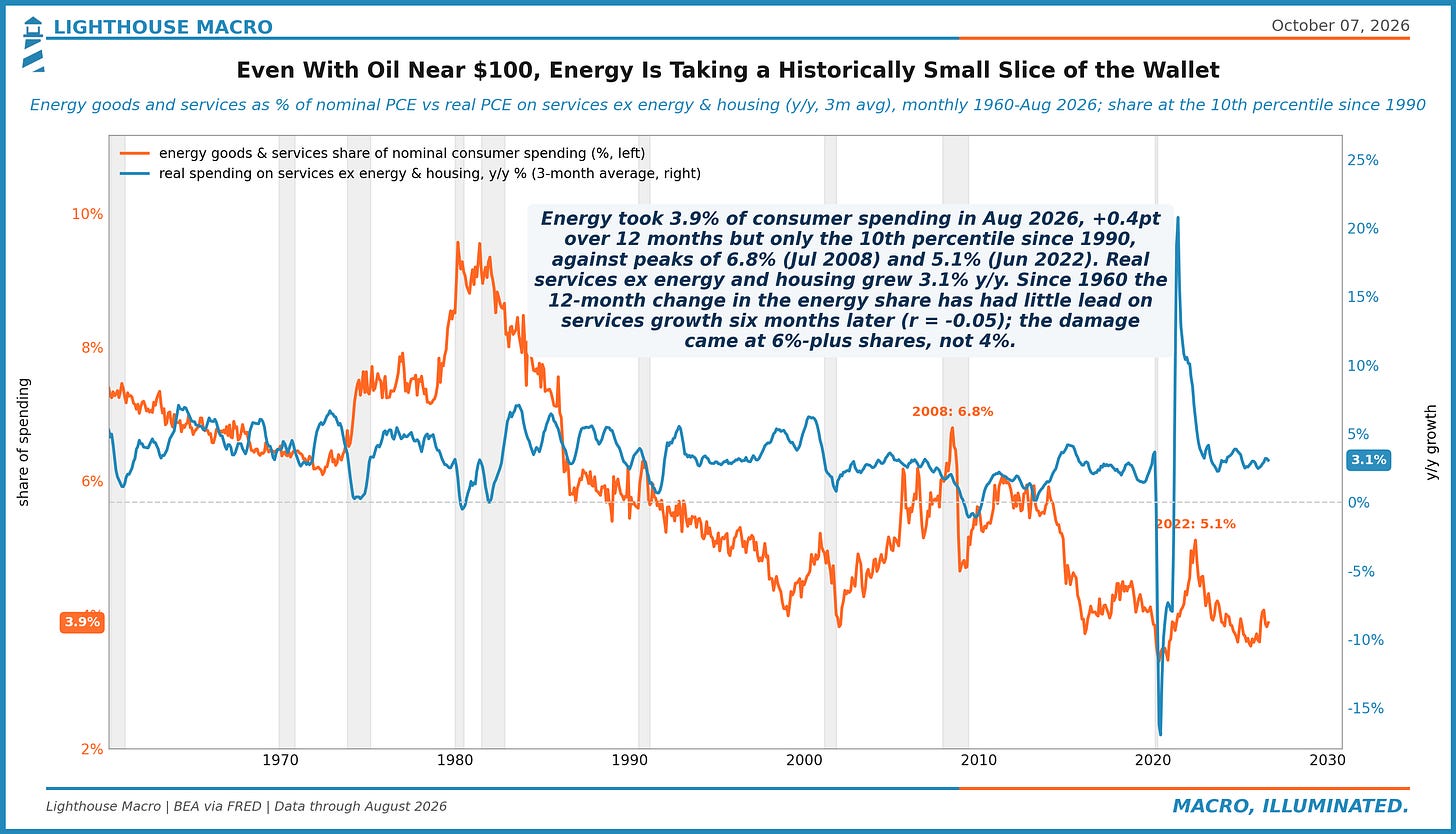
Figure 19. Real consumer spending grew +3.9% annualized over the three months to August (+2.6% y/y); the real weekly paycheck of production and nonsupervisory workers grew +1.6% (+0.2% y/y). Spending has outrun pay 8 straight months, financed by jobs, savings, credit and asset income, not the hourly wage.
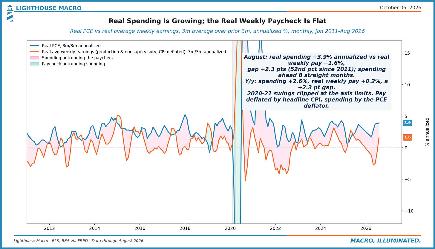
Figure 20. Regular gasoline averaged $4.35 in September, +38% on the year, and demand was +0.3%. That is the norm: in 18 earlier months since 1992 with a price rise that large, the median demand change was -0.3%. Volumes hold, so the gasoline bill rises nearly one for one with price.
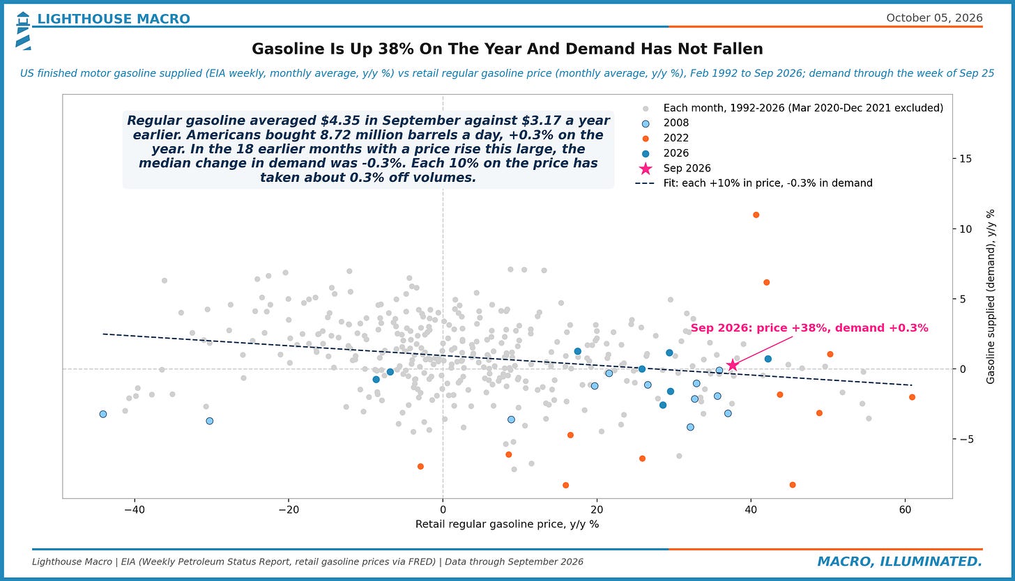
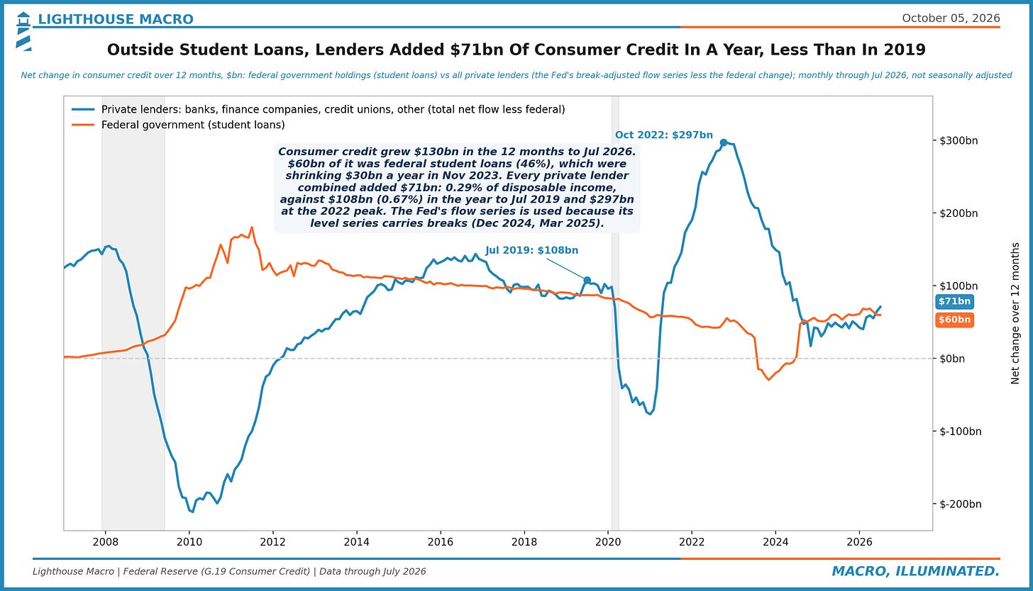
Figure 21. Into Wednesday's consumer credit report: households added $130bn of consumer credit in the 12 months to July; $60bn was federal student loans. Private lenders added $71bn, vs $108bn in the year to Jul 2019 and $297bn at the 2022 peak. Spending is not leaning on lenders.
Business
Four charts on the supply side of the hike. Inventories outside autos are lean against 2019, the regional surveys show input prices running far ahead of selling prices, wholesale and retail margins are absorbing the goods pipeline, and the count of new businesses planning to pay wages is at a first-percentile low. Firms are being asked to carry the cost of money and the cost of goods at once.
Figure 22. Aug 2026: 34.9k business applications a month planned to pay wages (3-mo avg), -17% y/y, 1st percentile since 2004. All applications +17% y/y, so the planned-wage share is 6.4%, from 15.3% in 2017. Formation is fine; employer formation is weak: the hiring side of low-hire, low-fire.
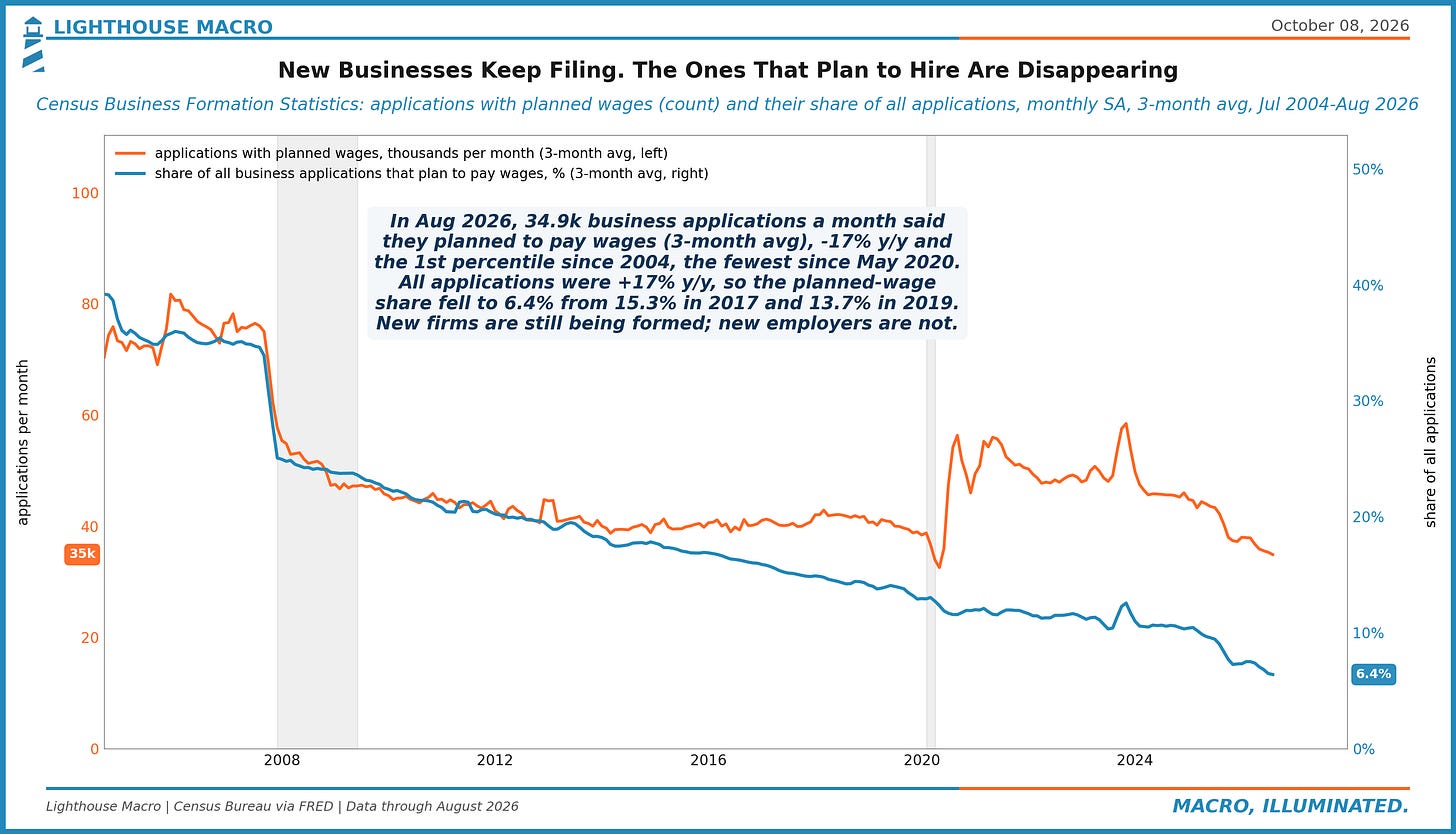
Figure 23. Sep regional Fed manufacturing surveys (NY, Philly, Dallas): input prices at a 55 diffusion reading, selling prices 29, a 26-point gap, 74th percentile since 2004 (2017-19 avg 17). ISM mfg prices 77.9. Either margins absorb it or the pass-through is still ahead of us.
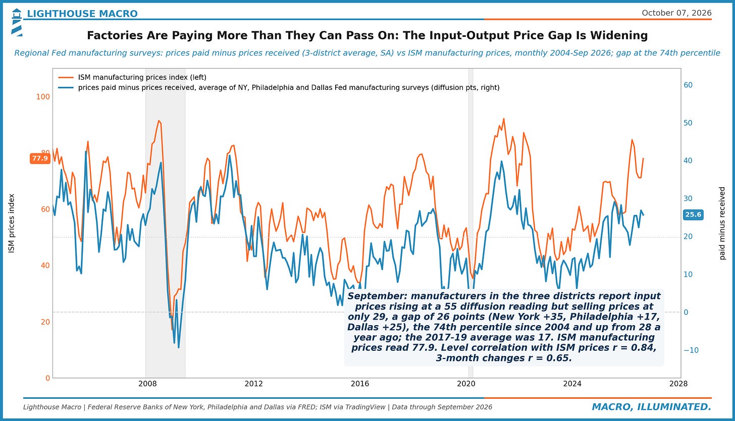
Figure 24. August: PPI core finished goods +3.8% y/y, wholesale and retail margins (PPI trade services) +3.7%, CPI core goods +0.7%. Since Jan 2025 the gate price is +6.0%, the shelf +1.5%, a wedge in the 94th percentile since 1990. Sellers are not eating the tariff in the spread; the lag sits at the shelf.
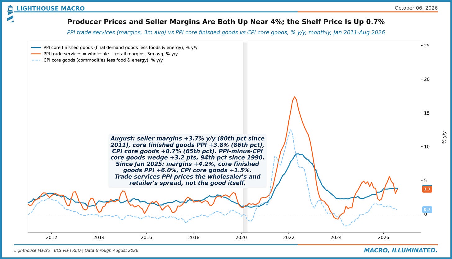
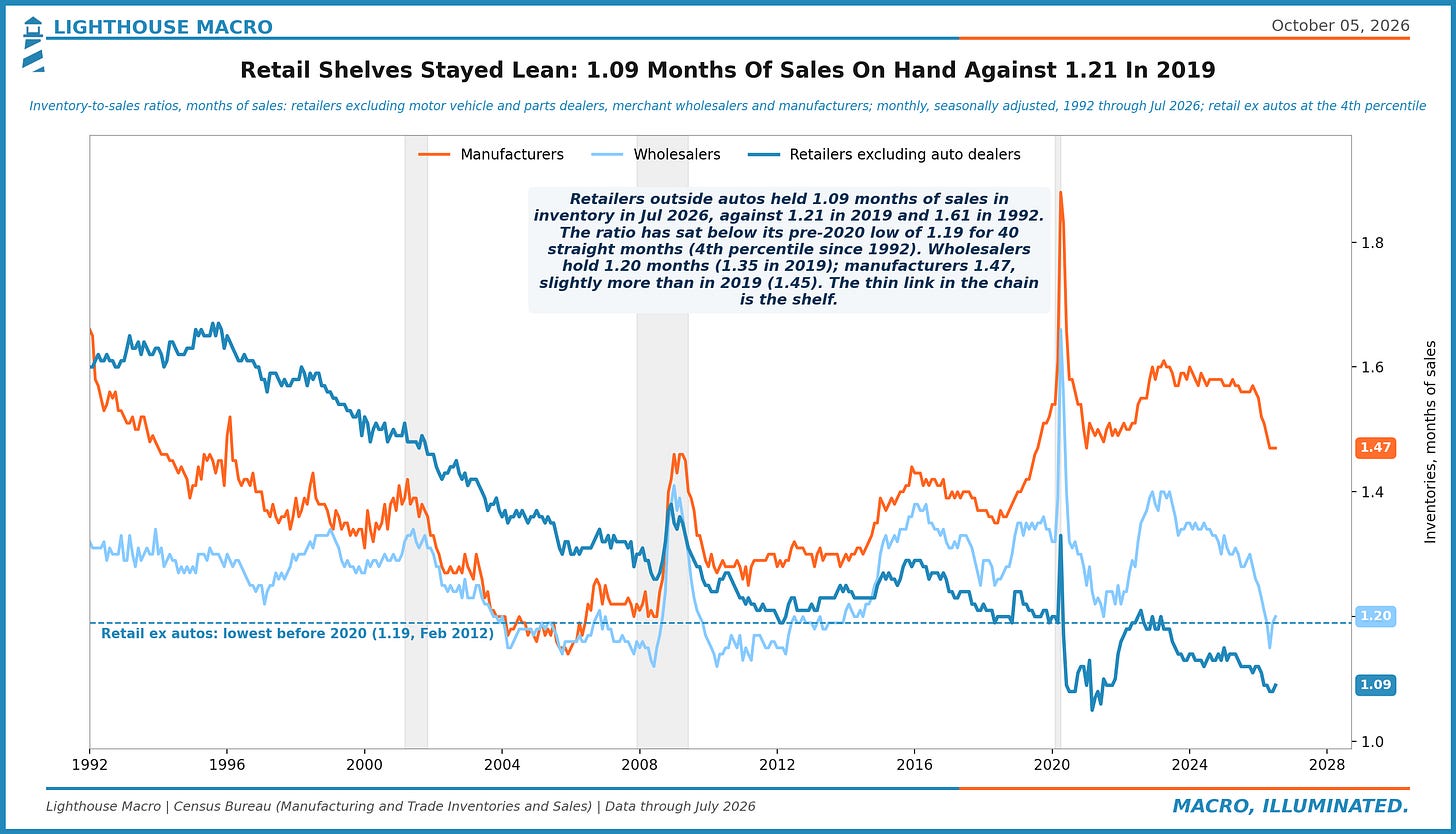
Figure 25. Retailers outside autos held 1.09 months of sales in inventory in July, vs 1.21 in 2019, and have sat under the pre-2020 low of 1.19 for 40 straight months. Manufacturers hold 1.47, more than in 2019. The shelf is the thin link: little buffer when costs rise.
Trade
The dollar's week was Europe's week, mostly. The euro lost more to the franc and the pound than to the dollar, Spain called a snap election with its spread already widening, and the gilt market is now trading like the Treasury market with a 0.74 daily correlation. The thread through the eight charts: one long-end repricing, many issuers.
Figure 26. Gold bought 41 barrels of Brent Wednesday, 47% below the Jan 28 peak of 78, the 88th percentile since 2000. Since gold's peak: gold -22%, Brent +42%, 10-year real yield +103bps to 2.92%. Weekly link loose (r -0.20); since January a no-yield metal lost to a 100-dollar barrel as real rates rose.
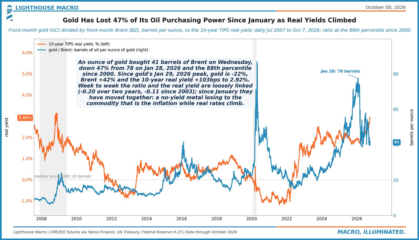
Figure 27. 20 sessions to Wednesday: 30-year gilt +11bps, sterling -2.0% to 1.321 (dollar index +3.5%). The 2022 LDI window: +232bps with the pound -10.1%. In the 79 sessions since 2006 with a 50bps-plus gilt rise, sterling fell 81% of the time (median -2.6%). A grind to 6%, with the stress signature absent.
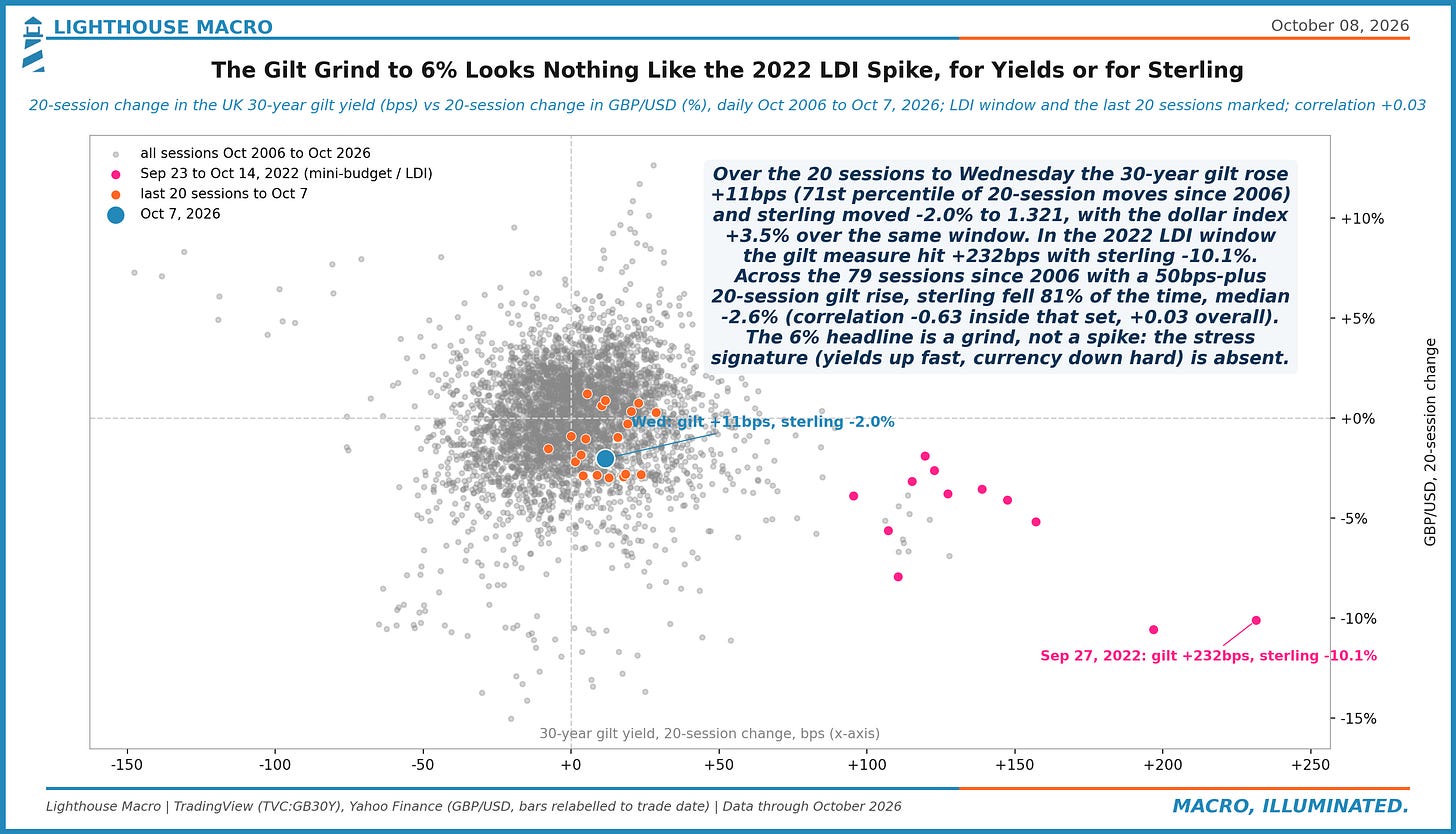
Figure 28. Import prices from China were +3.0% y/y in Aug 2026, from -3.5% in Jul 2025; Mexico +2.3%, EU +4.1%, Japan +1.1%; all ex petroleum +5.5%, the highest since May 2022. All four origins positive since May 2026. Pre-duty border prices; the tariff lands on top. China's cheap-goods offset has faded.
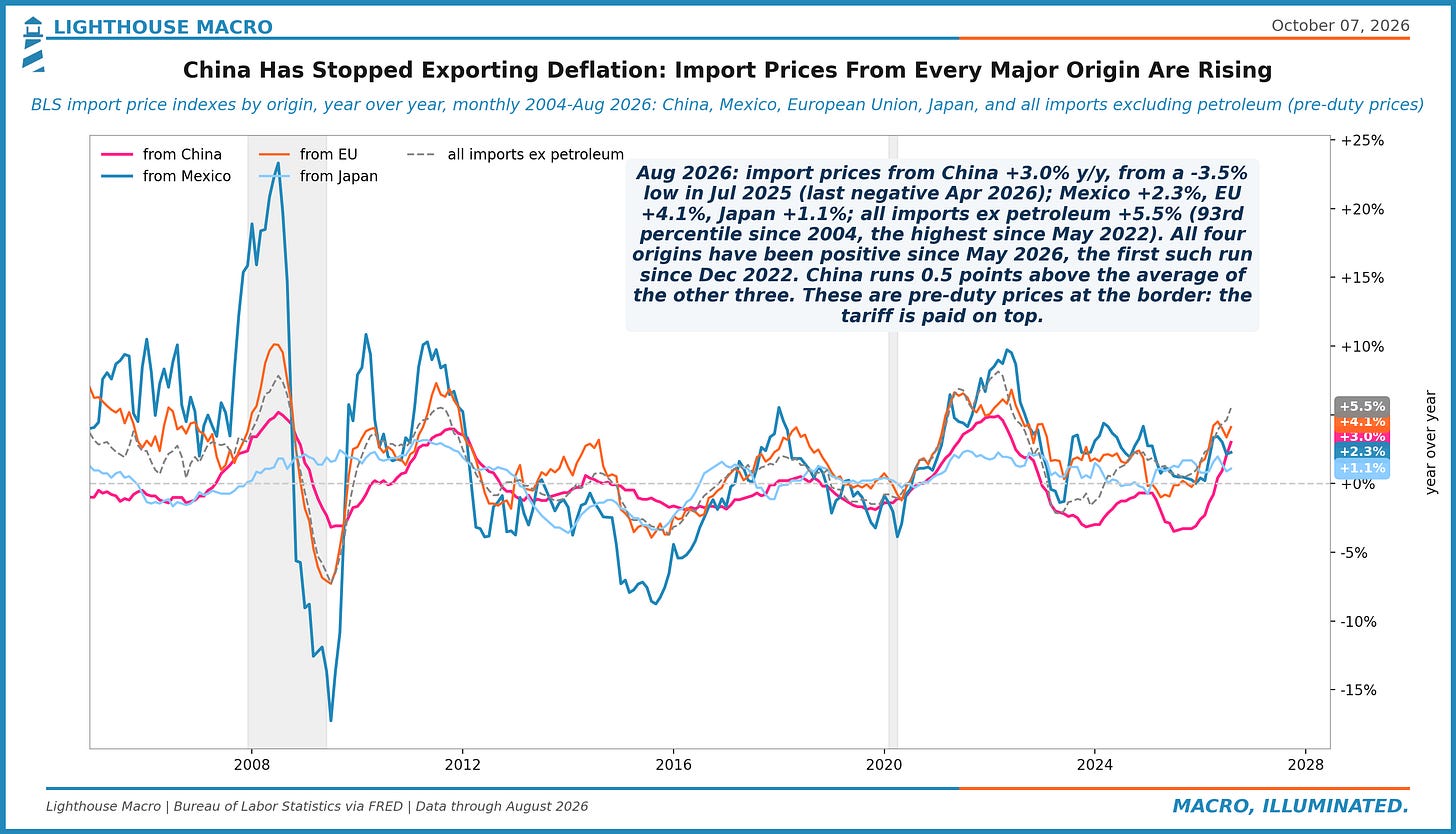
Figure 29. Since Jan 2021 an equal-weight basket of INR, KRW, BRL, MXN, ZAR, CNY is -8.9% vs the dollar, close to the average US trading partner (-8.4%, Fed data to Oct 2). The split inside is the story: INR -24%, KRW -20% vs MXN +10%, BRL +0%. The dollar bid lands on oil importers; commodity exporters shrug.
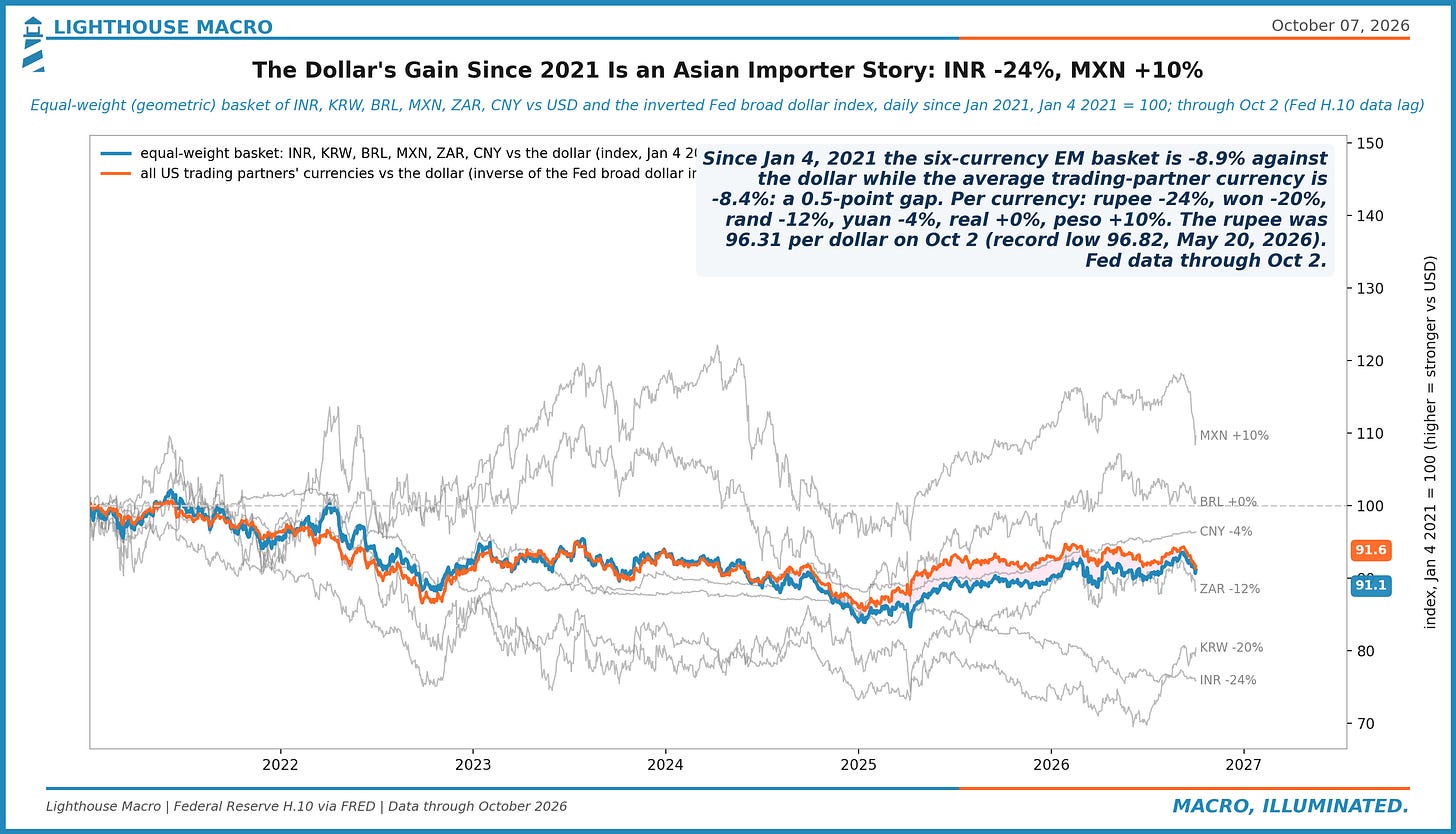
Figure 30. By Aug 2026, 13 of 31 central banks in the BIS set had a hike as their most recent move (42%), from 6% in Jul 2025; the 2022 peak was 90%. The Fed, RBA and BoJ in September and the RBI on Oct 7 postdate the data; the US and India still read as cutters here. Easing cycles end together too.
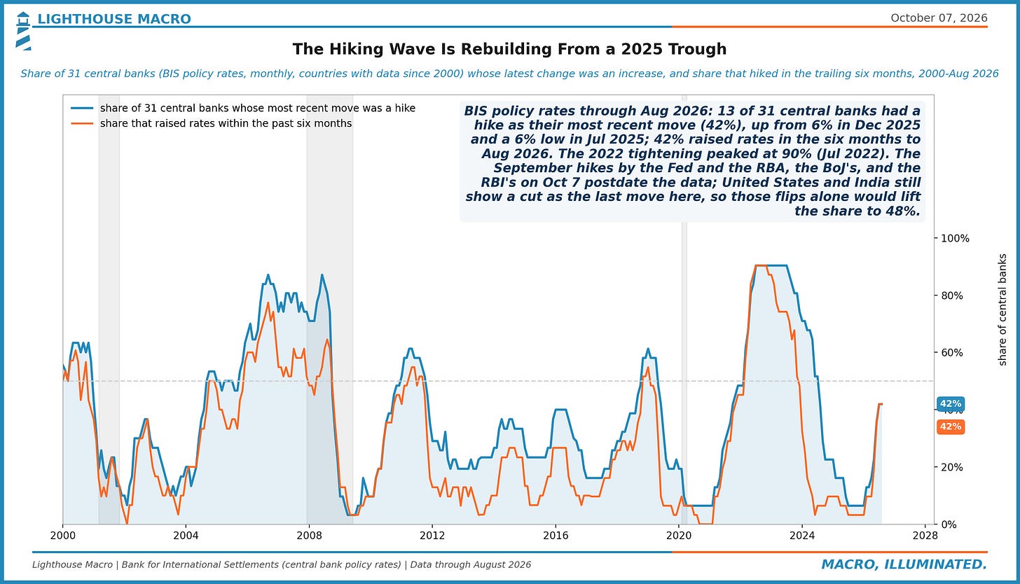
Figure 31. August goods deficits: Mexico $27.0bn, Vietnam $25.0bn, Taiwan $19.8bn, China $18.4bn (4th, from 1st in Aug 2024). Over 12 months China is $166bn vs $283bn two years ago (-41%); Vietnam +98%, Taiwan +224%. The China gap changed address.
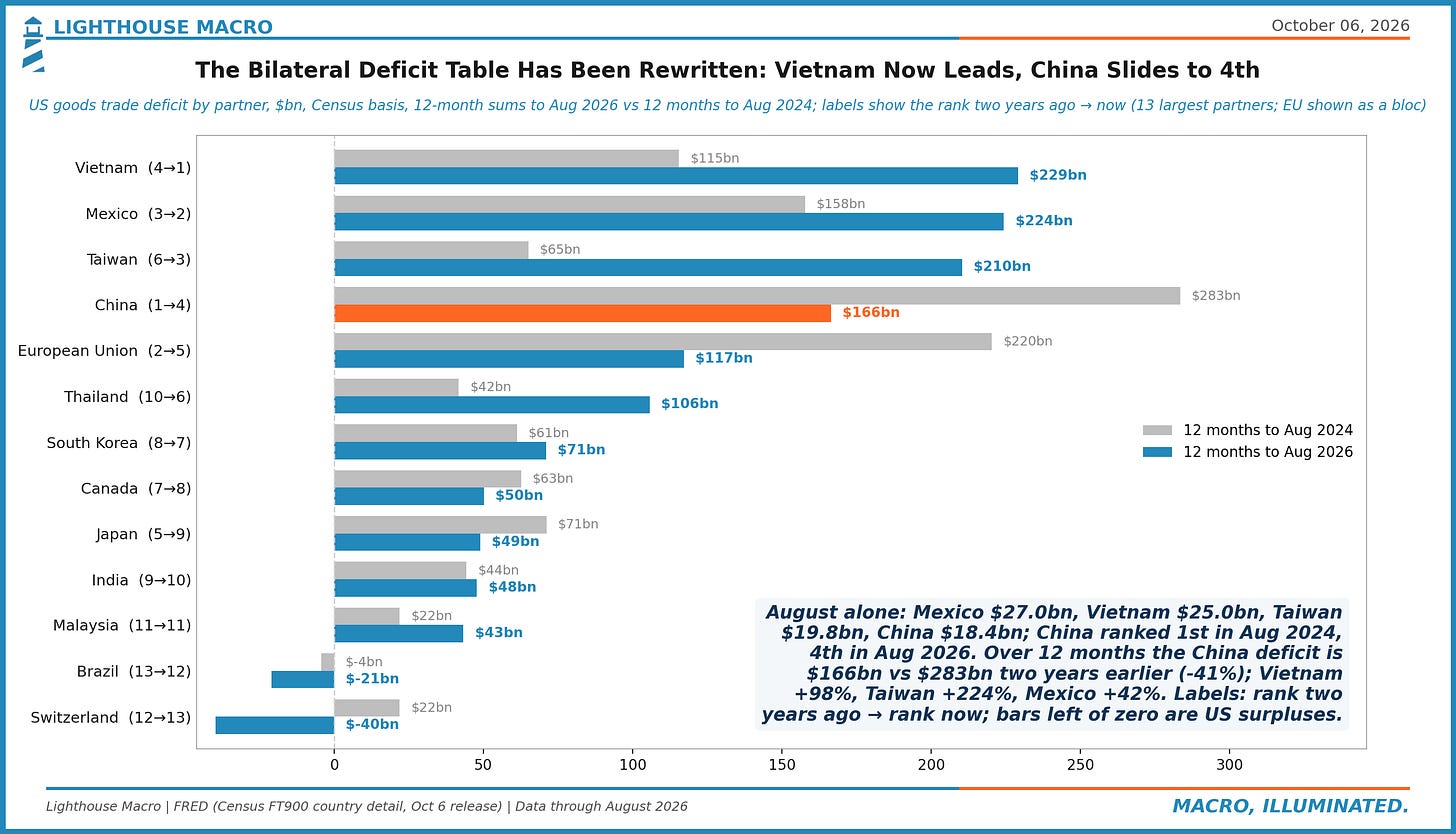
Figure 32. Real goods exports grew +4.0% over the year to July (3-month average), down from +10.1% in March. The real dollar leads them by about 3 months: it was -7.5% y/y in Feb 2026 and is -0.2% now. The currency tailwind is gone ahead of this week's August trade report.
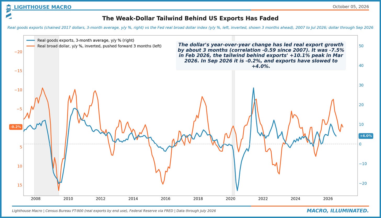
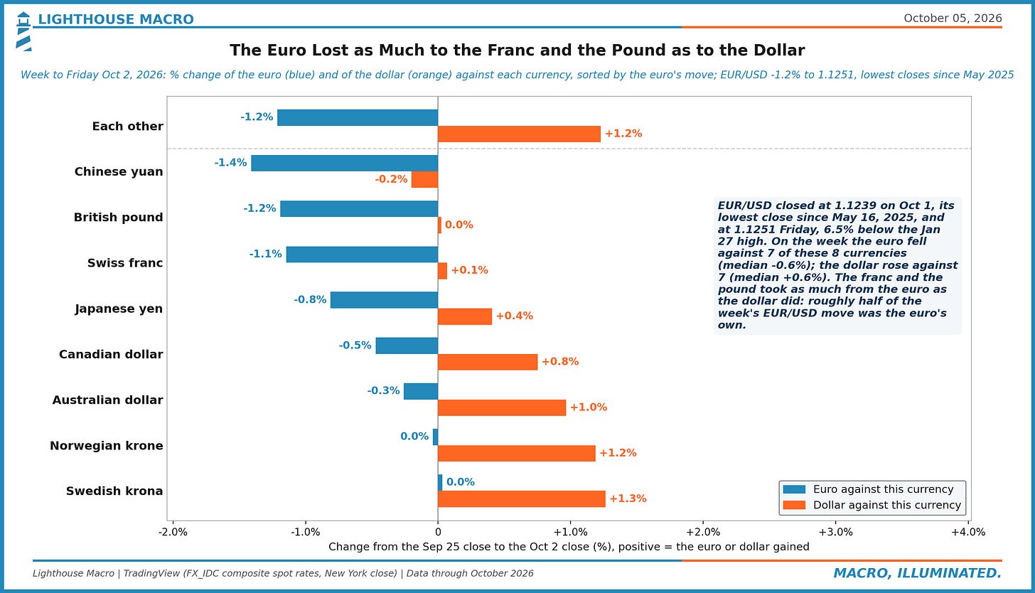
Figure 33. The euro lost 1.2% to the dollar last week, and as much to the franc (1.1%) and the pound (1.2%), where the dollar was flat. Median across eight currencies: euro -0.6%, dollar +0.6%: about half the move is Europe's own. Thursday's 1.1239 close was the lowest since May 2025.
Government
A third of the marketable Treasury stock matures inside a year, which makes the hike a fiscal event on a short fuse. The charts follow the money: who holds the debt, how auctions are clearing at these yields, what withheld taxes say about payrolls, and the split between a shrinking federal workforce and the states and cities still hiring.
Figure 34. Sep 30, 2026: 33% of the $32.0tn marketable Treasury stock ($10.7tn) matures within a year and 54% within three; WAM 5.8 years vs 5.6 in 2001. Sep 2001 had 42% under a year. The roll into a 4%-plus bill curve is the fiscal transmission of the hike, and it is fast.
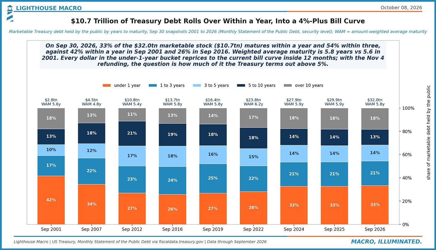
Figure 35. Q2 2026: real federal purchases -2.1% y/y (20th percentile since 1960, 4 straight quarters negative) while state and local purchases ran +1.3%. Federal buying is 6.0% of GDP, state and local 11.2%. The fiscal impulse from purchases is split: the smaller buyer is shrinking, the larger one is not.
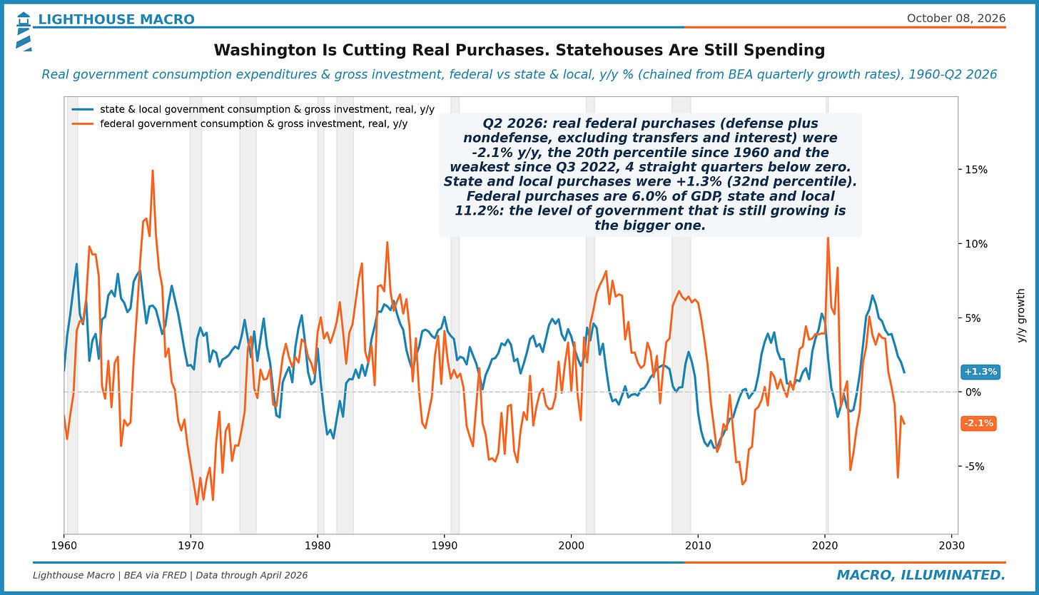
Figure 36. Jan 2026: domestic private investors hold 55% of the $31.5tn federal debt held by the public, foreigners 30% (from 49% in 2008), the Fed 15% (from 27% in 2021). Of the $7.6tn added in four years, domestic buyers took 97%. A 10-year at a 2002 high is part of the price of replacing them.
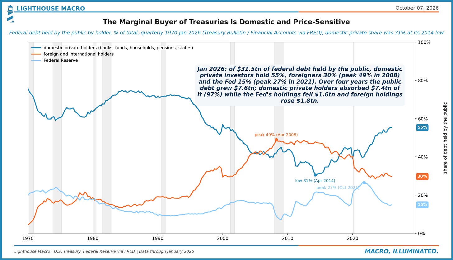
Figure 37. Federal payrolls are -328k (-10.9%) since Jan 2025 at 2.68m, the lowest since May 1966. State government -53k, local +151k, private +1,006k. Over 12 months government subtracted 216k from a +496k total. The public payroll still growing is the one funded by property and sales taxes.
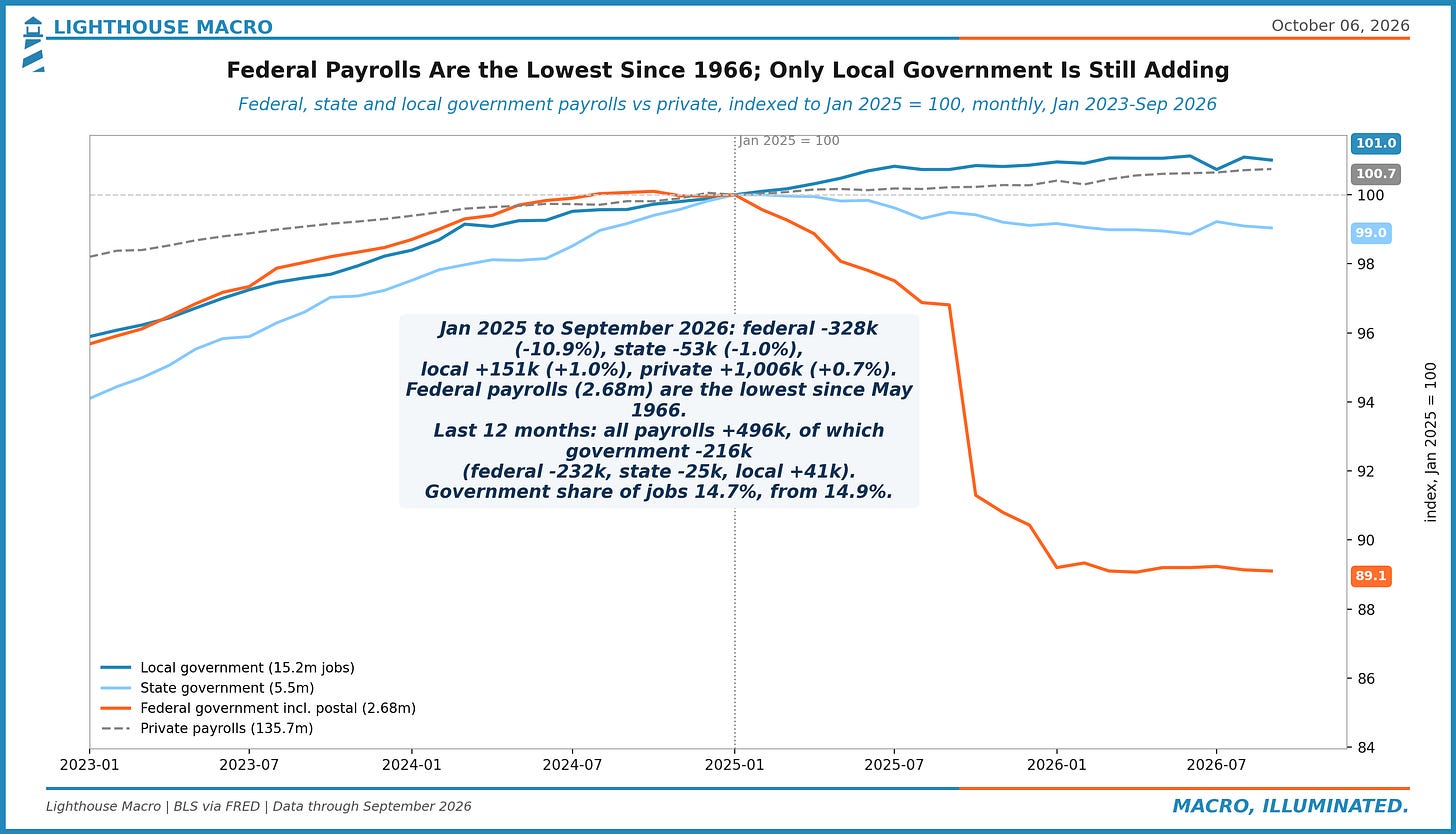
Figure 38. Withheld income and payroll taxes reaching Treasury rose 5.8% over the year in July-September. Private aggregate payrolls (jobs x hours x pay) rose 4.2%. The 1.6-point gap compares with 1.0 on average since May 2024. Bonuses, high earners or withholding tables could explain it.
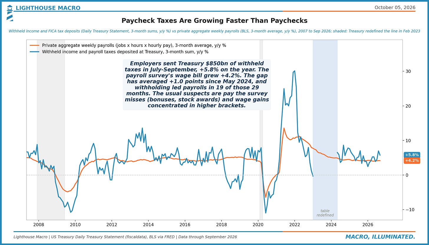
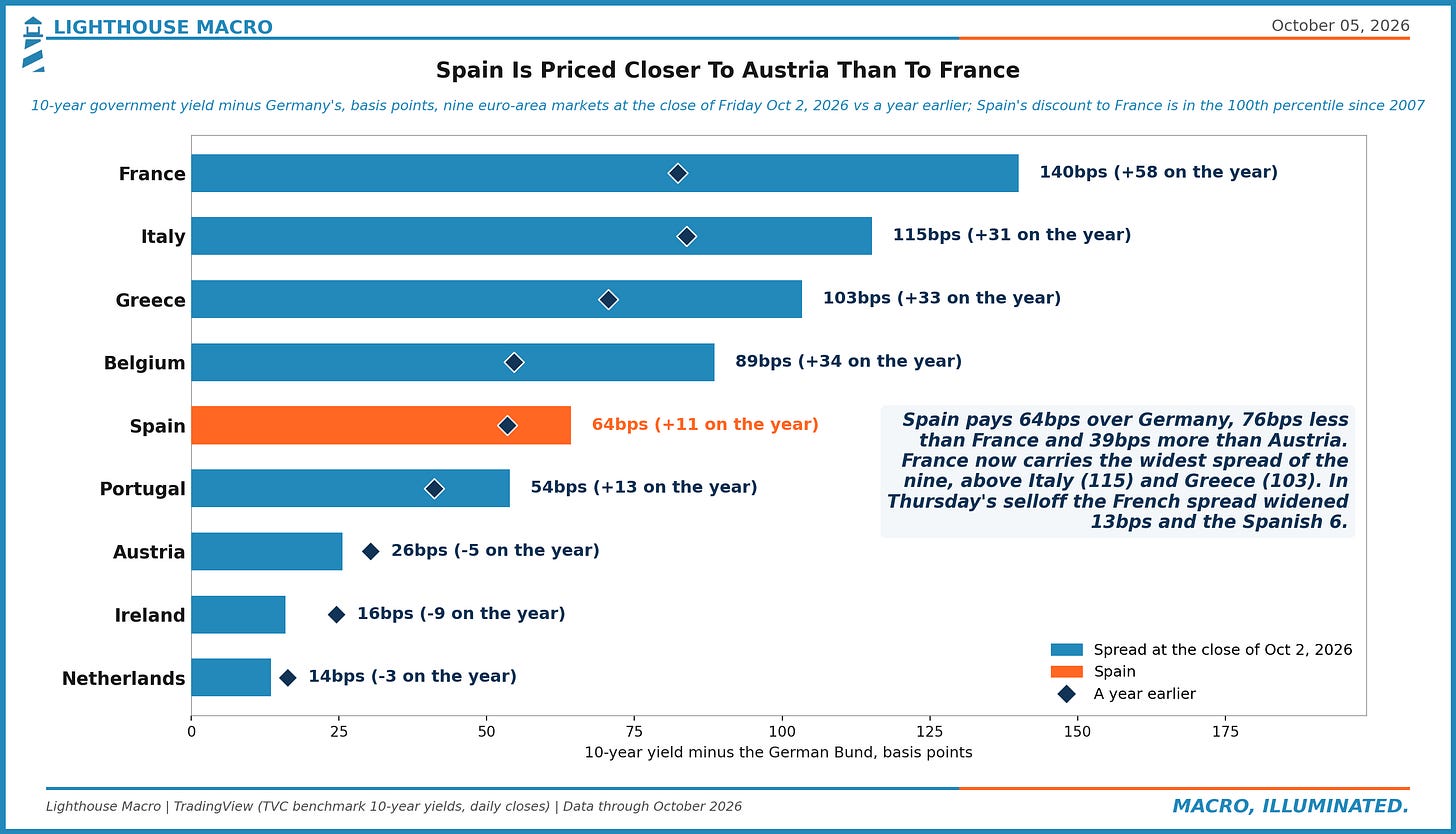
Figure 39. Spain paid 64bps over Bunds for 10 years at Friday's close: 76bps less than France, 39bps more than Austria. France's 140bps is the widest of nine euro markets, above Italy and Greece. On the year Spain is +11bps, France +58. Any Spanish political premium starts from a low base.
Financial
This section is the title. High-yield spreads at the 12th percentile against bond volatility at the 73rd, a 10-year carry cushion at the 96th, the 20-year yielding more than the 30-year, and a Baa borrower paying the most since 2023 with a spread that says nothing is wrong. Credit is priced to equity calm. Rates are priced to something else.
Figure 40. 10-year at 5.28% Wednesday: duration 7.7 years, so a 69bps rise over a year erases the carry, the 96th percentile cushion since 2000 (end-2021: 16bps, then +236). With a cushion this big the next-12-month rise beat it 17% of the time, vs 24% overall. The value case for duration is arithmetic first.
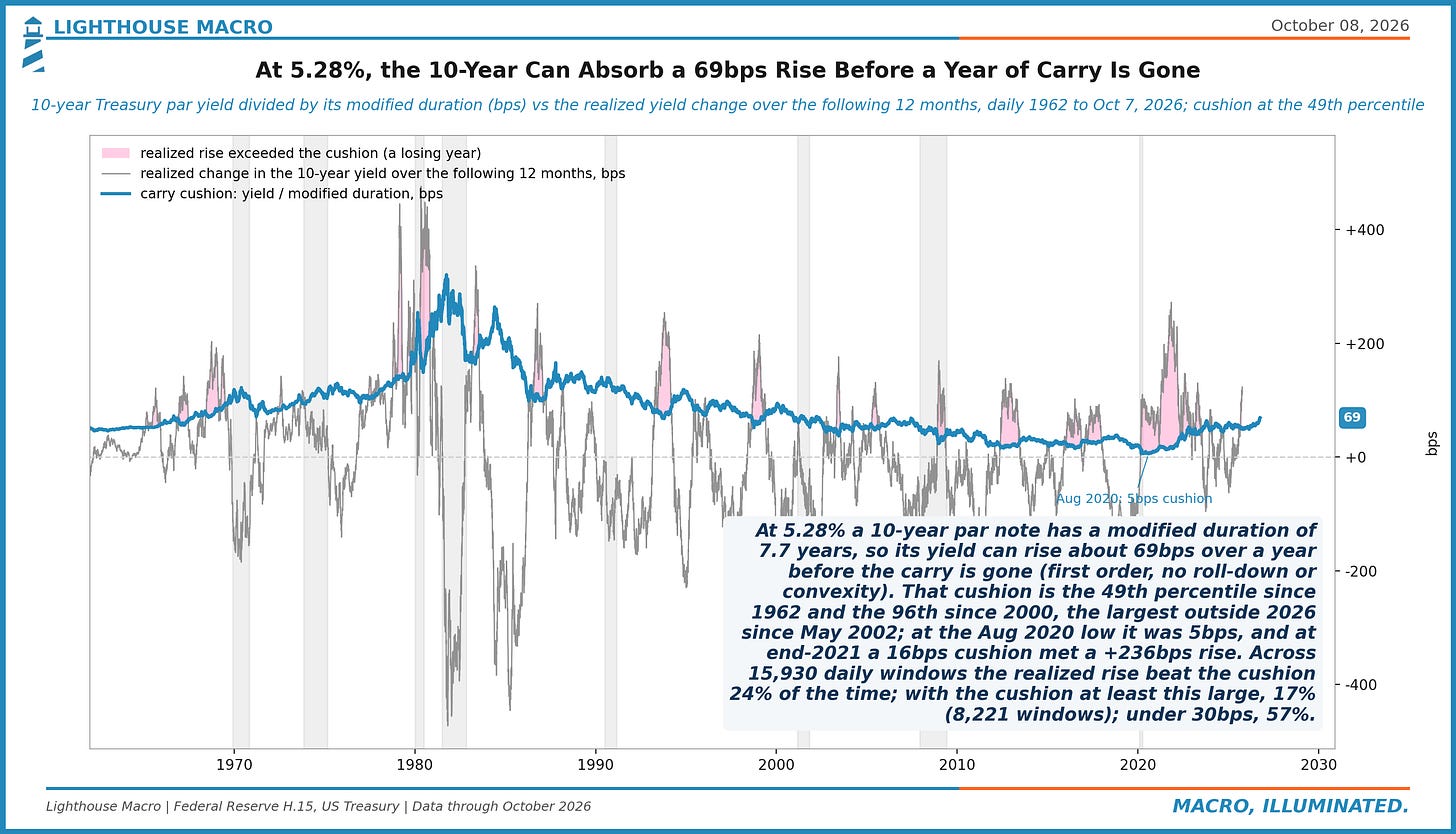
Figure 41. 30-year gilt 5.98% on Wednesday, above the 4.96% LDI-crisis peak of Sep 27, 2022; 30-year Treasury 5.67%, a series high. Gap +31bps vs +81 a year ago: over 12 months gilts +44bps, Treasuries +94bps. Daily moves correlate +0.74 over 63 sessions. One long-end repricing, two issuers.
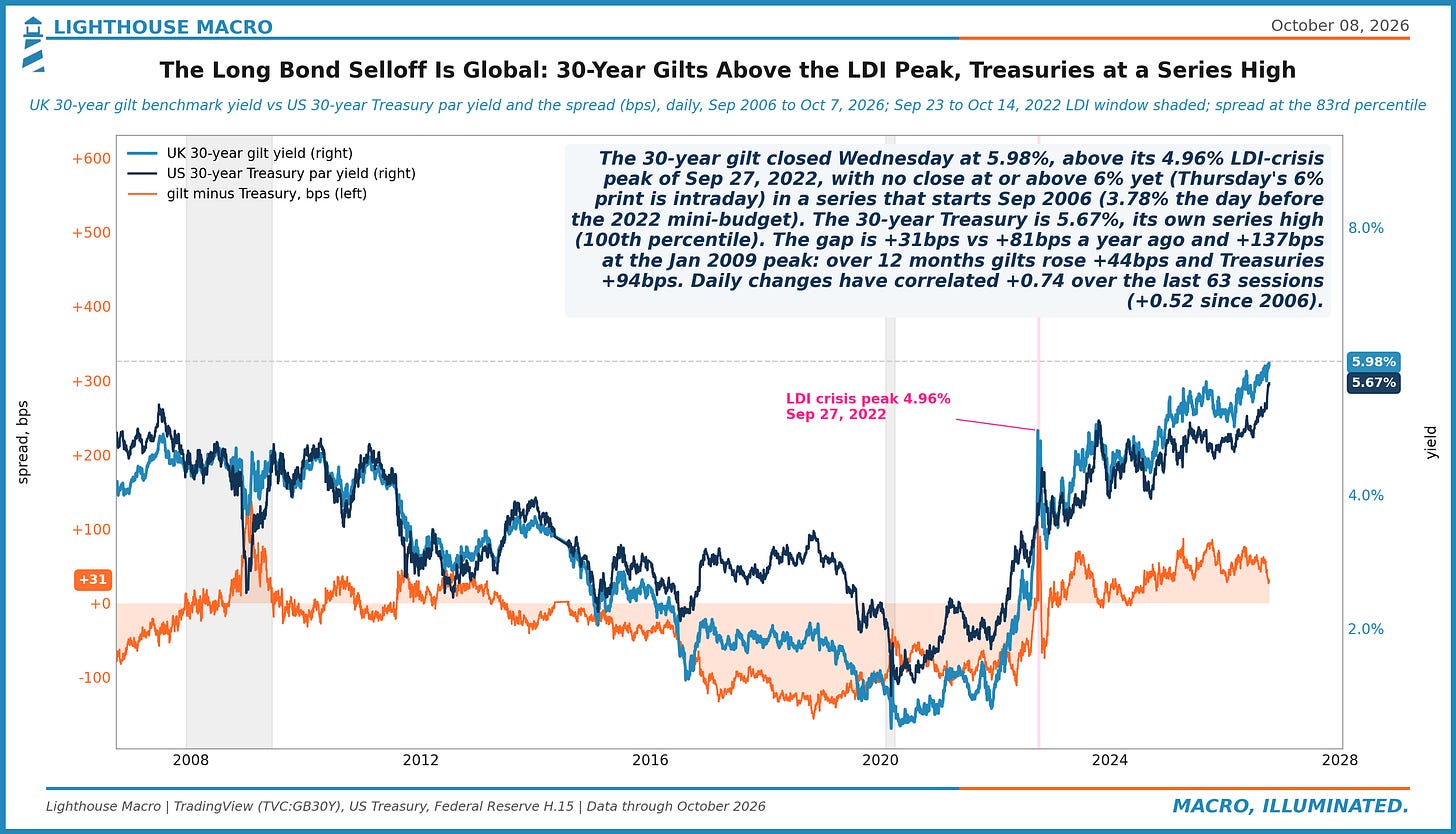
Figure 42. HY spreads 309bps Wednesday (12th percentile since 2003), MOVE 103 (73rd). The fit on bond vol says 519bps; the -210bps gap is the 3rd percentile of residuals (on the VIX, -94bps). In 219 weeks with the MOVE near here, HY was not under 264bps. Credit is priced to equity calm, not rate vol.
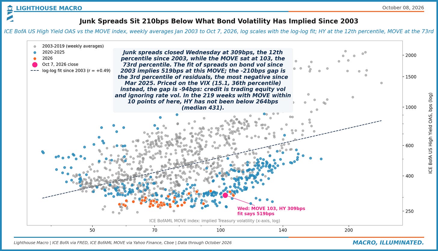
Figure 43. A Baa borrower paid 6.77% on Oct 5, the 53rd percentile since 1986, the highest since Oct 2023; the spread over Treasuries was 146bps, the 3rd percentile. IG OAS 84bps (11th pct), HY 312bps (14th). The cost of money is high and the price of risk is low; the Treasury leg is doing the tightening.
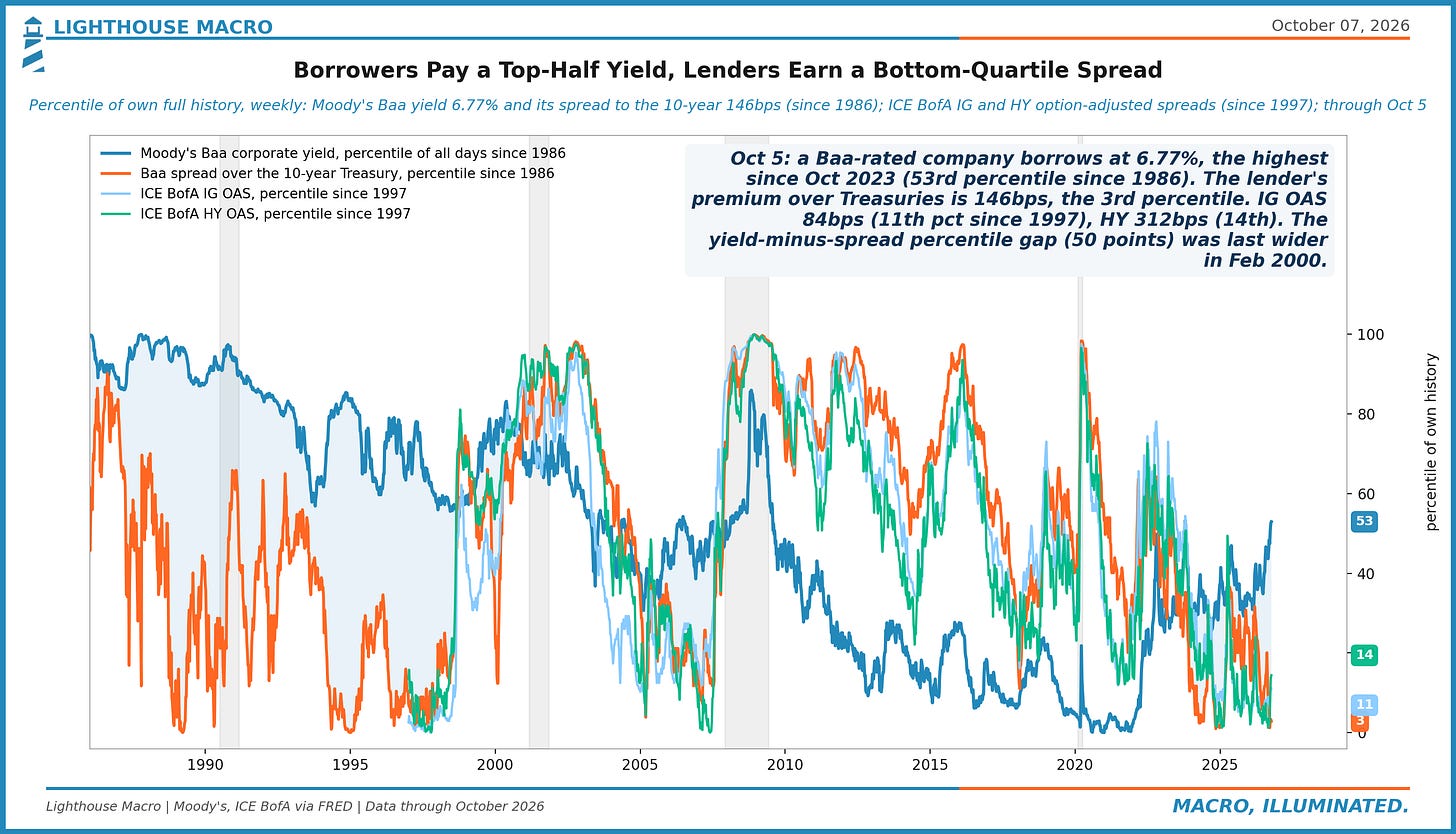
Figure 44. Payrolls averaged +51k/month over the three months to September; junk spreads were 312bps on Oct 5, the 15th percentile since 1997. In 43 prior non-recession months with hiring this weak, HY averaged 578bps. Credit reads the freeze as benign: that paid in 2003 and failed in 2007.
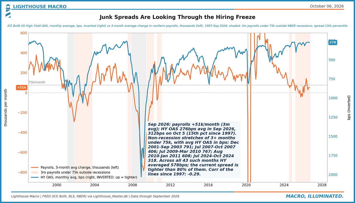
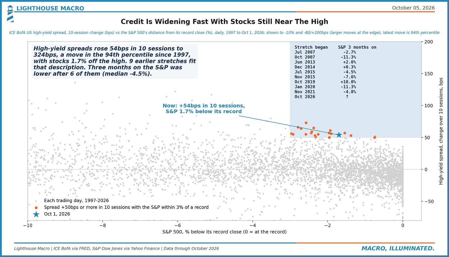
Figure 45. High-yield spreads widened 54bps in 10 sessions to 324bps on Oct 1 with the S&P 500 1.7% from its record. Credit has moved that fast that close to a high in 9 earlier stretches since 1997. Stocks were lower three months later after 6; 2013, 2014, 2019 were the exceptions.
Plumbing
Three charts on the pipes. Money funds now hold 43% of their assets in Treasuries and less in repo, $3 trillion a day of repo sets SOFR and clears at one price, and bank lending to business is growing at the fastest pace since 2023 into a hike. The system is absorbing the long-end move without a visible strain yet; this is where it would show first.
Figure 46. $3.00tn of Treasury repo set SOFR on Tuesday (record $3.51tn, Jan 2) while the 99th-to-1st percentile rate gap was 14bps, the 33rd percentile since 2018. 2026 averages $3.10tn and 14bps vs $2.76tn and 16bps in 2025. More collateral is financed overnight, and it clears at one price.
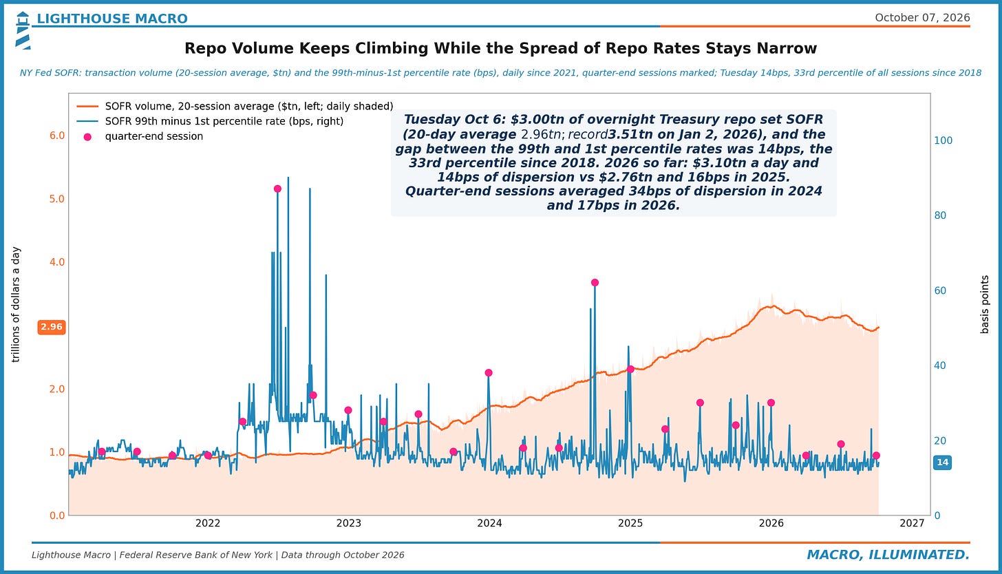
Figure 47. Money funds held $3.70tn of Treasuries in Aug 2026, 43.3% of $8.53tn in assets (from 40.9% a year ago); repo fell to 33.2%. Three months: Treasuries $+318bn, repo $-172bn. The funds are the marginal bill buyer, and they are selling repo to do it.
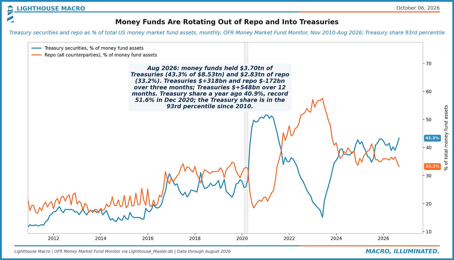
Figure 48. Bank lending into the Fed's hike: business loans +10.3% in the 52 weeks to Sep 23, fastest since Mar 2023, and +7.3% annualized over the last 13. Auto loans +6.4% and +8.0%; cards +4.4% but +1.9% lately. Firms are borrowing; the card is cooling. One hike is a small sample.

Market Structure
Eight charts because the internals did the most this week. The S&P 500 and the Nasdaq 100 are within 1% of their highs with the 10-year at a 2002 high and TLT at a 52-week low; small caps have lost 4.4% to large since the hike, the worst of seven cycles at this point; Korea has given back 25% from a June peak while US chips gave back 11%. The index is calm. The parts of it are not.
Figure 49. Through Wednesday Korea KOSPI is -25% from its Jun 22 high after a +61% year; 4 of 15 major indices are 10%+ below their 2026 highs (median -5.5%). 3 are within 1%: S&P 500, Nasdaq 100, Taiwan TAIEX. The give-backs are in Korea, India and Hong Kong; Taiwan and the US are still at their highs.
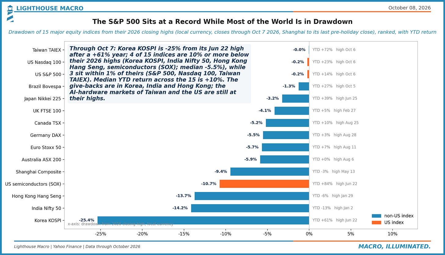
Figure 50. KOSPI and the Philadelphia semiconductor index both peaked on Jun 22, 2026. Since then Korea is -25.4%, US chips -10.7%; last 20 sessions +3.4% vs +15.1%. The KOSPI/SOX ratio is at the 4th percentile since 2010 (through Wednesday). Samsung guided a record quarter and the index sold the news.
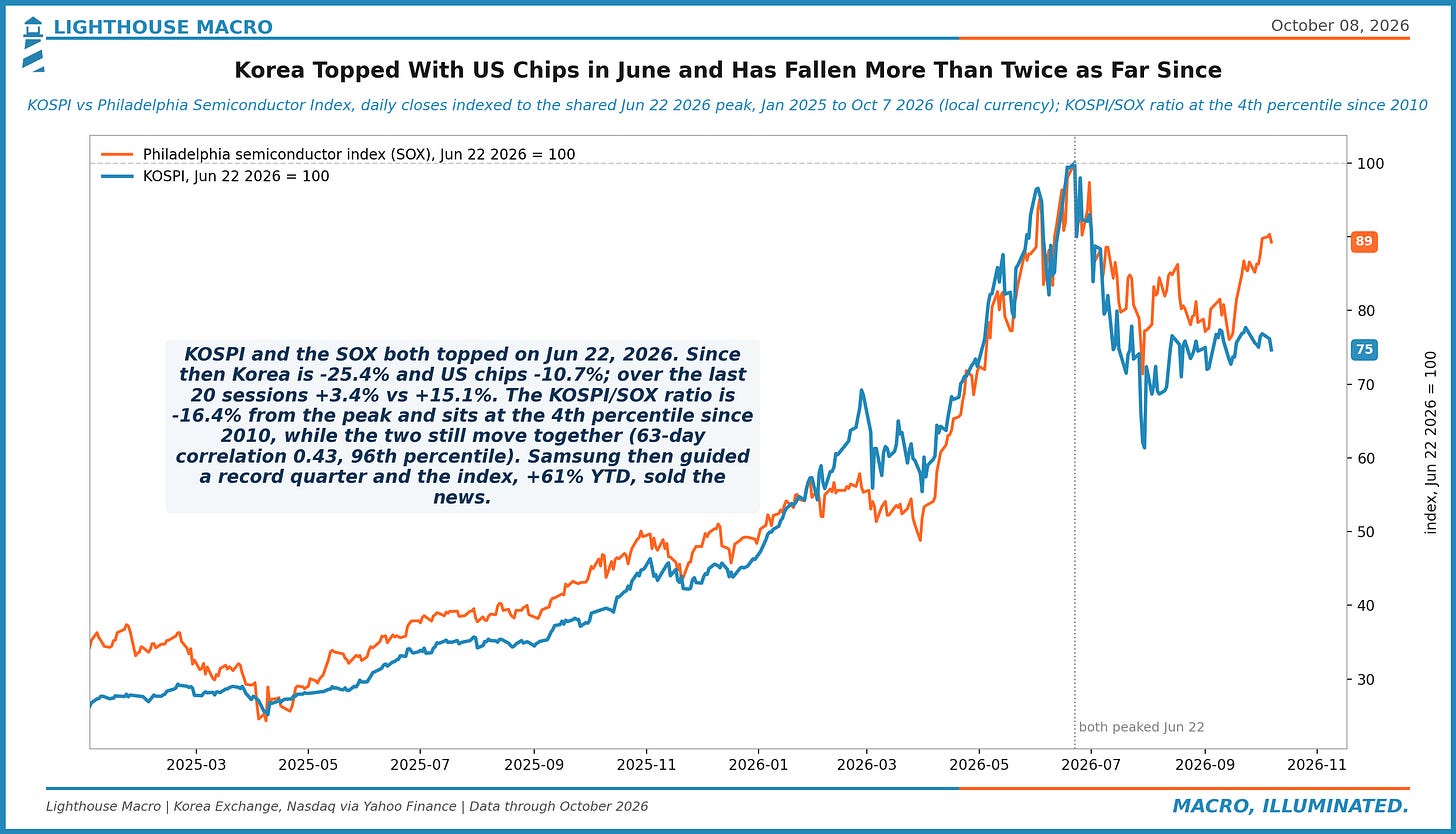
Figure 51. 60/40 (SPY/TLT) 12-month return to Oct 6: +6.2%, with SPY +17.7% and TLT -9.5% as the 10-year rose +114bps (94th pctile of 12m changes since 2003). When the 10-year was up 75bps+ over a year, the blend was positive 73% of the time (median +6.8%). Stocks are carrying the bond sleeve.
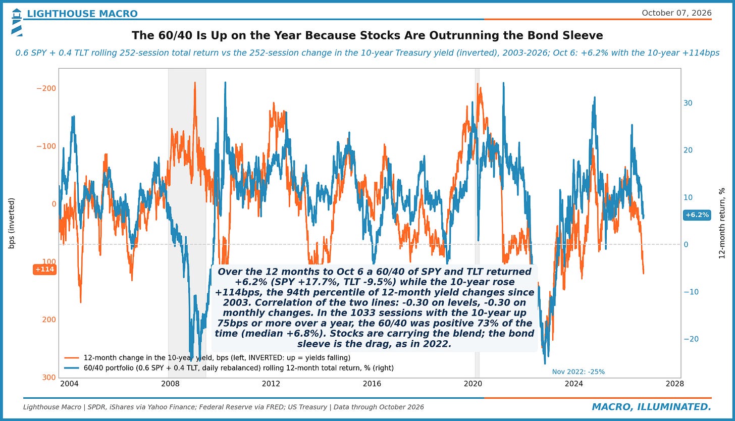
Figure 52. Small caps after first Fed hikes: 14 sessions in, the Russell 2000 has lost 4.4% to the S&P 500. The six cycles since 1988 ran -3.3% (Jun 2004) to +2.0% (Mar 1988) at this point; 0 of 6 were worse. Median path by session 120: -0.2%. Early tightening has favored large caps, which need less credit.
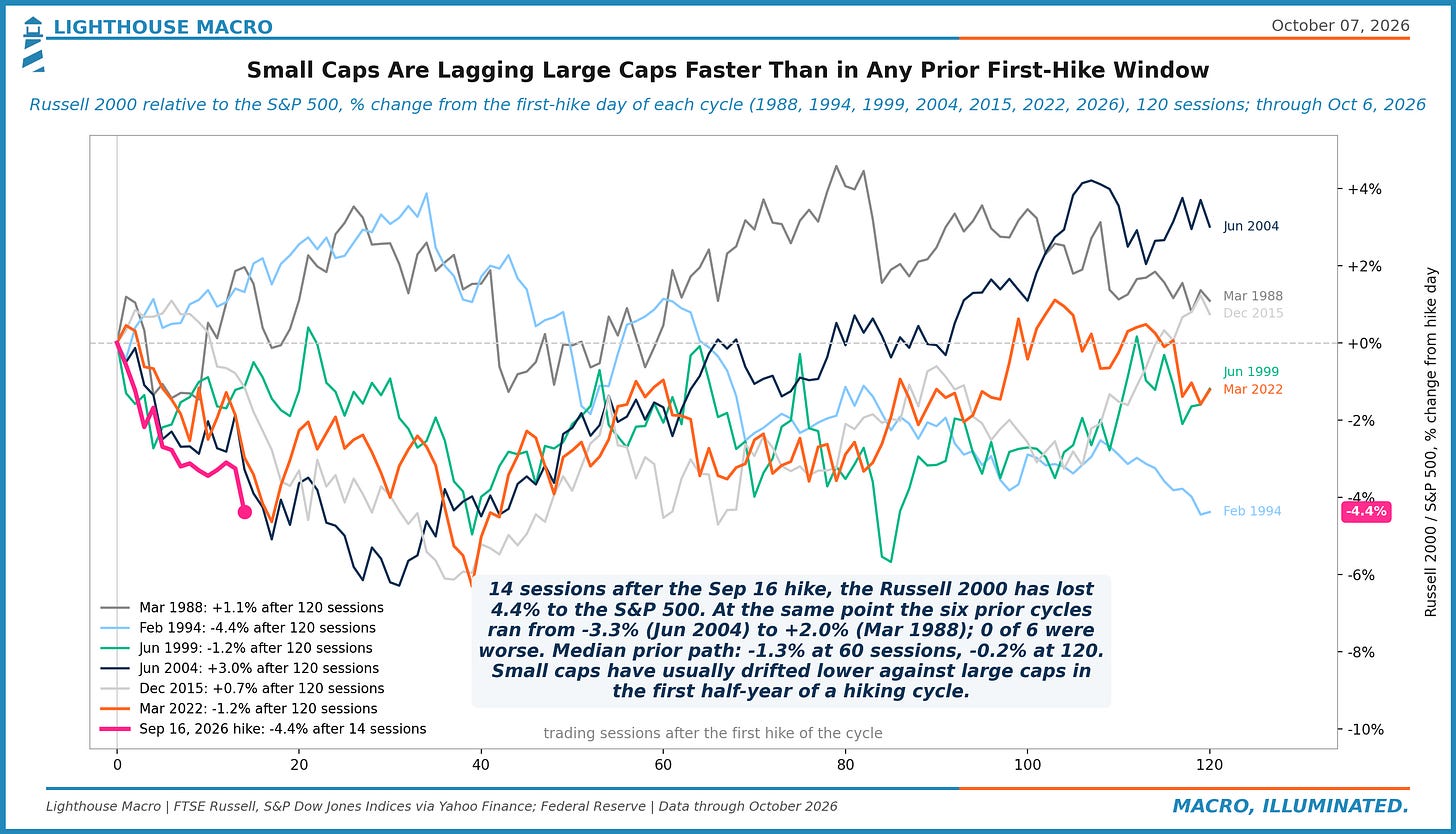
Figure 53. ETF flows, month to Oct 6: munis +6.3% of assets, utilities +5.0%, Treasuries +3.9%, bank loans +3.8%; MBS -3.5%, financials -1.5%, tech -0.4%. Bond ETFs +2.4% vs equity +0.6% with the 10-year at a 2002 high. Buyers are averaging into duration and defensives.
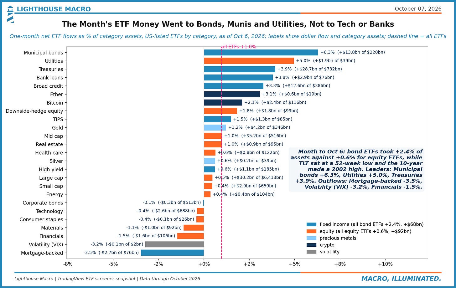
Figure 54. Since the Sep 16 hike the 10-year is +30bps and utilities -5.4% vs SPY (13 sessions). Over 6,857 same-length windows since 1999 the correlation is -0.31; the fit implied -1.7%, and the actual is in the bottom 9% of windows with yields up. The bond-proxy sell-off ran well past the rate move.
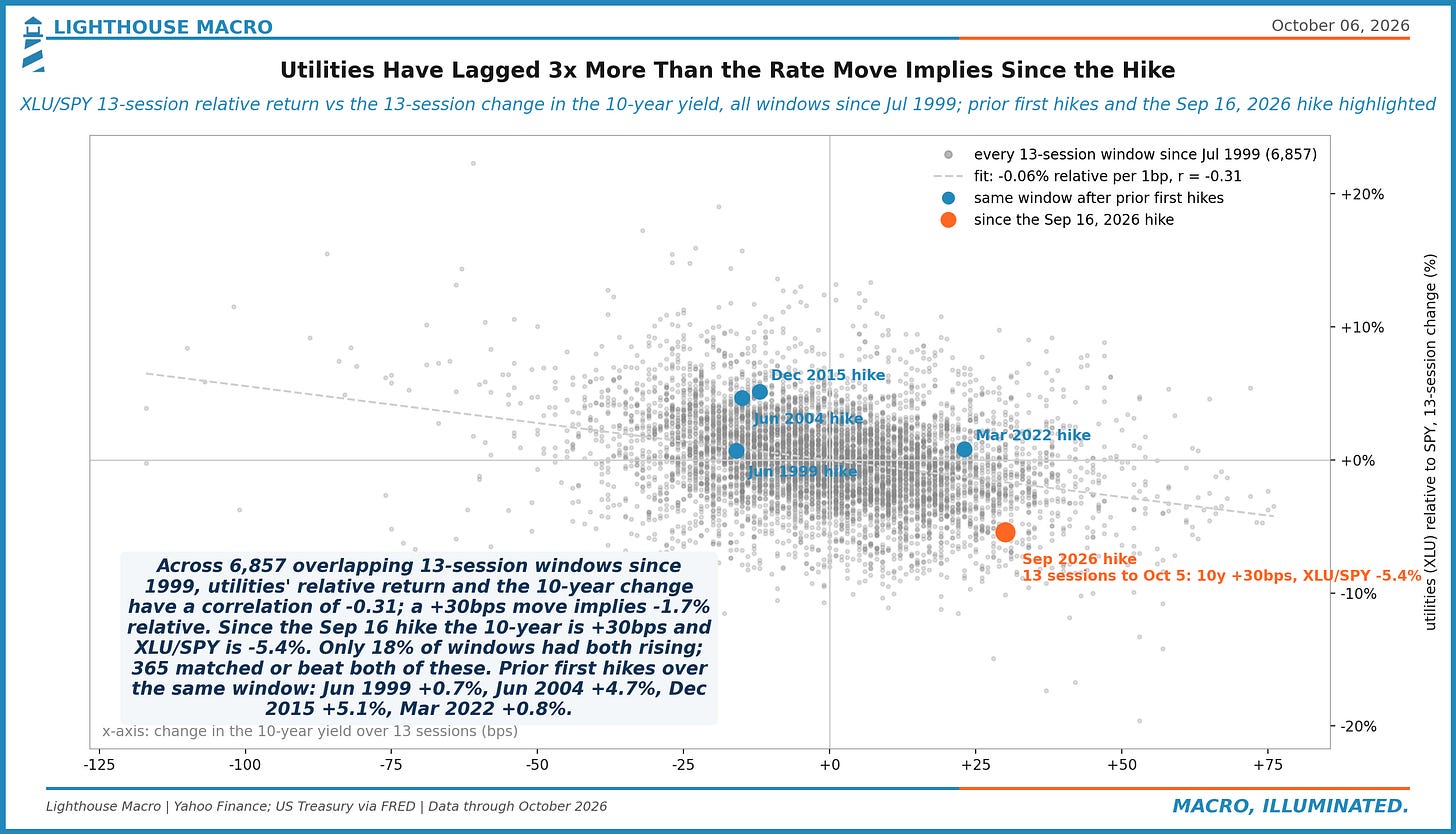
Figure 55. Monday: S&P 500 0.3% from its record, TLT at a 52-week low. 2026 has 11 sessions with stocks within 1% of a record and long Treasuries within 1% of a 52-week low; 2003-2025 had 44 in total (2006: 17, 2013: 9, 2016: 8). That is 13% of this year's near-record sessions, against 3% before.
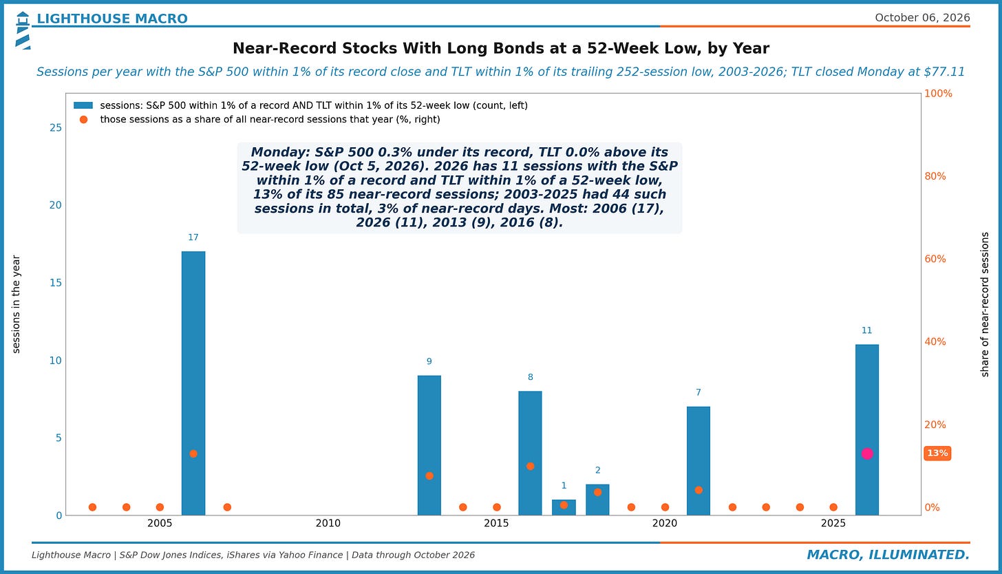
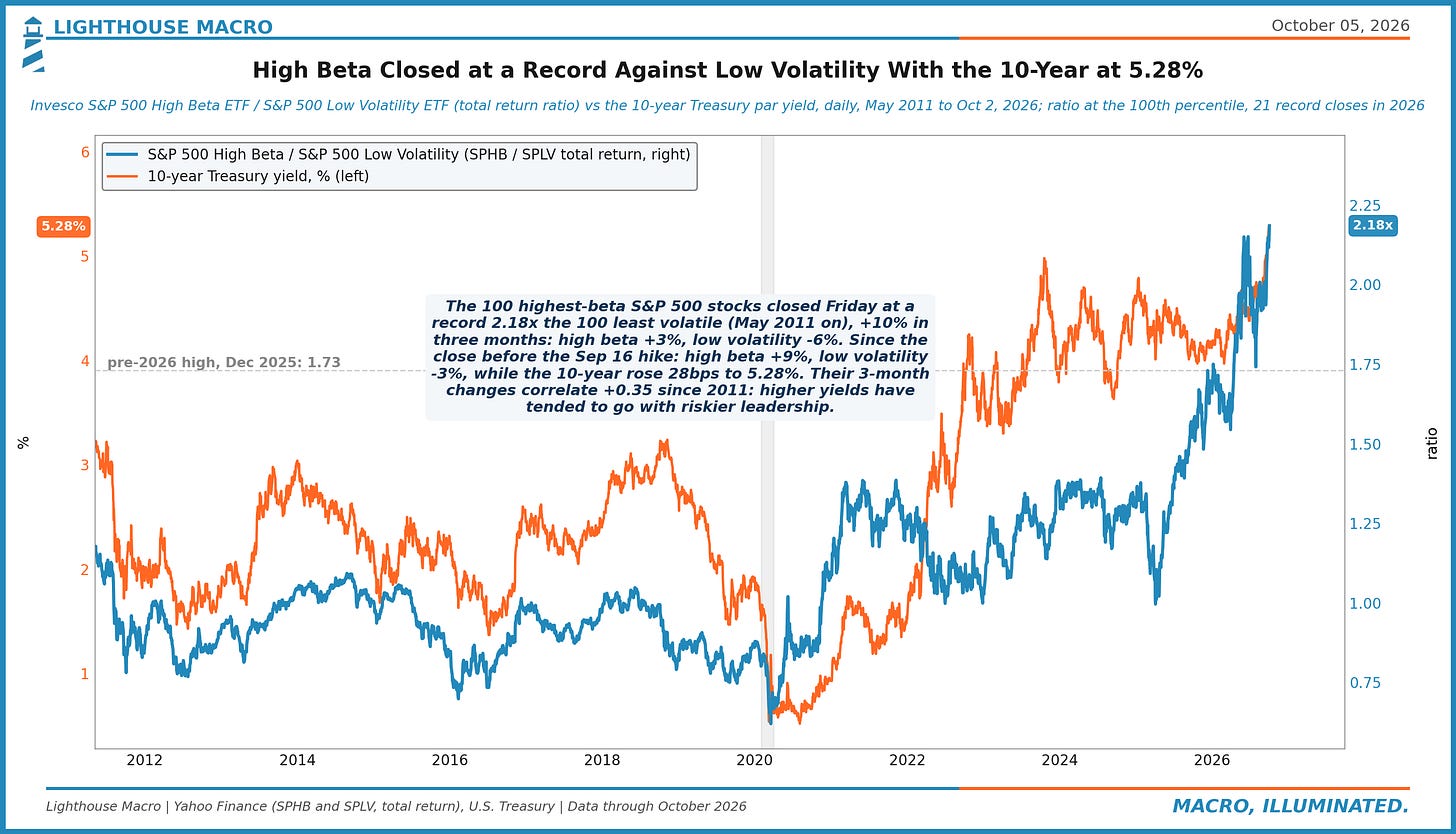
Figure 56. S&P 500 high-beta stocks closed Friday at a record 2.18x low-volatility stocks (ETFs since 2011). Since the Sep 16 hike high beta is +9% and low vol -3%, with the 10-year up 28bps to 5.28%. So far the hike has moved money toward risk inside the index, away from defensives.
Sentiment
The survey crowd is bearish, the options crowd is not, and the two have rarely disagreed this much. AAII bears lead bulls by 13 points with the index at a record, households expect 3.6% inflation against a five-year breakeven near 2.3%, and a VIX of 15 with a 5.3% 10-year is a combination this market last priced in 2007. Say and do are two different charts.
Figure 57. Wednesday: 10-year 5.28%, VIX 15.1. 2026 has 12 sessions with the 10-year at 5%+ and the VIX at 17 or under; the combination last appeared in 2007. Median VIX on 5%-plus 10-year sessions before 2026: 17.9; this year 15.6. The closest analog on this map is 2006-07, and equity vol is priced to it.
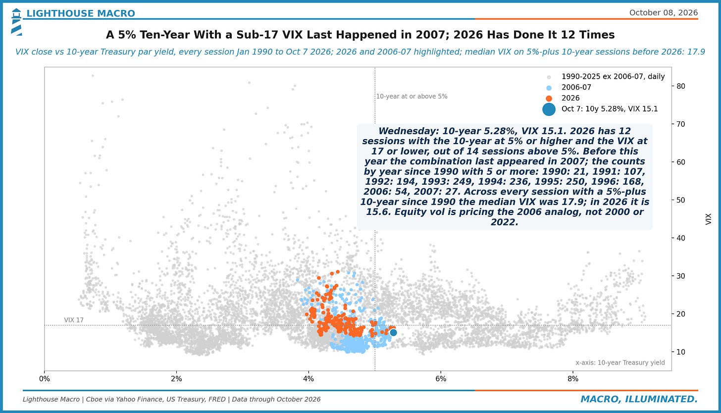
Figure 58. Managed money was net long 120,318 COMEX gold contracts on Sep 29, 30% of open interest (66th pctile since 2006), vs 118,159 just before the Jan 29 record. Gold is -22% since; the net long is +2%, and 8% below its Aug 4 high. A 22% drawdown, and the speculative length has not flushed.
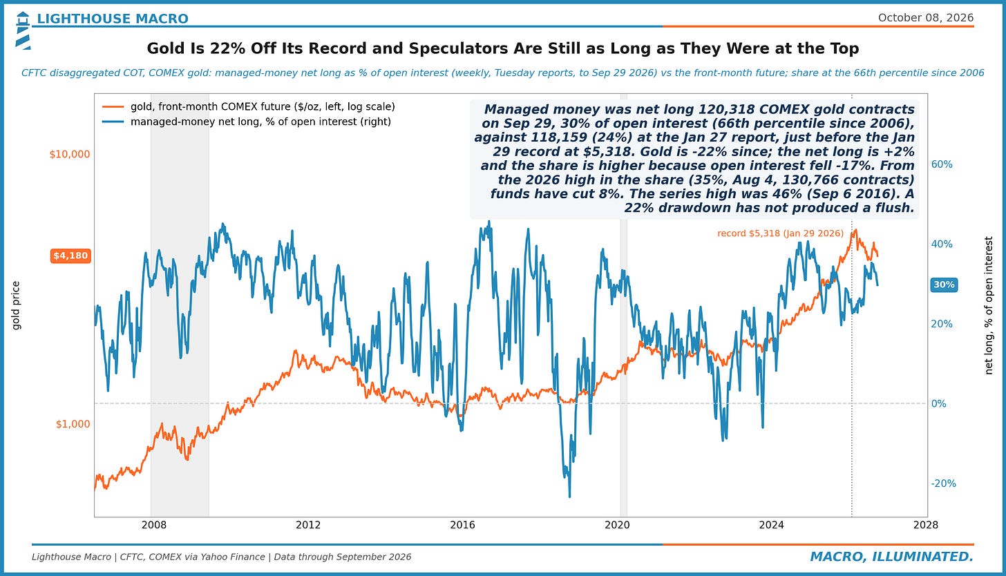
Figure 59. NY Fed survey, Aug 2026: households expect 3.6% inflation over the next year, 3.2% a year over three; the 5-year breakeven averaged 2.26%. The 1-year gap, +1.3pts, is the 60th percentile since 2013. Households price their receipts; the market prices the Fed. September's survey is the next test.
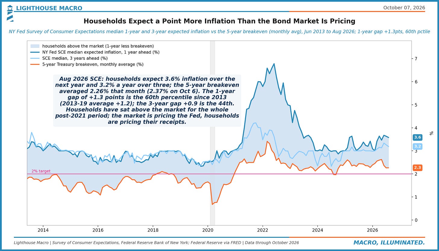
Figure 60. UMich consumer sentiment was 51.7 in August, the month before the Sep 16 hike: the 1st percentile since 1978 and 11 points below the prior low at a first hike (Mar 2022, 62.8). The six earlier cycles began near 90. Tightening into a consumer this sour has no precedent in this series.
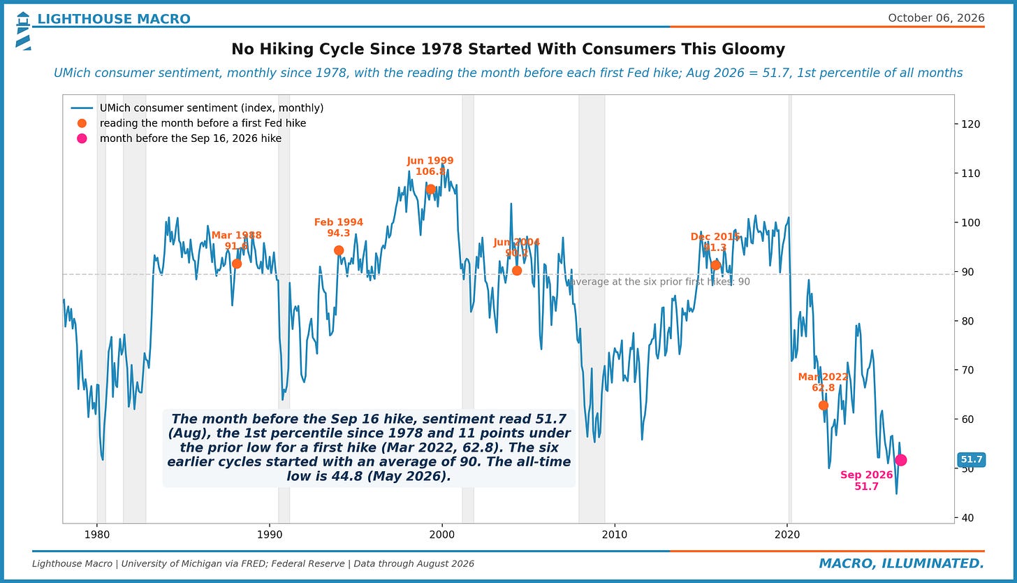
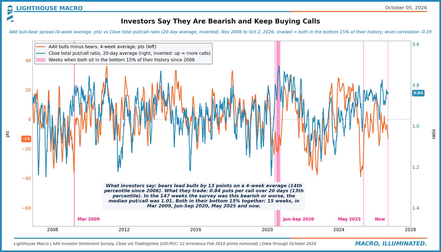
Figure 61. AAII bears lead bulls by 13 points on a 4-week average (14th percentile since 2006) while the 20-day put/call ratio is 0.84 (13th percentile): heavy call buying. Both that low together: 15 weeks, in Mar 2009, Jun-Sep 2020, May 2025 and now. Stated fear, traded appetite.
Cross-Asset and Crypto
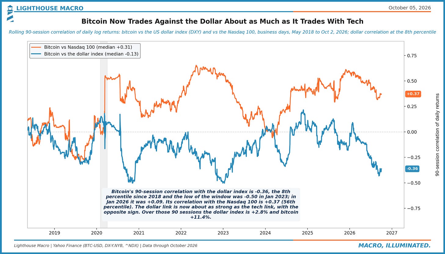
Bitcoin a year after its peak is down 31% while gold is up 5% and the dollar is up 4%, its correlation with the dollar is at the 8th percentile and its beta to the Nasdaq is 0.9. It trades as a high-beta technology asset that lost its hedge story, and the book sizes it that way: the smallest name, on trend alone.
Figure 62. Bitcoin's 252-day beta to the Nasdaq 100 is 0.91 (77th pctile since 2016). Over the past year the Nasdaq 100 returned +24.7%, implying about +22.5% for bitcoin at that beta; it returned -33.2%. The index is -0.2% from its record, bitcoin -33.2%. The tech link is intact; the drawdown is its own.
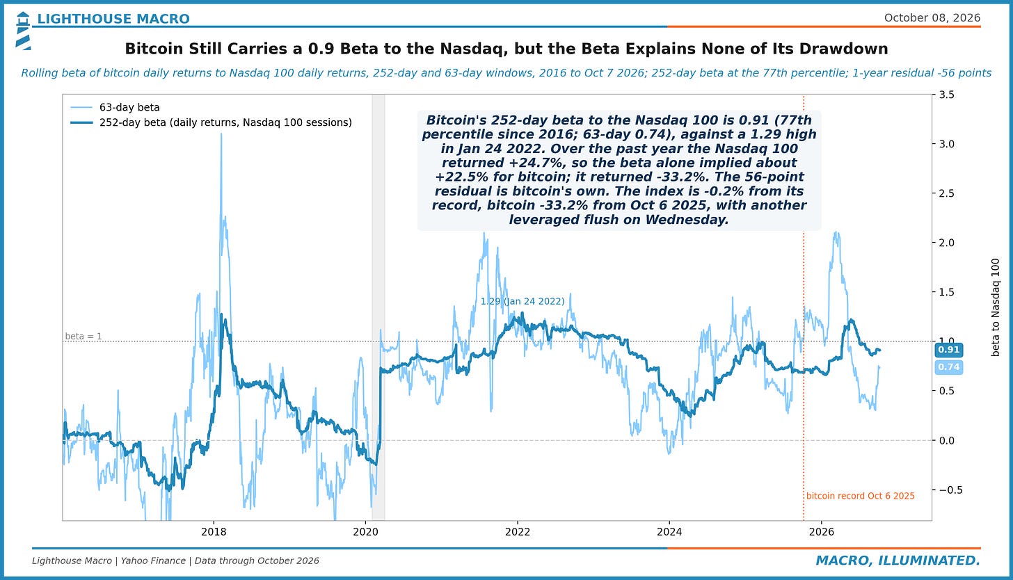
Figure 63. One year after bitcoin's Oct 6, 2025 peak: bitcoin -31%, gold +5%, the dollar index +3.8%. Gold topped at +34% (Jan 29), bitcoin bottomed at -53% (Jun 30); daily correlation +0.22. A 37-point gap between two assets sold as dollar hedges. Gold had the official bid; bitcoin had the Nasdaq beta.
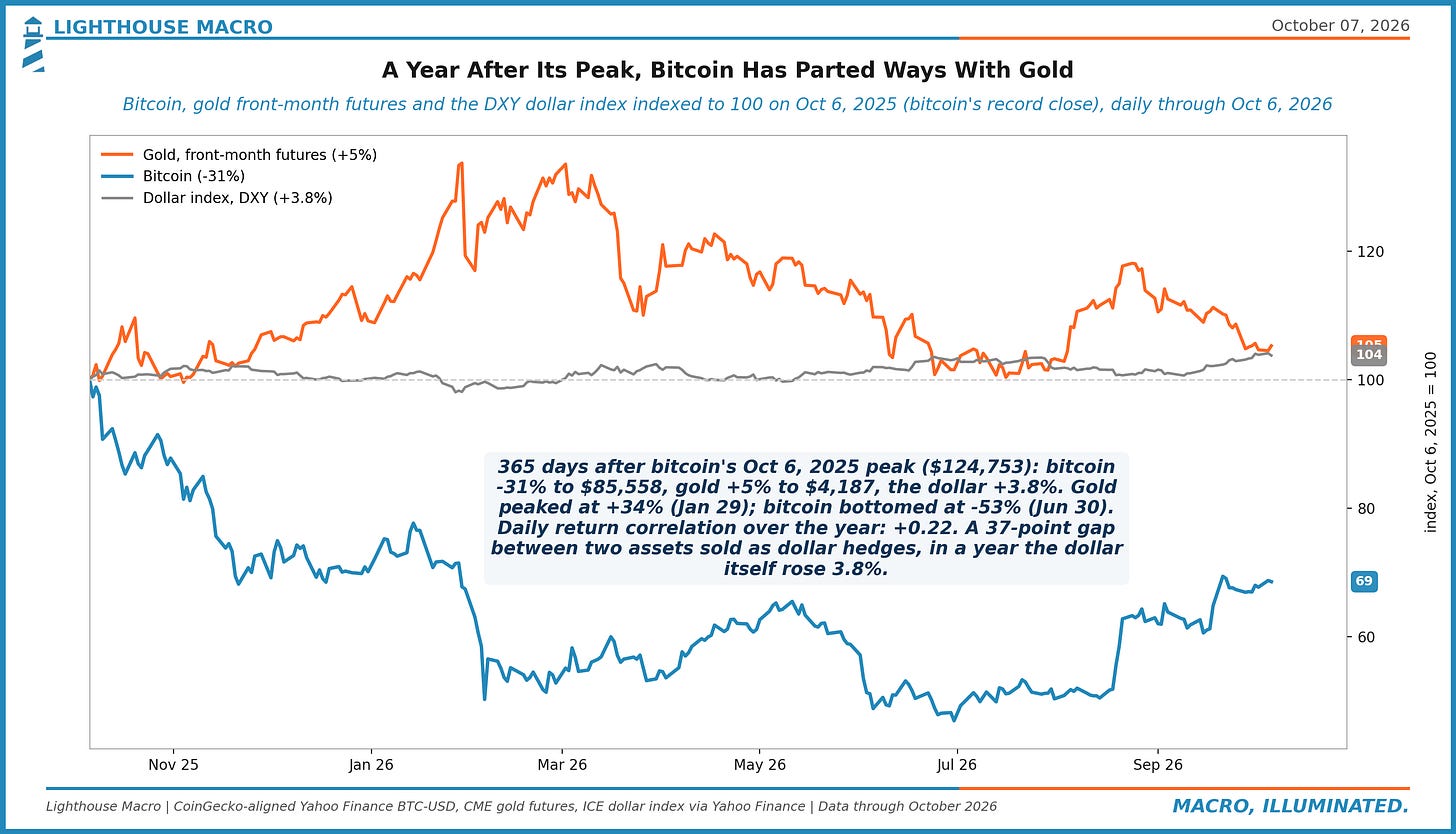
Figure 64. Bitcoin's 90-day correlation with the dollar index is -0.36, the 8th percentile since 2018, against +0.37 with the Nasdaq 100; in Jan 2026 the dollar link was +0.09. It now trades against the dollar about as much as it trades with tech. Correlations do shift.
Put the two halves together and the picture is consistent. The long end has moved to a level that makes duration arithmetic rather than faith, the fiscal roll onto that curve is fast, inflation is broad and the labor market has gone quiet on both sides at once. Credit and equity volatility have not priced any of it. The index sits within 1% of a record while the parts of it, small caps, chips, the exporters, the countries that ran hardest this year, have already started to give back.
The book owns the orders and the price pressure, and it is running a half point ahead of the index after a week and a half. That is not a result. It is a start, and the stops are there for the version of this where the calm breaks the other way. We will show the next week whatever it says.
For allocators, the one line: the market is priced for a 2007 that stays 2007. The data argues for keeping the names that are being paid for now, keeping the exits tight, and treating the long end as the signal rather than the noise.